

1910 Postcard
This card shows 3 products and their logos:
National Light Oil
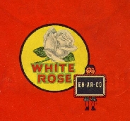
White Rose Gasoline
Sterling Paint and Varnish (the Toronto plant also produced a wide array of petroleum based surface coatings before being destroyed by fire in 1923.)
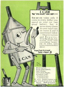
"I Can" was used briefly ,circa 1918-1920.He did not seem to catch
on and his potential as a company spokesman was never fully realized.
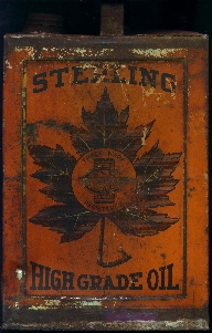
Sterling, National and Early En-Ar-Co cans used a logo of a Maple Leaf.
Inside this leaf were the letters
C, O, & Co's (Canadian Oil Companies). In the centre of these letters
on a small bar was the word Sterling, National or En-Ar-Co depending on
their age. All cans from this period were soldered together by hand.
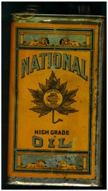
Sterling, National and Early En-Ar-Co cans used a logo of a Maple Leaf.
Inside this leaf were the letters
C, O, & Co's (Canadian Oil Companies). In the centre of these letters
on a small bar was the word Sterling, National or En-Ar-Co depending on
their age. All cans from this period were hand soldered .
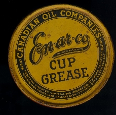
Sterling, National and Early En-Ar-Co cans used a logo of a Maple Leaf.
Inside this leaf were the letters
C, O, & Co's (Canadian Oil Companies). In the centre of these letters
on a small bar was the word Sterling, National or En-Ar-Co depending on
their age. All cans from this period were hand soldered . On this
particular can the maple leaf is not shown but is on the side of the can.
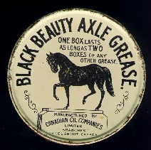
Black Beauty was used for many years.Available in many sizes this product
earned a lasting reputation as a quality multi-purpose grease.
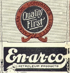
This is a scan from a 1920 En-Ar-Co Oil News booklet,and I refer to
this as the Quality First logo.
1915 is the first that I have seen it used,
but possibly earlier.
click the picture to view the article.
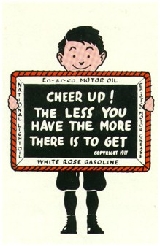
In late 1938 National Refining Company sold Canadian Oil Co's to Nesbitt,
Thomson & Co of Montreal. A new sign was designed for the "All Canadian
Company." During this transition period the Boy and Slate was joined by
the new Rose sign. The White Rose Script was horizontal and under the rose.
This was used on invoices, maps etc. until 1942, but not on their cans.
Canadian Oil Co's used the Boy and Slate until at least 1952 on their lower
priced oil.
By 1942, the Boy and Slate was being phased out and was replaced
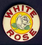
with a new sign. The words "White Rose" wrapped arround the rose image.
This was used until 1952. This logo replaced the Boy and Slate on all products
but the lower priced oil. I refer to this as the "Encircled Rose" logo.
A new design was introduced in 1953. It was hoped this shape would
be as unique, recognizable, and memorable to customers as the Boy and Slate's.
I refer to this sign as "The Wedge" logo. This design was used right up
to the purchase of the company by Shell Canada, in 1962. Shell continued
using "White Rose - a division of Shell Canada" on signs, cans and paperwork
,running as late as 1967. The brand name "En-Ar-Co" was used in Canada
until 1967 on lower priced oil. but the Boy and Slate was gone.
Recently the 'Wedge' logo briefly appeared on composite and plastic litre (metric) containers of oil, with Canadian Oil Company. Ltd., presumably under licence to Shell Canada.