you chose DAREDEVIL

The blind leading the blind?

This sequence of examples is intended to illustrate an article in COMIC BOOK NET. Two weeks after the article appears, its complete text will be posted here.

* EXAMPLE ONE *

How the AVERAGE comic book of twenty years ago begins to look like a Classic next to the AVERAGE comic book of today. Also proves that the difference between homage and rip-off is often the difference between skill and ham-fistedness.

(some big images here, sorry)


IN THIS CORNER: FF #201

* Design in the service of Drama

* Human anatomy distorted for dramatic purposes

* Joe Sinnott inks ('nuff said)

* Extremely busy layout nonetheless comes off clear, exciting and easy to assimilate, even on the internet.

* Successful homage to an older cover presents a new and interesting situation in a way that carries reminders of past glory.

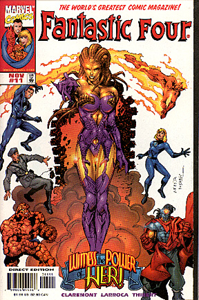
IN THIS CORNER: FF #11 (NEW)

* Design for the sake of design (and BAD design at that)

* Human anatomy distorted because the artist doesn't know how to draw

* No Joe Sinnott inks ('nuff said)

* Straightforward layout nonetheless comes off as busy, muddled and extremely hard on the eyes, even on paper.

* Unsuccessful homage to an older cover rips off the past (ineptly) by trying to fob off poor excecution and dumb ideas while invoking the name of more talented creators.

And does anybody think that the Thing looks GOOD here?

AND THE WINNER IS:

Clearly, FF#201: A fun if not spectacular read, as against its opponent, which could be used to torture prisoners of war.

* EXAMPLE TWO *

How the Silly can become Sublime, and how modern comics artists are made to look like fools by the LEAST ambitious stories of yesteryear.

More artistic integrity, better dramatic structure, and MUCH more entertainment value in the silly Hostess Fruit pies ad above (cir. 1975) than in this ENTIRE ISSUE of the Fantastic Four (cir. 1998) --------->

* EXAMPLE THREE *

Visual Gibberish

Compare this with the unexeptional Hostess Fruit Pies ad above. The Hostess ad presents its action in a clear, easy to follow, visually dramatic way. This exceptional page from a recent issue of Iron Man is more concerned with panel arrangement than good storytelling. Just what the hell is going on here, anyway? Even with a better than average computer coloring job, it's hard to tell. There's no depth of field, poor spotting of blacks, and no storytelling sense. It's all snarling, posing bodies with no sense of dramatic structure or pace at all. In fact, when I was scanning this page I had a hard time telling whether or not I'd inadvertantly got it upside down.

And remember, this is a better than average page. I could have found much worse without trying hard.

* EXAMPLE FOUR *

Look at the DEPTH in this image. Look at the WEIGHT of the figures and the spotting of blacks. Look at the RELAXED POWER in the Hulk's left hand and the way that Trimpe has implied MOTION even though the figures are static. Most of all, look at the STORY. There's more good storytelling in this one panel than in the entire page above.

RETURN TO SLUMBERLAND

A N O T H E R

 D U C K

S O U P

P R O D U C T I O N

copyright © 1998 Duck Soup Productions