

Jim Welch
Special Thanks to Jim Welch, Stanley Mouse and Alton Kelley who helped bring to light some of the best album art in music.
Q: How did you get involved with doing Journey artwork?
A: It's a long story...but, I worked in top 40 radio in San Francisco 1973 (I needed a real job). FM was just getting started. AM radio dominated. Anyway, I met Randy Tuten, who at that time was the weekly ad layout guy and poster artist for promoter Bill graham. Then, when I started my own Ad Agency (1975)...one of the assignments I had was to art direct posters for Bill Graham shows. A famous one was for a Who & Dead dual bill show. I visualized an owl on a tombstone with a wreath of roses. Philip Garris did the actual painting.
Then, I met Kelley and Mouse, Victor Moscoso, Rick Griffin, John Van Hammerveld, Charles White III, and a number of California painters and artists. It was the late seventies and air brush art was flourishing. As time went by, I negotiated book deals, art directed and got involved in the merchandising of memorobilia. I actually became the Merchandising Director and Art Director for the Grateful Dead. Their management was a consortum of people. Richard Loren, Rock Skully, and several other people were at the forefront of imparting the band's wishes. I contracted with and art directed the artists and had arms length input on final design work. It worked well for awhile.
Eventually, I met Herbie Herbert, the manager of Journey. The band had released 2 albums and was about to release another. I showed Herbie and the band the book on Kelley and Mouse artwork, published by Dragon's World, Roger Dean's (Artist for the group YES) company in London. They liked the scarab images. They also liked wings and colorful type. Herbie liked my style. He asked me to help him realize his vision of developing the band's image and merchandising. We hit it off. He was business and bravado and I was a businessman artist. It was synergistic and exciting. Mouse and Kelley started on the INFINITY cover. I helped some. I titled the album and we came up with the mobeus strip (sideways figure eight). Kelley had great color sense and design ideas and Mouse had a deft touch with the airbrush. In those days the art evolved in a creative "group conciousness" environment.

A: They were busy in the studio and on the road. These guys toured constantly and literally won fans throughout the USA without a hit song. They worked their butts off. They had ideas, but their schedules did not permit much in the way of directing any of the album art. They were thrilled with the quality of art and design in those days. They went along with management.

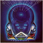
A: Think of the Star Wars stories. There is a constant theme throughout. I always felt that Journey's music was transcendent. It took you to a higher level, if you wanted it to. It was also connected to the elements. The band had a style and grace that weaves through every record. We used the Scarab, the Mobeus strip, circular forms, wings and nature. Frontiers was a subtle shift. Mouse and Kelley were not involved with that cover. My vision for Frontiers was based on "tunnels" and the relativity of time and motion. Light stays the same, but time bends. It was Einstein theories for artist interpretation. The alien in Frontiers wasn't really an alien at all, he was a connection to a higher level of listening to Journey. We called him "Elmo". For the Frontiers tour, Jonathan Cain wrote, and the band used "Elmo's theme" to open the show.

A: Both. I call them conscious refinements. They evolved with the band. It was a special thing.
Q: Where there any Journey album covers and/or art ideas that never made it to a Journey album?
A: There are always tests. Sometimes art just pops out immediately, but it takes doing. It's like winning a race or making a hole in one in golf. You can't make them happen without constantly working at it. The point is, you can't win all the time. But if you work hard you have a chance to do something meaningful.

A: Captured. It was Mouse's rendering, so I didn't really design it, just had a part of the creative process. Like I said earlier, the creative team made these happen. Each of us had input towards the end result. I did the back cover photo using a fish eye lens and airbrush on a large C-print. Plus, from Captured on, I always did the mechanical packge design, the film and the press proofs. This album was full of "eye candy".
Q: Did you use any ideas from Journey's first 3 albums (Pre-Infinity) on the albums you designed, if so, what were they?
A: On Captured and Escape, I continued the theme of having the band in action. Frontiers was way over the top. The band skydiving through time and space. I didn't control the packaging before Captured, so the band did alot of posed pictures for Infinity and Evolution. Back then, they would send the cover art and photos to Columbia Records, and Columbia would do the package design.

A: Other bands are...The Doobie Brothers, Tubes, Rod Stewart, Crowded House, Steve Miller Band, Sy Klopps, Gregg Rolie, and Abraxas Pool. Today, I am involved with multimedia and have diversified into doing corporate image making.
Q: Have you ever thought about releasing a collection or book of Journey and related art you designed? (Posters, shirts, albums, etc.)
A: It's been done. I'm more into the moment. I do have an idea for a book. But, its a fiction story.
Q: What album art projects are you working on now?
A: This fall I'll be creating art for Steve Miller's 30th anniversary. This will include a re-release of a selection of his albums in Europe. I'd actually like to do another Journey project. I think the latest album drifted to far into fantasy. A girl with a cats head? A girl with a Heron's head? It wasn't in keeping with the timeless art of the past. But, the band is the band, and they have a right to do what they want.
A: It's like the invention of the light bulb, only better!
Q: What advice would you suggest to anyone wanting to start to do graphic design for music and what you have found to be successful on how to advance in this field?
A: You have to know somebody and you have to have talent. Plus, it's fate and timing wrapped up together. By that I mean that you just can't say, Hey, I'm going to do a cover for Bush! They, or any group travel in a kind of small world together. To get into that world means you probably live in a metro area with a music scene and you do art for small groups that eventually blossom. You absorb from doing and grow. My advise is to work at it every day. Whatever your dream is...find it and make it happen!
Thanks very much to Jim Welch for taking the time for this interview, we look forward to more great music art from you in the furure. Scott Sullivan of the Journey WWW Page.

CLICK HERE TO GO TO BLUEYEDOG CREATIVE SERVICES
Visit Jim Welch's web site, it includes artwork of Gregg Rolie, Steve Miller and Abraxas Pool.