This unit explores labels, command buttons, and text boxes in detail. It explains all the properties associated with those controls. The important thing to remember as you
wade through the tables of properties is that you need to master these properties
if you are going to master Visual Basic. Unless you understand how to set up each property to respond in the manner your application requires, you cannot use Visual Basic
effectively or create the outstanding applications that Visual Basic is capable of
creating. Once you learn about the properties available for these controls, the next unit will explain all the event procedures that are possible with the command button,
label, and text box controls.
Note: From this unit through the end of the book, each lesson's project contains a complete application that uses the concepts taught in the two units. Each unit is descriptive, and the project takes what you learned in the two units and shows you what a real-world application of the material looks like. You get the best of both worlds of teaching: The theory comes in the units, and the practical applications appear in the end-of-lesson projects.
Concept: As you learn about controls, you often hear the term focus. Learning about focus now saves you a lot of trouble later.
Definition: Focus refers to the control that is currently highlighted.
The control with the focus is the next control that will accept the user's response. Most Windows users
instinctively understand focus even though very few have thought much about focus. The control with the focus is always the control that is
highlighted. The focus often moves from control to control as the user works. The focus determines where the next
action will take place.
Tip: In a way, a control's focus is much like a word processor's text cursor. The focus enables the user to know where the next action will take place unless he changes the focus, just as a text cursor tells the user where the next character will appear unless he moves the text cursor to a different location.
Only one control can have the focus at
any one time, and not every control can get the focus. Figure 5.1 shows a form with four command buttons. The Third command button has the focus. You can tell this because the Third command button is highlighted,
whereas the other command buttons are not.
Not only is the button highlighted, but there is a dotted line around its caption.
Figure 5.1. The Third command button has the focus.
Definition: The focus order determines the control next in line for the focus.
Every form has a focus order that determines the next control that will receive the
focus. In Figure 5.1, if the user presses Enter, the figure's Third command button will depress only because it has the focus. If the user pressed Tab before pressing
Enter, the next control in sequence to receive the focus would be highlighted. If the
Second command button were next in sequence to gain the focus, the user's Tab press would highlight the Second command button.
When you see a dialog box such as a File Open dialog box, the OK button is almost always the command button that has
the focus. You can press Enter to select the OK command button, click a different command button (such as a Cancel command button), or
press Tab until the command button that you want has the focus.
Through property settings, you can determine
the focus order and whether a control can receive the focus. Your form might have some controls that you don't want the user to be able to highlight; therefore, you prevent them from getting the focus.
Review:
The focus determines the control that triggers next. If a command button has the focus, it is highlighted and is the next button chosen if the user presses Enter. If a text box has the focus, it will
receive the next keystroke's character
even if there are five other text box controls on the form at the same time. If the user needs to enter text in a certain text box that does not have the focus, he must press Tab until the text box gets the focus, or
he must click the text box that he
wants with the mouse cursor.
Concept: The command button is
the cornerstone of most Windows applications. With the command button, your user can respond to events, signal when something is ready for printing, and tell the program when to
terminate. Although all command buttons work in the same fundamental
way—they visually depress when the user clicks them, and they trigger events such as Click events—numerous properties for command buttons uniquely define each one and its
behavior.
You are already familiar with several command button
properties. You have seen that command buttons vary in size and location. Table 5.1 describes all the command button properties. You might want to open a new project, add a command button to the Form
window by double-clicking the command button on the
toolbox, and press F4 to scroll through the Properties window.
Several of the property settings can accept a limited range of numeric values. Most of these values are named in CONSTANT.TXT, and they are mentioned in this book as well. Some
property settings accept either True or False values, indicating a yes or no
condition. For example, if the Cancel property is set to True, that command button is the cancel command button and all other command buttons must contain a False Cancel property
because only one command button on a form can have a True Cancel property.
Tip: As you read through the property tables in this book, familiarize yourself not only with the purpose of each property but also with its name. When you write code, you need to refer to these properties by their full and exact names.
| Property | Description |
| BackColor | The command button is one of the few controls for which the background color property means very little. When you change the background color, only the dotted line around the command button's caption changes color. |
| Cancel | If True, Visual Basic automatically clicks this command button when the user presses Esc. Only one command button can have a True Cancel property value at a time. All command buttons initially have their Cancel property set to False. |
| Caption | The text that appears on the command button. If you precede any character in the text with an ampersand (&),it acts as the access key. Therefore, the access key for a command button with a Caption property set to E&xit is Alt+X. The default Caption value is the command button's Name value. |
| Default | The command button with the initial focus when the form first activates has a Default property setting of True. All command buttons initially have False Default property values until you change one of them. |
Definition: An icon is a picture on the screen.
| DragIcon | The icon that appears when the user drags the command button around on the form. |
Because you only rarely enable the to user move a command button, you won’t use the Drag... property settings very much.
| DragMode | Contains either 1 for manual mouse dragging requirements—the user can press and hold the mouse button while dragging the control—or 0 (the default) for automatic mouse dragging—the user cannot drag the command button, but through code you can initiate the dragging if needed. |
| Enabled | If True (the default), the command button can respond to events. Otherwise, Visual Basic halts event processing for that particular control. |
| FontBold | If True (the default), the Caption displays in boldfaced characters. |
| FontItalic | If True (the default), the caption displays in italicized characters. |
| FontName | The name of the style of the command button caption. You typically use the name of a Windows True Type font. |
(margin)Definition: A point is 1/72 of one inch.
| FontSize | The size, in points, of the font used for the command button's caption. |
| FontStrikethru | If True (the default), the caption displays in strikethrough letters. In other words, characters have a line drawn through them. |
| FontUnderline | If True (the default), the caption displays in underlined letters. |
| Height | The height of the command button in twips. |
| HelpContextID | If you add advanced context-sensitive help to your application, the HelpContextID provides the identifying number for the help text. |
| Index | If the command button is part of a control array, the Index property provides the numeric subscript for each particular command button. (See Lesson 6.) |
| Left | The number of twips from the left edge of the Form window to the left edge of the command button. |
| MousePointer | The shape to which the mouse cursor changes if the user moves the mouse cursor over the command button. The possible values range from 0 to 12 and represent the different shapes that the mouse cursor can take on. (See Lesson 12.) |
| Name | The name of the control. By default, Visual Basic generates the names Command1, Command2, and so on, as you add subsequent command buttons to the form. |
| TabIndex | The focus tab order begins at 0 and increments every time you add a new control. You can change the focus order by changing the TabIndex values of the controls. No two controls on the same form can have the same TabIndex value. |
| TabStop | If True, the user can press Tab to move the focus to this command button. If False, the command button cannot receive the focus. |
| Tag | Not used by Visual Basic. The programmer can use it for an identifying comments applied to the command button. |
| Top | The number of twips from the top edge of a command button to the top of the form. |
| Visible | True or False, indicating whether the user can see and, therefore, use the command button. |
| Width | The width of the command button in twips. |
Warning: Table 5.1 lists only those command button properties that you can initialize and change in the Properties window. Other command button properties that you can change using Visual Basic code are available only at runtime.
Review: There are many command button properties. As you can see from Table 5.1, learning which properties are available tells you a lot about what you can do with command buttons later.
Concept: The label holds text on the form. Although there are several ways to
display text, the label control enables you to post messages on the form that you can change by means of Visual Basic code. The
user, however, cannot change the value of a text control.
Label controls are vital to Visual Basic applications
because you are always putting text on the form for the user to read. Here are some of the uses for the label control:
Titles (boxed and unboxed)
Data descriptions
Color warning messages
Graphic descriptions
Instructions
Labels are extremely easy to place and initialize. If you don't want a message to appear in a label when
the user first starts the application, be sure to delete all the text from the label's Caption property. Table 5.2 lists the properties available
for labels within the Properties window.
Tip: Notice that many of the properties in Table 5.2 match those in Table 5.1. Many properties, such as Width and Height, apply to several different controls. Other properties, such as AutoSize, apply to only a few controls.
| Property | Description |
| Alignment | Set to 0 for left-justification (the default), 1 for right-justification, or 2 for centering the Caption within the label. Putting a border around the label or shading the label a color often makes the justification stand out. |
| AutoSize | If True, the control automatically adjusts its own size to shrinkwrap around the contents of its caption. If False (the default), the control clips off the right of the text if the label is not large enough to hold the entire caption. |
Definition: A hexadecimal number is a base-16 number.
| BackColor | The background color of the label. It is a hexadecimal number that represents one of thousands of possible Windows color values. You can select from a palette of colors displayed by Visual Basic when you are ready to set the BackColor property. The default background color is the same as the form's default background color. |
| BackStyle | If set to 0, meaning transparent, the form’s background color comes through the label’s background. If set to 1 (the default), the label's background color hides the form behind the label. |
| BorderStyle | Either 0 (the default) for no border or 1 for a fixed single-line border. |
| Caption | The text that appears on a label. |
| DragIcon | The icon that appears when the user drags the label control around on the form. |
Because you only rarely enable the to user move a label control, you won’t use the Drag... property settings very much.
| DragMode | Contains either 1 for manual mouse dragging requirements—the user can press and hold the mouse button while dragging the control—or 0 (the default) for automatic mouse dragging—the user cannot drag the label control, but through code you can initiate the dragging if needed. |
| Enabled | If True (the default), the label control can respond to events. Otherwise, Visual Basic halts event processing for that particular control. |
| FontBold | If True (the default), the Caption displays in boldfaced characters. |
| FontItalic | If True (the default), the caption displays in italicized character. |
| FontName | The name of the label control’s style. You typically use the name of a Windows True Type font. |
| FontSize | The size, in points, of the font used for the label control's caption. |
| FontStrikethru | If True (the default), the caption displays in strikethrough letters. In other words, the characters have a line drawn through them. |
| FontUnderline | If True (the default), the caption displays in underlined letters. |
| ForeColor | The color of the text inside the caption. |
| Height | The height of the label control in twips. |
| Index | If the label control is part of a control array, the Index property provides the numeric subscript for each particular label control. (See Lesson 6.) |
| Left | The number of twips from the left edge of the Form window to the left edge of the label control. |
Definition: DDE stands for Dynamic Data Exchange.
| LinkItem | Contains the data to be passed to an advanced DDE application. |
| LinkMode | Set to 0 (the default) for no DDE allowance, 1 for automatic DDE allowance, 2 for a code-based DDE, or 3 for a code-based notify requirement. |
| LinkTimeout | The count of tenths of seconds that a sent DDE message is to wait for a response. |
| LinkTopic | Specifies the source application and topic for a DDE application. |
| MousePointer | The shape to which the mouse cursor changes if the user moves the mouse cursor over the label control. The possible values range from 0 to 12 and represent the different shapes that the mouse cursor can take on. (See Lesson 12.) |
| Name | The name of the control. By default, Visual Basic generates the names Label1, Label2, and so on, as you add subsequent label controls to the form. |
| TabIndex | The focus tab order begins at 0 and increments every time you add a new control. You can change the focus order by changing value of the TabIndex of the control. No two controls on the same form can have the same TabIndex value. |
| Tag | Not used by Visual Basic. The programmer can use it for identifying comments applied to the label control. |
| Top | The number of twips from the top edge of a label control to the top of the form. |
| Visible | True or False, indicating whether the user can see and, therefore, use the label control. |
| Width | The width of the label control in twips. |
| WordWrap | If True, the text wraps to hold the entire caption. If False (the default), the text does not wrap but is truncated to fit the caption. |
Warning: Table 5.2 lists only those label properties that you can initialize and change in the Properties window. Other label properties that you can change using Visual Basic code are available only at runtime.
Rarely, and more probably never, will you have to specify every property value when you create a new control. Most of the
default values work well without any modification.
Review: The label properties display text on the form that the user can read.
Concept: Text box controls display default values and accept user input. Text box controls enable you to determine how the user enters
data and responds to questions and controls that you display.
When you display a text box on a form, you give the user a chance to accept a default value—the text box's initial Text property—or to change it to something else. The user
can enter text of any data type—numbers, letters, and special
characters. He can scroll left and right by using the arrow keys, and he can use the Ins and Del keys to insert and delete text within the text box control.
Most of the text
box's properties work like the label control's properties. Unlike the label, however, the text box properties describe data-entry properties so that the control can deal with user input instead of simple text display. Table 5.3
describes the property
values for the text box control.
| Property | Description |
| Alignment | Set to 0 for left-justification (the default), 1 for right-justification, or 2 for centering the Caption within the text box. If MultiLine contains False, Visual Basic ignores the Alignment setting. |
| BackColor | The background color of the text box. It is a hexadecimal number that represents one of thousands of possible Windows color values. You can select from a palette of colors displayed by Visual Basic when you are ready to set the BackColor property. The default background color is the same as the form's default background color. |
| BorderStyle | Either 0 (the default) for no border or 1 for a fixed single-line border. |
| DragIcon | The icon that appears when the user drags the text box around on the form. |
Because you only rarely enable the user to move a text box, you won’t use the Drag... property settings very much.
| DragMode | Contains either 1 for manual mouse dragging requirements—the user can press and hold the mouse button while dragging the control—or 0 (the default) for automatic mouse dragging—the user cannot drag the text box, but through code you can initiate the dragging if needed. |
| Enabled | If True (the default), the text box can respond to events. Otherwise, Visual Basic halts event processing for that particular control. |
| FontBold | If True (the default), the Text displays in boldfaced characters. |
| FontItalic | If True (the default), the Text displays in italicized characters. |
| FontName | The name of the text box's style. You typically use the name of a Windows True Type font. |
| FontSize | The size, in points, of the font used for the text box control's Text value. |
| FontStrikethru | If True (the default), the text value displays in strikethrough letters. In other words, the characters have a line drawn through them. |
| FontUnderline | If True (the default), the text value displays in underlined letters. |
| ForeColor | The color of the text inside the Text property. |
| Height | The height of the text box in twips. |
| HelpContextID | If you add advanced context-sensitive help to your application, the HelpContextID provides the identifying number for the help text. |
| HideSelection | Keeps text highlighted even when the text box loses its focus. |
| Index | If the text box is part of a control array, the Index property provides the numeric subscript for each particular text box. (See Lesson 6.) |
| Left | The number of twips from the left edge of the Form window to the left edge of the text box. |
| LinkItem | Contains the data to be passed to an advanced DDE application. |
| LinkMode | Set to 0 (the default) for no DDE allowance, 1 for automatic DDE allowance, 2 for a code-based DDE, or 3 for a code-based notify requirement. |
| LinkTimeout | The count of tenths of seconds that a sent DDE message is to wait for a response. |
| LinkTopic | Specifies the source application and topic for a DDE application. |
| MaxLength | If set to 0 (the default), the limit of the Text value can be as great as approximately 32,000 characters. Otherwise, the MaxLength specifies how many characters the user can enter in the text box. |
| MousePointer | The shape to which the mouse cursor changes if the user moves the mouse cursor over the text box. The possible values range from 0 to 12 and represent the different shapes that the mouse cursor can take on. (See Lesson 12.) |
Definition: A carriage return character sends the text cursor to the next line.
| MultiLine | If True, the text box can display more than one line of text. If False (the default), the text box contains a single, and often long, line of text. The text can contain a carriage return. |
| Name | The name of the control. By default, Visual Basic generates the names Text1, Text2, and so on, as you add subsequent text boxes to the form. |
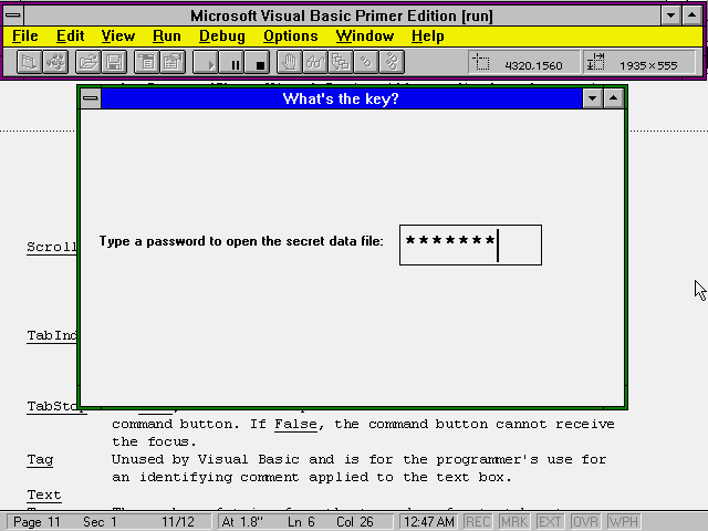
| PasswordChar | If you enter a character, such as an asterisk (*) for the PasswordChar, Visual Basic does not display the user's text but instead displays the PasswordChar as the user types the text. Use text boxes with a PasswordChar set when the user needs to enter a password and you don't want others looking over his shoulder to peek at the password. Figure 5.2 shows a password-entry form that uses an asterisk for the password character. Even though the text box receives the user's actual typed characters, the screen displays only the PasswordChar typed. |
| ScrollBars | Set to 0 (the default) for no scroll bars, 1 for a horizontal scroll bar, 2 for a vertical scroll bar, or 3 for both kinds of scroll bars. |
| TabIndex | The focus tab order begins at 0 and increments every time you add a new control. You can change the focus order by changing the value of the TabIndex of the control. No two controls on the same form can have the same TabIndex value. |
| TabStop | If True, the user can press Tab to move the focus to this label control. If False, the label control cannot receive the focus. |
| Tag | Not used by Visual Basic. The programmer can use it for identifying comments applied to the text box. |
| Text | The initial value that the user sees in the text box. The default value is the name of the control. The value continues to update as the user enters new text at runtime. |
| Top | The number of twips from the top edge of a text box to the top of the form. |
| Visible | True or False, indicating whether the user can see and, therefore, use the text box. |
| Width | The width of the text box in twips. |
Figure 5.2. The password character appears instead of the characters that the user types.
Warning: Table 5.3 lists only those text box properties that you can initialize and change in the Properties window. Other text box properties that you can change using Visual Basic code are available only at runtime.
Review: The text box control enables you to display default values and to accept the changes and additions that the user
makes to those values when he enters text from the keyboard. Once the user enters text in
a text box control, you can check the Text property to access that text.
Concept: The Properties window makes its easy for you to set properties when you place controls on the form and build your application.
The Properties window contains a list of every property that you can specify at design time. For example, there are 25 command button properties—refer to Table 5.1 for the complete list—that you can set when you place a command
button
on a form at design time. You can also read and change many of them when you run the program. Three properties that you can set at runtime through code are not available at design time. There are additional properties that you can set at runtime
through
code but not set at design time.
The Properties window offers several ways of setting property values. Figure 5.3 shows the Properties window for a label control. Notice that the Properties window contains a scrolling list of properties
available at design time for labels, a data entry
and dropdown list for setting property values, and a dropdown list for selecting another control's properties.
Figure 5.3. The Properties window offers you
several ways to change property values.
As you found out in the previous unit, you can change a property value by clicking the property’s row in the Properties window and entering a new value. The window’s data entry text
box receives the new property as you type the name. If you
clicked the Name property and typed a new name, you would see the name in the data-entry text box.
The Properties window also offers you multiple-choice selections from which to choose
if a property can assume a limited number of values. For example, the MousePointer property can hold the only values 0-Default through 7-Size NS. These are the various
shapes in which the mouse can appear. Instead of typing one of these values, simply
click the MousePointer property and then the down arrow that opens the data-entry text box's dropdown list, shown in Figure 5.4. You can select one of the values from the
list without having to type a value.
Figure 5.4.
Visual Basic offers a choice of property values.
Note: You don't have to select a control first to see its properties in the Properties window.
Some programmers prefer to place several controls on a form before they set any property values. Once you place several controls on the form, each control has its own set of properties that you can set from the
Properties window. Use the window's
control dropdown selection box to display all the controls in the application, as shown in Figure 5.5. Select from the list of controls that drops down to see the control's property settings appear in the Properties
window.
Figure 5.5. Select the control whose properties you want changed.
Tip: The Properties window’s dropdown list of controls shows the type and the name of each control.
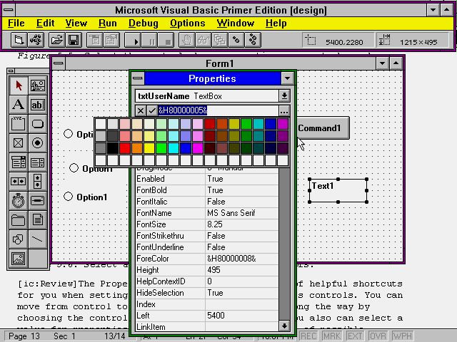
Definition: A palette is a set of colors from which you choose.
When you set a color property, such as a label's BackColor property, you can type the hexadecimal color value, but it is much easier to select the color from a palette of colors that
Visual Basic displays for you. If you clicked the BackColor property
of a control such as a label, the Properties window data-entry text box changes to ellipses (...) instead of the arrow that normally accompanies a dropdown box. When you click the
ellipses, Visual Basic displays a color selection palette like the one shown
in Figure 5.6. Click one of the palette's colors to select it for the BackColor property. Visual Basic assigns the appropriate color hexadecimal value to match the color that you
select.
Figure 5.6. Select a color from the palette of colors.
Review: The Properties window offers all kinds of helpful shortcuts that you can use when
you set property values for your form’s controls. You can move from control to control and set properties along the
way by choosing the control from the Properties window. You also can select a value for properties that is based on a fixed list of
possible values.
Which text box control property works the most like the Caption property of a command button or label?