


| SUMMER 2016 1. Prior to your
freelance artwork for Topps that started in 1986, what did your art education/schooling
and work résumé look like up to that point as you carved your artistic
path in life? 2.
Do you recall how you found work at the Topps Company during that time -- any
specific contact or person that may have seen your work and asked to interview
you? Was this job specifically for Garbage Pail Kids (GPK)? One note about John
Pound - to me he was and always will be the 'GPK Master' The more I looked at
his art the more I realized it was just impossible to attain his level of brilliance…the
design, the technique, the ideas, - saying the most with so little, just great.
Instead of emulating his art style I just had to accept that I was a different
artist. Also, since I worked in oil paint I couldn't use an airbrush and detail
might have been more difficult. Art and Mark did a great job at art directing
Tom Bunk and I into some uniformity but really John Pound's work always hit the
nail on the head. * OS6
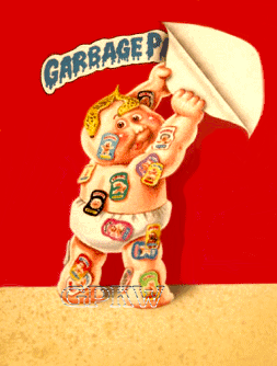
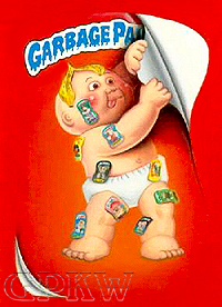
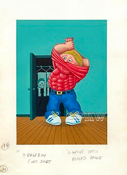
PAGE EXCERPTS: The original and final artwork piece
for 6th Series cards 248a HECTOR Collector and 248b G.P. KAY was completed by
John Pound and James Warhola, respectively. Pound's character, pictured to the
left, was completed before the 6th Series release and was originally intended
for the 5th Series release, but was later re-painted by newcomer Warhola, pictured
to the right, as a test piece for painting Garbage Pail Kids by the NPD department.
Unlike the rendition completed by Warhola with nine GPK sticker images there are
no distinguishable GPK images from the previous sets that can be found on Pound's
artwork containing sixteen GPK stickers. 3.
You worked on the original GPK sets from the 6th Series set to roughly the 13th
Series set in early 1988 (card number chart attached below), where I believe the
single artwork pieces stuck into the 14th and 15th series sets were carry-over
images that were previously unpublished – please correct me if I’m wrong,
like #645 ‘Handy MANDY’ for the 16th Series set. Do you remember this
gradual decrease in work for Topps, and was this your decision to move on from
the project? The
big turning point was the Cabbage Patch 'settlement'. Up to that point life was
fantastic! …but after that agreement we got word that the look would change
'a little'. Tom Bunk did new model sheets that showed the new GPK look - the characters
now were to look like they were made of plastic with elbow joints and cracks...not
soft and fleshy as before. Speaking for myself…I thought the new look was
terrible! a total bummer. To me they just didn't seem real anymore… maybe
one too many steps from reality, nothing like the old look. That was probably
the beginning of the end or at least a turning point. I'm sure the kids picked
up on it. I made the best of it as one does do satisfy a client but the shift
killed some enthusiasm. As for my work load I always had other jobs… alien
barroom scenes, dragons, spacemen, etc etc and… MAD assignments too.
As GPK started to wined down, my other jobs filled in my schedule. I also started
doing kids books which meant something different - a royalty, unheard of in other
parts of the illustration field. * 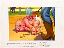
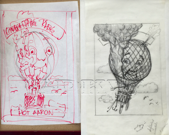
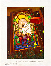 OS10 PAGE EXCERPTS: There are several Unpublished Garbage Pail Kids paintings from 1987 intended for the 10th Series set including two by artist James Warhola; a kid being branded and a brick being tossed through a stained glass window. An artwork chart is listed below for Warhola's completed Original Series pieces. OS6:
213, 214, 216, 231, 232, 233, 241, 244, 246, 248 4. Looking back, during that year and a half you worked for Topps, the experience must have flown by. With this same time period in mind, how did you feel about working on GPK at the beginning, during the middle, and at the end? Were your friends and family supportive, and/or was this a means to a paycheck? My family
loved my GPK work as they had with all of my work for MAD magazine. It
was mainstream and mass produced. I was a hit with all my nephews and nieces.
The experience though short-lived as it was, was incredible! I wouldn't have traded
it for the world. It was underground humor for kids - something despised by most
adults. I don't think its ever happened before and can ever be repeated. The idea
found the perfect time and place and the right creative bunch to make it all happen
- Mark, John, Art, Jay, Tom and Len. I was just very fortunate to go along for
the ride. 5. Speaking of family, your uncle, Andy Warhol, was of course a renowned leading figure in the visual art movement, especially in New York City and reviving 1960’s pop art – what were his thoughts on your chosen career and his feelings on you working for Topps on the GPK images? I have seen larger-than-life ‘surreal’ images in your art studio that come to mind… what influenced those? As
for career advice, my Uncle Andy tried to persuade me to go into something different
- either photography or film directing. His thoughts was that illustration was
a dying profession. He was right to a certain extent - the need for illustrators
was a downward spiral. Of course I didn't listen and went my own way and became
an illustrator as he had. He still grooved with everything that I did - the sic-fi
/ fantasy/ MAD assignments… and the Garbage Pail Kids. He thought
it was all great. He came from an illustration background so he was always tapped
into the mass media. It set him apart from most of the other big contemporary
artists making him like an oracle mirroring our popular culture back to us in
the form of FineArt. Yes, he was especially intrigued with my GPK work. He loved
things that hit a nerve and the GPK's certainly did that. One of his comments
was that the small 5 x 7 paintings were too small…he suggested I try doing
them big so they can be hung on walls by rich people. He always thought big. It
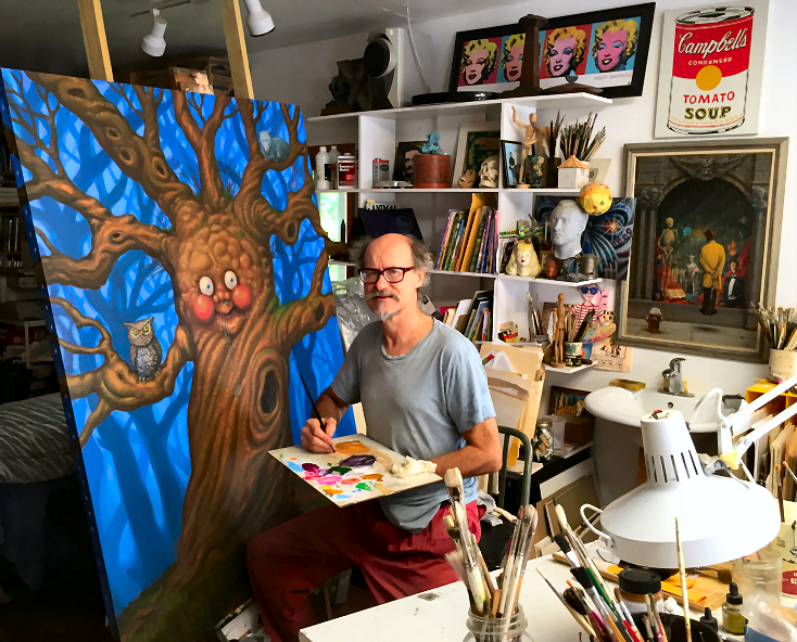
took me a while but I finally took his advice and in recent years started making
my images larger than life, not 5 by 7 inches but 5 feet by 7 feet. To my surprise
it kind of works - making something lowbrow and mass produced into something highbrow.
Could it be like making a boring old soup can into something important. Maybe.
I have no idea where these large paintings will take me but I'm having a helluva
lot of fun doing them. 6. Did you often come up with your own GPK concepts, or was it collaborative with Art [Spiegelman] and Mark [Newgarden]? Were there any concepts you plainly shook your head at and refused to do? I
never offered any of my own concept ideas. I stuck to their system they had in
place - Mark and Art giving me the gags and I focused on designing and painting.
They never seem to be short of ideas, their creative flow was great. You name
it they were coming up with it. Brainstorming at its best. There may have been
a few times that my interpretation may have been too literal or I may have had
a hard time seeing the humor… Didn't happen too often. They'd rework the
idea or try giving it to either Tom or John. At first the ideas were just thoughts
and words, then they went into a doodle stage, then I'd sketch it out and if it
passed mustard I'd get the go-ahead on a finish. Each card had a life of it's
own. At the idea stage everything was up for criticism, all for the purpose of
making them better.
The
only things I have from the early series are the sketches, tissues and some of
Art's and Mark's doodles. Unfortunately not one final painting. Yes, Topps kept
all the finals. I suppose at the time it didn't bother me. As a beginning artist
I was just happy to get work so I accepted any terms thrown at me. The same went
for MAD magazine, they insisted on keeping the original artwork. That policy
changed in the early 90's and then artwork was returned. Though there was a big
difference with MAD. When MAD put everything up for auction at Sotheby's,
they were gracious enough to split the profits with all the artists. That didn't
happen with Topps. They didn't feel any gratitude toward the artists that helped
make it all happen for them. I guess generosity wasn't quite their thing unless
maybe you were an executive. * OS12
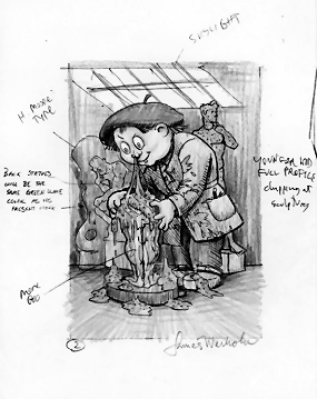
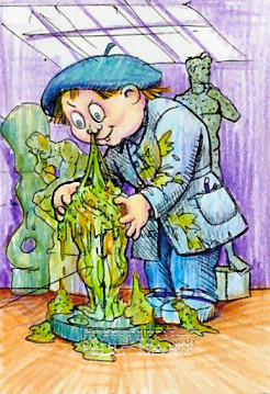
PAGE EXCERPT: Artist James Warhola was the third
largest contributor to GPK during the original releases. Warhola's pencil art
for 12th Series cards 486a Chiseler CHAD and 486b JULIUS Sneezer can be found
littered with notes by either Art Spiegelman or Mark Newgarden along with his
own notations; James lived in NYC and was able to visit the Topps office or meet
up with Art in the city to go over concepts, etc. Comments were jotted on the
sidelines pointing out a 'Skylight' at the top of the picture and that the farthest
sculputure was a 'H. Moore Type'; this may have been a dedication to Henry Moore
(an English sculptor/artist) who passed away in August of 1986 who created sculptures
of abstract human form. The other two statues are The Thinker (Le Penseur) by
Auguste Rodin, a French sculptor, and David, a Renaissance sculpture by Michelangelo.
Additional notes mention a 'Younger Kid, full profile, chipping at sculpture'
where a chisel and hammer were added to the artwork, to add 'More goo' to the
main sculpture and that the 'Back statues will be the same green slime color as
his present work". 8. Do you remember who contacted you from Topps for the All-New releases that started in 2003? Were you happy to jump back onto the GPK bandwagon for the ANS2 set released in 2004? I
think I was first contacted out of the blue by John Williams… he asked me
if I'd do a few. He caught me in between book jobs so I had fun doing them like
in the old days. Of course it helped that the pay was better and the artist kept
the art! At some point I started working with Jeff Zapata but my memory is lacking
as to who was who over the phone. 9.
This period was a very short-lived freelance job for Topps where you created less
than 15 new pieces; was other work keeping you from working on more? And, was
it different working with a whole new group at Topps? 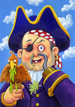 The All-New Series 2 final artwork image for cards 1a Peg Leg GREG and 1b JUSTIN Timber Leg by Warhola. Warhola's completed All-New Series pieces (thus far): ANS2: 1, 21, 31, 35 + ANS3: 9, 12, 16, 18, 27, 34, S10 + ANS4: 19, 21, B8 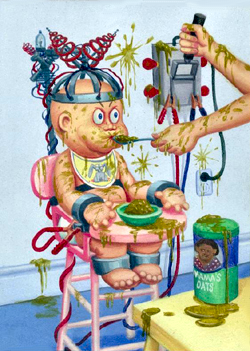 OS4 PAGE EXCERPT: [This] unpublished piece by James Warhola is rumored to have been intended for the 14th Series set, but was most likely rejected prior to this release. Artwork that the higher-ups at Topps found questionable in taste were held back and often resubmitted in future sets to see if the paintings could be 'snuck' in for a later release. The last, largest contribution from Warhola for the 1988 GPK sets was for the 12th Series set and three pieces for the 13th Series set. Only one final artwork image made it into the 14th and 16th Series sets each and were most likely images held back and re-submitted by the NPD Department. Warhola had this to say about the piece: "Yes it's one of my rare 'not in the mood' pieces, I think I was moving out of the city and was rushed, thus the slightly different style. [The painting] is oils and of course no one else used oils except me" (April 2016). The piece does feel 'off' and not one of Warhola's strongest offerings, but as mentioned, he was moving out of NYC physically and quite busy. Mark Newgarden, one of the art directors for the set, mentioned no dates were located of when this piece was planned or completed but "the sketch notes call for a few of the coils and food splashes, but James really went overboard here. I'm guessing that 'Yes', it probably sat around for quite awhile."
Likewise, great meeting you also at the premier. Loved the movie, very well done! Doesn't seem like 30 years, really its like yesterday. The
children's picture books have pretty much tapered off and for the last several
years I've been doing art for art's sake. I still like telling a story so I hope
to keep my hand in the narrative. Presently I have a show out of the blue this
September in Bratislava, Slovakia. It's a Warhol/Warhola show and besides my uncle's
and my work from my books it'll feature four of my large GPK inspired paintings.
Hard to say how those Eastern Europeans will view it but it certainly should be
interesting. I think with the way the state of the world is at the moment it certainly
could use a good dose of raw humor.
THANKS
JAMES! |