
PRODUCTION ARTWORK — BITS & BOBS BACKSTORY —ANNOTATED NOMENCLATURE


167a
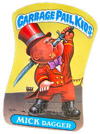
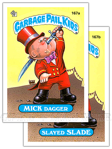
MICK DAGGER — Nomenclature = Mick Jagger. A name parody of the rock star Mick Jagger of the 'Rolling Stones' music group. def’n: Dagger — A short pointed weapon with sharp edges. 167b SLAYED SLADE — Slade; a same-sounding forename as the word 'slay+ed'. def’n: Slay — To kill, or be killed, by violent means. 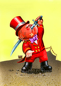
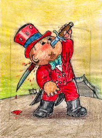 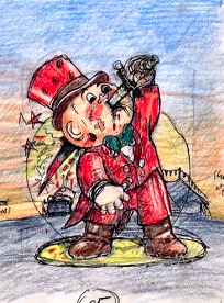
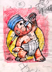 BITS & BOBS: — Bunk's gag-inducing 'RINGMASTER' gag... the individual directing a circus performance, was the thirty-fifth approved concept by Topps for the release that Tom executed for the OS5 set per the conceptual artwork. The painting portrays a sword-swallower... a person who passes, or pretends to pass, a sword blade down the throat and gullet as entertainment that is often part of an old-time circus act; but in this case is protruding out the backside of the character's noggin. The image shows adhesive bandages and several old scars and stitches where the entertainer was not successful with his many attempts. — The original concept showcased a Sadhu-style turban and loincloth character swallowing a sword. Visual notes from the art director show blood being added to the sword and ground that remained through all of the concept stages but removed for the final artwork. A 'CIRCUS' ringmaster ringleader was suggested for the character and Bunk placed him in a dusk setting (blue to yellow gradient) with spotlight and bullet holes, but all were removed. A circus wagon was suggested along with placing the circus tent in the background in shadow. A daytime setting was eventually chosen and a purple bow tie switched from green for the final artwork. |

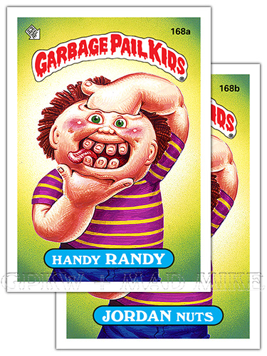
168a
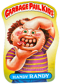
HANDY RANDY — Rhyme; the forename Randy with
the word 'hand+y'. def'n: Handy — Manually dexterous. Skillful under pressure. def'n: Hand — The terminal part of the arm below the wrist. Skill; ability. 168b JORDAN NUTS = Jordan nuts; a product name parody of 'Jordan Almonds' candies. Jordan Almonds are a candy covered almond, coated with primary colors and used as a wedding favor. def'n: Nuts — slang. Crazy; insane; eccentric person. Extremely enthusiastic. def'n: Almond — An oval, edible nut with a soft, light-brown shell. 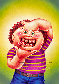
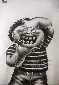 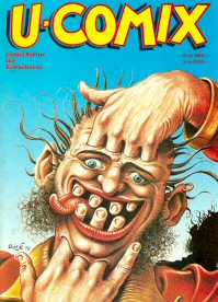 BITS & BOBS: — Pound's digit-teeth tomfoolery was one of many concepts that John executed for the OS5 set. The anti-dentite character uses specifically placed holes in his noggin to place his hands through to make his fingers act or appear as teeth; the finger food you can play with. The illusion works very well with the clever use of piercing green eyes and longer ears that takes the viewers eye away from the fingernail smile; the onlooker doesn't question the fact that most GPK characters do not have fingernails and that one of the hands is going through optic nerves and a nasal passageway. The deadpan eyes and severe smile with a side tongue sticking out gives the character a comical appeal and feel; this facial expression in comics and cartoons translates to the character being silly, stupid, and/or crazy. — The GPK artwork is most likely a tribute to Solé's '78 artwork found on the front cover of the French L'Echo des Savanes (The Echo of the Savannas) publication No.47, released in January 1978, and later on the front of the German underground U-COMIX, "Comic Strips für Erwachsene (for Adults)", No.60, released in August 1985; cover artwork by Jean Solé. The later version included comics by: Mandryka, Edika, Franquin, Gotlib, Goossens, Lucques, Hansi Kiefersauer, Bill Griffith, Jay Lynch, and many others. Solé is a French comic artist and illustrator that stood out for his more absurd and even psychedelic drawings and paintings. The GPK character does not have a pierced ear and is not sporting a 70's button-up shirt & jacket, but a striped short-sleeve t-shirt instead. Note: the whole hand is inserted for the GPK character, whereas only finger holes for the source material. [Thanks Brent!] "In the mid-80s, someone at Topps sent me a b/w copy of something like this as a suggestion/idea for a GPK sticker. Great! Weird and crazy it is!" --John, circa 07/2022. — Besides the trading card sticker image, the final artwork was also used for the completed 21-card, orange border puzzle 'D' within the set and as the side artwork for the display box. The character shows up twice due to reverse card back variations. — The black-and-white image picture above is a GPK film transparency; during the card production process a photographic image is placed on black mask film and used to alter the transparency of the artwork. This is a transparent positive image and not a film negative which adds color to the printed image. Transparency proof cards were auctioned off of eBay through the Topps Vault in 2006. |

169a
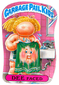
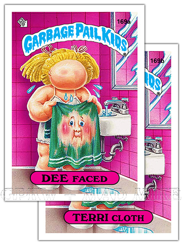
DEE FACED — Nomenclature = Deface+d. def'n: Deface — To spoil or mar (damage) the surface or appearance of. def'n: Face — The surface of the front of the head. 169b TERRI CLOTH — Nomenclature = Terry cloth. def'n: Terry cloth — An absorbent cotton fabric with uncut loops forming a pile. def'n: Cloth — A piece of fabric used for a special purpose, as a washcloth or towel. 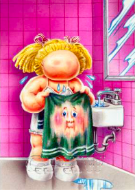
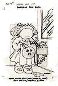 BITS & BOBS: — Pound's identity defacing gag was one of several concepts that John executed for the OS5 set. The simple surroundings tell the damaging story; the character has finished using the sink and mirror to wash her intact face, grabs a towel to dry off whilst water tap still running, only to find she is staring at the audience from a terry cloth, super absorbent towel. Thus, leaving the onlookers wondering why the Twilight Zone-esque face has no eye sockets, nasal passage or mouth cavity any longer. — Besides the trading card sticker image, the final artwork was also used for the completed 21-card, purple border puzzle 'E' within the set. The character also shows up twice within the set due to reverse card back variations. 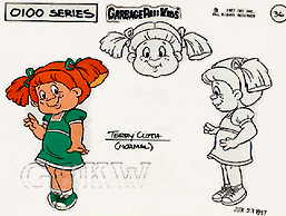
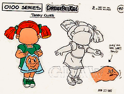 — The character was one of the main cast members for the cancelled 1987 CBS Garbage Pail Kids cartoon of 13 episodes later released by Paramount on DVD in 2006. The cartoon cells were created by artist Geof Darrow (right), artwork time-stamped Jun 23, 1987 for the 'normal' and 'transformed' cartoon character along with an OS6 character. |

170a
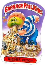
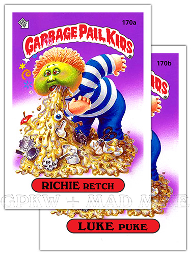
RICHIE RETCH — A play on words; rich wretch. A name parody of the comic book and cartoon character 'Richie Rich'. def'n: Rich — containing a large amount of choice ingredients. def'n: Retch — To try to vomit. def'n: Wretch — An unfortunate and/or unhappy person. Despicable; contemptible. 170b LUKE PUKE — Rhyme; the forename Luke with the word 'puke'. def'n: Puke — To vomit. Throw-up; upchuck; barf. 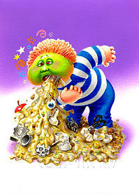
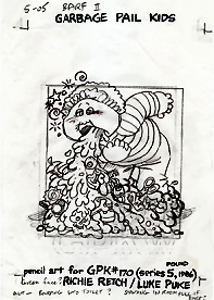 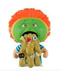 BITS & BOBS: — Pound's wretched retch-er gag titled 'BARF II', with the OS1 character being the first 'BARF', was the fifth approved concept for the release by Topps that John executed for the OS5 set per his production notes, although not all concepts made it into the release. As listed on Pound's tight pencil, the artist questioned whether the character should have a 'GREEN FACE?', as an alt[ernative], if he should be 'BARFING INTO [A] TOILET?' and/or whether 'STANDING IN [A] ROOM FULL OF BARF?'. The miserable guy is barfing up his guts along with a plethora of miscellaneous objects, including an apple core, a tin can, a human eyeball, a plastic bottle, a skull and bone, a bird's foot, a fish head, a single shoe, some used tissue, a pair of scissors and two egg shells. — There contains three OS5 characters, including RICHIE Retch (Series 1, #21), within the 2013 and 2014 MiniKins releases of resin figures that are reminiscent of the 1986 Cheap Toys characters; sticker write-up text by Pat Barrett and Colin Walton. — The character became one of Funko's Mystery Minis sculpted vinyl figures in 2016; thirty-one years after its card release to continue celebrating the 30 year anniversary of GPK. All the items located in the barf can be seen within the trading card image. |

171a
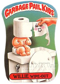
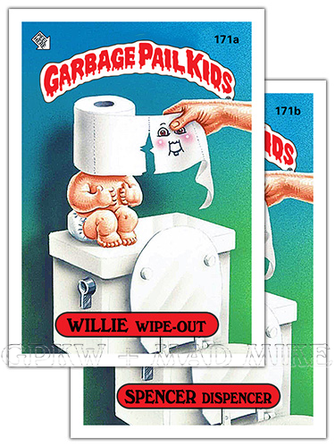
WILLIE WIPE-OUT — A play on words; 'will [he]
wipe out'. def'n: Will — Futurity; a future event or possibility. def'n: Wipe — To rub, as with cloth or paper, in order to clean or dry. def'n: Wipe-out — To destroy completely. To lose balance and fall. 171b SPENCER DISPENCER — Rhyme; the forename Spencer with the word 'dispenser'. def'n: Dispenser — To deal out in portions. def'n: Toilet paper — Soft paper for cleansing oneself after defecation or urination. def'n: Roll — A piece of paper that is rolled up. A toilet paper roll dispenser. 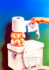
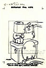 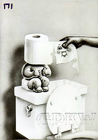
BITS & BOBS: — Pound's toilet paper dipenser gag was one of many concepts that John executed for the OS5 set. The very patient character sits restrictively upon a toilet tank awaiting the next person to use his facilities. The character's body, most notably the neck, acts as the toilet paper dispenser holder while the head is an actual toilet paper roll, most likely one-ply with poor perforation. Although the character currently has a one-toothed grin, once there's contact with the nether regions, the facial feature will most likely change. The toilet bowl handle appears to already be in the 'FLUSHED' position or broken. — The black-and-white picture to the right is a GPK film transparency; during the card production process a photographic image is placed on black mask film and used to alter the transparency of the artwork. This is a transparent positive image and not a film negative which adds color to the printed image. Transparency proof cards were auctioned off of eBay through the Topps Vault in 2006. |

172a
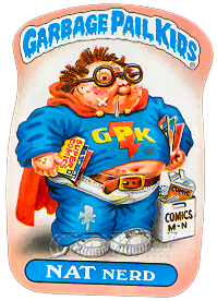
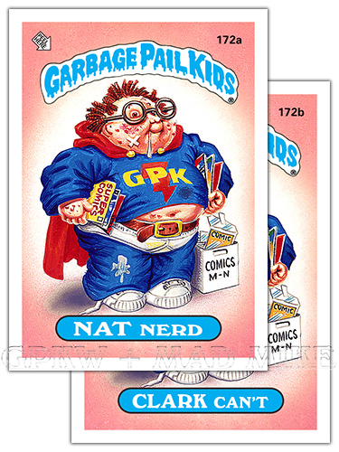
NAT NERD — Nomenclature = Natty nerd.
def'n: Natty — informal. Smart; neat; intelligent. def'n: Nerd — informal. As in 'computer geek' or dork. Extremely (comic) book smart. 172b CLARK CAN'T = Clark Kent; the comic book super hero Superman's alter ego. def'n: Cannot (can't) — The negative form of can; one's physical or mental ability. def'n: Superman — One with more than human powers. 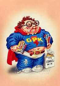 
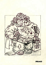 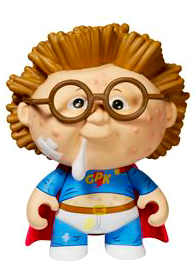 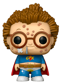
BITS & BOBS: — Pound's contagious comic-con gag titled 'SUPERHERO / COMIC-FAN' was the thirty-sixth approved concept for the release by Topps that John executed for the OS5 set per his production notes, labeled '5-E' and changed to '5-36R', although not all concepts made it into the release. The comic-book storage box for indexed 'COMICS M-N' was chosen by John Pound in honor of the Garbage Pail Kids editor and art director, Mark Newgarden, whom signs his correspondence with his initials 'MN', even to this day. Per tight pencil artwork, the chest area was erased and redrawn, most likely previously having a Superman-esque parody symbol. Let's GPK bolt! — There contains three OS5 characters, including NAT Nerd (Series 1, #22), within the 2013 and 2014 MiniKins releases of resin figures that are reminiscent of the 1986 Cheap Toys characters. Sticker write-up text by Pat Barrett and Colin Walton. — The character became one of Funko's Mystery Minis sculpted vinyl figures in 2015; thirty years after its card release to help celebrate the 30 year anniversary of GPK. The same character also became a Funko POP sculpted vinyl figure in 2018 with charcoal eyes. |

173a
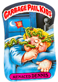
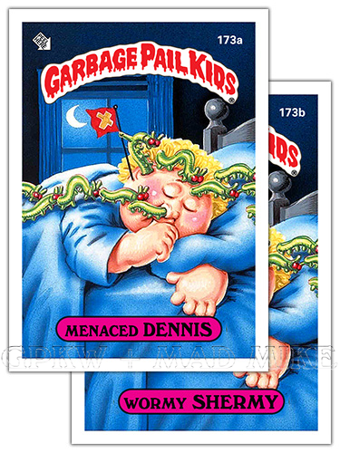
MENACED DENNIS — Rhyme; the forename Dennis
with the word 'menace+d'. A name parody of the cartoon character and the 50's TV show 'Dennis the Menace'. def'n: Menace — A threat. A troublesome or annoying person or thing. 173b WORMY SHERMY — Rhyme: the forename Shermy with the word 'worm+y'. def'n: Worm — Any of various invertebrates, as an earthworm or caterpillar, that have a long, flexible rounded or flattened body. def'n: Wormy — A weak, abject or revolting person. Infested with or eaten into by worms. 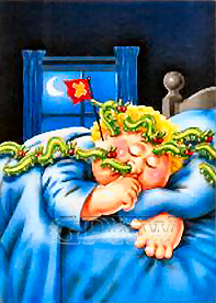
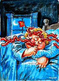 BITS & BOBS: — Pound's infectious infestation gag titled 'WORM INVASION' was the sixth approved concept for the release by Topps that John executed for the OS5 set per his production notes, although not all concepts made it into the release. The one major change in direction from the color rough to the final artwork was the monochrome red worms were changed to an apple-green color with the large menacing red eyes remaining. The one worm has crawled out of the victim's ear and has staked a x-symboled flag onto the head which signifies this body of 'land' has been conquered and claimed. The thumb-sucking character is a sound sleeper, dead to the world. — Most of the original GPK cards had very unique die-cut or die-line for their sticker pattern or outline which was adopted from the Wacky Packages franchise (pictured at the bottom of this page). |

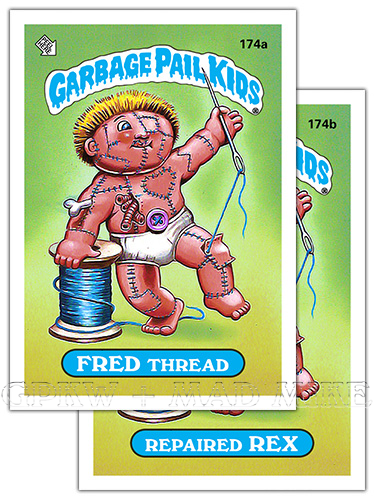
174a
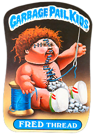
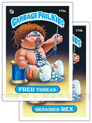
FRED THREAD — Rhyme; the forname Fred with the
word 'thread'. def'n: Thread — A fine cord of a fibrous material made of filaments twisted together. def'n: Threading the needle — socially. To navigate through a difficult conflict or situation. 174b REPAIRED REX — Nomenclature = Repaired wreck. def'n: Repair — To restore to sound condition after damage or injury. The act of repairing. def'n: Wreck — The remains of something. One that is in a shattered, broken-down, or worn-out state. 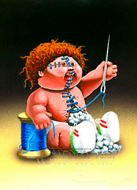
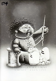 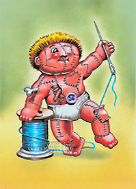
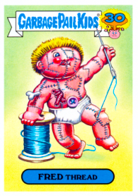 BITS & BOBS: — Bunk's threading-the-needle gag was one of the several approved concepts for the release by Topps that Tom executed for the OS5. Considering how different the original concept (right) is of the character in a standing position, sewing his kneecap area, a bone and organ sticking out, a literal belly button, skin eyepatch and the painting style of the hair, skin tone and shadowing, this very well could be a carry-over piece from the OS3 release when Bunk started to paint front artwork. In comparison, the final character has a lot less stitching, is in a sitting position, cotton stuffing replaces the guts, has straggly hair and now wearing shoes. The only objects remaining the same is the spool of blue thread and the gigantic needle. — The black-and-white picture above is a GPK film transparency; during the card production process a photographic image is placed on black mask film and used to alter the transparency of the artwork. This is a transparent positive image and not a film negative which adds color to the printed image. |
WHAT IF?

175a
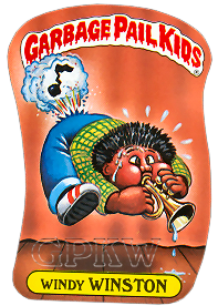
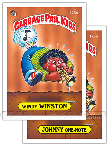
WINDY WINSTON — Winston; similar-sounding forename
to go with the word 'wind+y'. def'n: Windy — Characterized by or abounding in wind. Bombastic. def'n: Wind — A stream of air. Gas produced in the body during digestion; flatulence. 175b JOHNNY ONE-NOTE — Nomenclature = Johnny One Note. A famous 1936 song written by Lorenza Hart. Also, the name of a type of jukebox. def'n: Note — A tone of definite pitch. A musical cry. def'n: One-note joke — A person with so few dimensions it's difficult to see them from most angles. 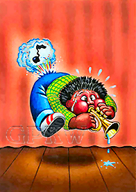
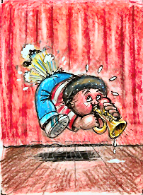 BITS & BOBS: — Bunk's 'ONE-NOTE' joke was one of many concepts approved for the release by Topps that Tom executed for the OS5 set. The one-trick pony is gifted with one special feature, a musical talent of a certain area of expertise, he's good for one-note only, a one-note joke ... that is to break wind; the release of gas from the anus. Per Bunk's color rough, the three puffs of cartoon farts became one solid gas cloud, the character's eyes have become cross-eyed instead of looking back, struggling to force the hair through the trumpet rather than his anus, the character is sweating a bit more profusely. The red and white striped long sleeve shirt has become yellow and green checkered and the blue stripes on the CPK-like shoes have become red. A very stinky stage performance and music solo. — The character shows up twice within the uncut card sheet due to reverse card back variations. |

176a
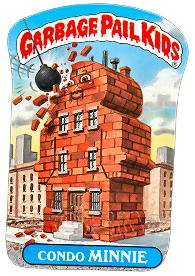
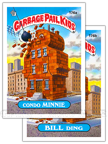
CONDO MINNIE — Nomenclature = Condominium. def'n: Condo — informal. Short for condominium. A high-rise condo. def'n: Condominium — An apartment building in which the apartments are owned individually. 176b BILL DING — Nomenclature = Building. def'n: Building — A structure; edifice. def'n: Ding — informal. A dent. 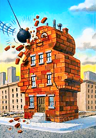
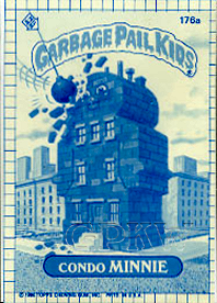 BITS & BOBS: — Pound's 'BRICKS & MORTAR' gag was one of several concepts approved for the release by Topps that John executed for the OS5 set. The derelict building, allegedly in poor condition from disuse and neglect, is most likely in the process of being demolished to make way and room for newer high-rises and skyscrapers. The empty lots surrounding the character speaks volumes, giving telltale signs of other recent demolition projects, and the encroaching city skyline in the near distance. Society has pushed the inanimate character to become a vagabond or vagrant, a person without a home, job or property. — During the trading card production, a blue-lines process is applied, also known as 'whiteprint', used within the correction process of the set. The method is a contact printing process which accurately reproduces the original in size of artwork. A whiteprint is not permanent and will fade if exposed to light for weeks or months. Blue-line proof cards were auctioned off of eBay through the Topps Vault in 2006 (above, right). |


177a
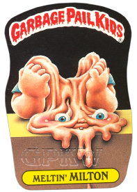
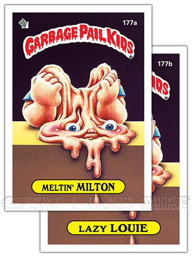
MELTIN' MILTON — Rhyme; the forename Milton
with the word 'meltin'/melt+ing'. def'n: Melt — To change or be changed from a solid to a liquid state. To dissolve. def'n: Milton — A masculine name originating from the surname Milton = Mill Town. 177b LAZY LOUIE — Louie; a L name to go with the word lazy. def'n: Lazy — Slowmoving; sluggish. Unwilling to work or use energy; slothful. Showing a lack of effort, care or activity; inactive. 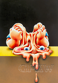
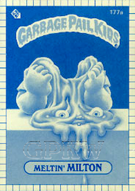 BITS & BOBS: — Pound's 'MELTING' gag was one of several concepts approved for the release by Topps that John executed for the OS5 set. The bored-to-death character has his hands under what was previously his chin, melting away from boredom. A Cabbage Patch Kids head is made of plastic and would have melting elements, unlike it's cloth body and appendages. The single tooth seems to have been added in order to add some structure or identification to the mouth area. — During the trading card production, a blue-lines process is applied, also known as 'whiteprint', used within the correction process of the set. The method is a contact printing process which accurately reproduces the original in size of artwork. A whiteprint is not permanent and will fade if exposed to light for weeks or months. Blue-line proof cards were auctioned off of eBay through the Topps Vault in 2006 (above, right). |

178a
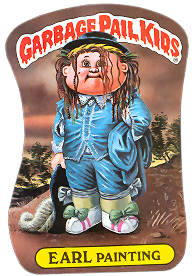
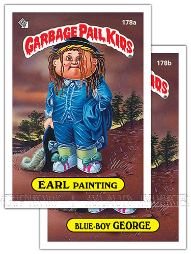
EARL PAINTING — Nomenclature = Early painting. def'n: Early — Near the beginning of a period of time. def'n: Painting — The process of working with paints. A picture in paint. 178b BLUE-BOY GEORGE — A name and image parody of Boy George; an effeminate 80's British singer/songwriter within the same setting/clothing as Thomas Gainsborough's The Blue Boy painting (1770). A famous poem Little Boy Blue written by Eugene Field; 'Boy Blue' has been used in song and painting. def'n: Blue — Gloomy; depressed. A state of melancholy. def'n: Boy — A word used as a mild exclamation. 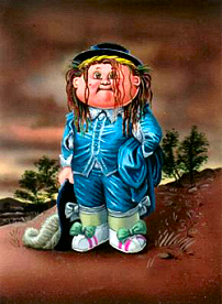
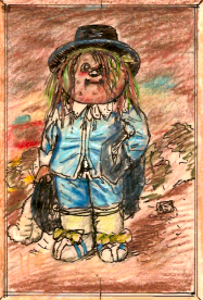 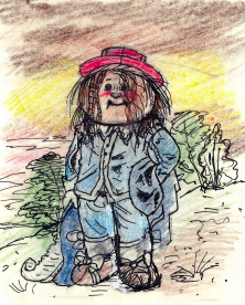
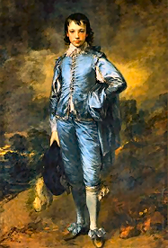 BITS & BOBS: — Bunk's 'BOY BLUE' parody was one of many concepts approved for the release by Topps that Tom executed for the OS5 set. The non-melancholy character is seen wearing the same attire and classy accoutrements (hat with feather) as the famous painting. Blue satin suit, knee-high socks, hand on hip holding coat with shrubs in the background. Instead of patent leather shoes, although the bow still remains, the character is wearing CPK-like shoes with pink stripes, for flare and sporting a second hat, braided hair and head bandana; the same as the musician Boy George. Not to be confused with the 1500s phrase 'By George!', the mild exclamation substituting 'God' for the name 'George', similar to 'gosh', 'golly', et cetera seen and heard now-a-days. Per Bunk's preliminary color roughs, the concept remained the same but the hat and shoe bow color changed over time. — Most of the original GPK cards had very unique die-cut or die-line for their sticker pattern or outline which was adopted from the Wacky Packages franchise (pictured at the bottom of this page). — The character shows up twice within the uncut card sheet due to a reverse card back variations. |

179a
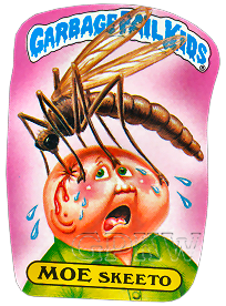
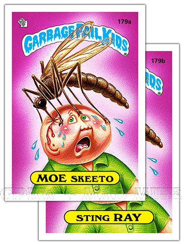
MOE SKEETO — Nomenclature = Mosquito. def'n: Mosquito — Any of various winged insects of which the females suck blood. 179b STING RAY — Nomenclature = Stingray. def'n: Stingray — A saltwater fish having a horizontally flattened body with fins that form wing like lateral extensions and a narrow tail. def'n: Sting — To pierce or wound painfully with a sharp pointed structure or organ. The wound or pain caused by stinging. 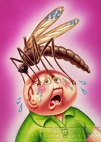
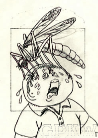 BITS & BOBS: — Pound's prehistoric-sized insect gag titled 'GPK W/ BIG MOSQUITO' was the fifteenth approved concept for the release by Topps that John executed for the OS5 set per his production notes, although not all concepts made it into the release. The puncture wound itself would be bad enough, not to mention the itchy, giant-sized mosquito bite mound and trying to place an 'X' on it with your fingernail to "stop" itching. Besides a copious amount of blood, the mosquito proboscis versus the size of the character's head would mean a certain amount of grey matter is also being sucked up. The distress of the character is measured by his widely opened mouth, showing pain and surprise, and the size of the raised eyebrow wrinkle and the disconcerting look in his eyes. Per Pound's tight pencil artwork, the entire GPK header was lightly sketched onto the paper in order to draw the partial GPK logo and paint the transluscent wings for the color rough as seen on the final artwork. — Most of the original GPK cards had very unique die-cut or die-line for their sticker pattern or outline which was adopted from the Wacky Packages franchise (pictured at the bottom of this page). |

180a
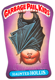
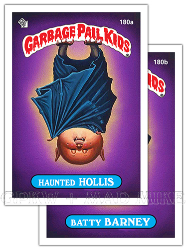
HAUNTED HOLLIS — Hollis; H forename to
go with the word 'haunted'. Sounds like 'haunted house' or 'haunted halls'. def'n: Haunt — To frequent. A place visited frequently. To recur to continually. 180b BATTY BARNEY — Barney; B name to go with the word 'bat+ty'. def'n: Batty — slang. Insane. def'n: Bat — A mouse-like flying mammal with membranous wings. 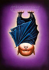
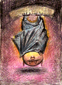 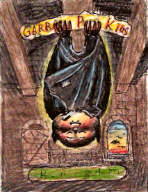 BITS & BOBS: — Bunk's 'BAT BOY' gag was one of several concepts approved for the release by Topps that Tom executed for the OS5 set. The image adds another dimension of humor using the GPK header as a roosting spot, leaving the final artwork character grasping for footing. Per Bunk's tight color roughs, the original concept had the bat character sleeping within a building or church, complete with ceiling rafters, brick walls, windows and a beautiful evening sky with bats flying in the distance. The roosting bat and GPK header central concept remained intact for the second color rough, but the foot claws were shortended as not to hide any of the letters and the wing-arm made longer and extended past the upside-down face. Topps and the NPD Department was still at the stage of having a cleaner character without much background or clutter, unlike the later released where the gag depended more on the surroundings for the story-telling. — Most of the original GPK cards had very unique die-cut or die-line for their sticker pattern or outline which was adopted from the Wacky Packages franchise (pictured at the bottom of this page). |

181a
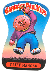
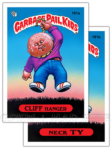
CLIFF HANGER — Nomenclature = Cliffhanger. def'n: Cliffhanger — A melodrama which ends in a suspense. def'n: Hanger — One that hangs; to suspend. 181b NECK TY — Nomenclature = Necktie. def'n: Necktie — A narrow band of fabric worn around the neck and tied in a knot or bow. def'n: Asphyxiate — To kill (someone or oneself) by depriving of air/oxygen. 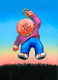
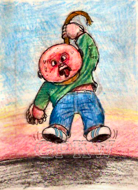 BITS & BOBS: — Bunk's self-suffocating 'ASPHYXIATION' gag was one of many concepts approved for the release by Topps that Tom executed for the OS5 set. Per Bunk's tight color rough, not a lot changed with the concept other than subtle changes; the patched green long sleeve shirt was changed to the color purple, the CPK-esque shoes changed from blue stripes to red stripes, detail added to the rope, the pulling hand configuration switched-up and the gasping mouth with tongue hanging out changed to a shifty grin with the tongue still hanging out. As with most GPK characters, even in dire straits, part of the humor is seeing a smile on the doll's face. — It is interesting to note that the suggestion of suicide (death by hanging) and the viewpoints of higher-ups at Topps, including attorneys, must have changed between the OS5 and unpublished OS16 releases. The character for Pound's 'HANGMAN'S ROPE' gag for the 1989 unpublished cards 651a Dunkin' DUNCAN and 651b WILL Hung (published as FB3 70a + 70b and OS1 Chrome L14a + L14b) had the rope around the character's neck moved under the character's armpit for the final artwork. |

182a
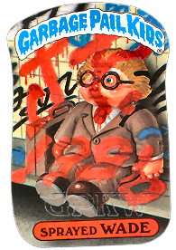
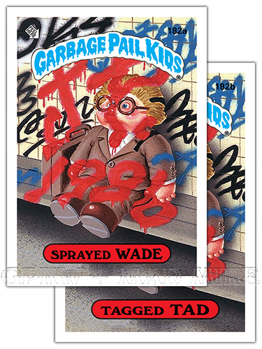
SPRAYED WADE — Rhyme; the forename Wade with
the word 'spray+ed'. def'n: Spray — Liquid moving in a mass of dispersed droplets or mist (of paint). A fine jet of liquid discharged from a pressurized container (spray can). 182b TAGGED TAD — Semi-rhyme; the forename Tad with the word 'tag+ged'. def'n: Tag — To label or identify with a tag. slang. Graffiti written by 'taggers' with spray paint. Usually a personalized tag name. 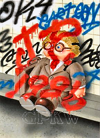
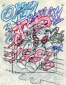 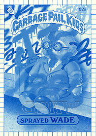 BITS & BOBS: — Pound's 'TAG'-teamed gag was one of several concepts approved for the release by Topps that John executed for the OS5 set. Per Pound's final pencil, color was added to the tight pencil artwork to showcase the tagging. Much like Pound sneaking in the art director's initials into the card image for #172 ('M-N'), this was the first time Pound could 'sign', per se, one of his many GPK paintings by placing 'J.P.' into the artwork and the year it was created, 1986. Also, much like the OS2 artwork for card #77 and OS5 #172, it's great to see CPK-esque eyeglasses that protrude so nicely. Unlike Pound's OS1 #30 who's the tagger, this character is sitting-happy as the 'tagee'. Part of the humor is treating the character as a doll, notice the feet don't come anywhere close to the ground. "OK4Cartoon". OK4GPK. — During the trading card production, a blue-lines process is applied, also known as 'whiteprint', used within the correction process of the set. The method is a contact printing process which accurately reproduces the original in size of artwork. A whiteprint is not permanent and will fade if exposed to light for weeks or months. Blue-line proof cards were auctioned off of eBay through the Topps Vault in 2006 (above, right). |

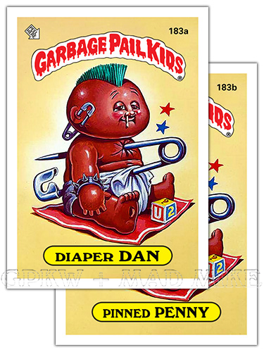
183a
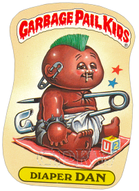
DIAPER DAN — Nomenclature = A parody on the
phrase 'dapper Dan'. def'n: Diaper — A piece of cloth or other absorbent material, folded and pinned or taped around a baby to serve as underpants. def'n: Dapper — Neatly dressed; trim. Small and active. 183b PINNED PENNY — Nomenclature = Pinched penny or Pinch pennies. def'n: Pinch pennies — To try to spend as little money as possible; to penny-pinch; to be a penny-pincher. def'n: Pin — A safety instrument used to fasten to the clothing by a clasp. def'n: Pinned — To fasten or secure with or as if with a pin. 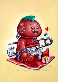
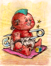 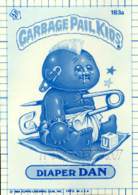 BITS & BOBS: — Bunk's counter-culter punk Kid was one of many concepts approved for the release by Topps that Tom executed for the OS5 set. Per Bunk's tight color rough, not a lot changed with the concept other than subtle changes: the pink blanket changed to a red blanket with a white border stripe, the tooth was removed from the mouth and a snot dribble added to the nose, brow creases rather than raised eyebrows, U+2+? added to the toy block replacing the 'A' anarchy symbols, and the mushroom cloud tattoo removed from the upper arm. The 'U2?' = "YOU, TOO?", this questions whether you're a comformist, as well: a person who conforms to accepted behavior or established practices. The 'diaper Dan' name parody pokes fun at the 'ostentatiously well, groomed, swanky man, usually one not inured or toughened to hard work; the fancy Dans; dandies. The artwork contains two of Bunk's trademark comic-strip stars meaning "That smarts!". The safety pin has a double-meaning; an earing statement piece worn by punks, NOTE: usually through the earlobe and not somehow double pierced through the ear hole and facial skin, and as a cheap, replacement for a 'diaper pin', used with now outdated cloth diapers. — During the trading card production, a blue-lines process is applied, also known as 'whiteprint', used within the correction process of the set. The method is a contact printing process which accurately reproduces the original in size of artwork. A whiteprint is not permanent and will fade if exposed to light for weeks or months. Blue-line proof cards were auctioned off of eBay through the Topps Vault in 2006 (above, right). |

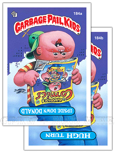
184a
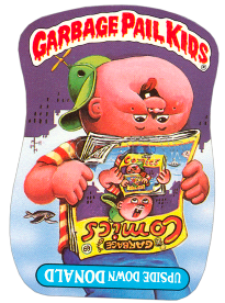
UPSIDE DOWN DONALD — Donald; D forename
to go with the phrase 'upside down'. def'n: Upside down — With the upper and lower parts reversed in position. In or into great disorder. 184b HUGH TURN — Nomenclature = U-turn. "NO U-TURNS" road signs. def'n: Turn — To change the direction or course, around or about. def'n: U-turn — A change of plan, especially a reversal of political policy. A U-shaped vehicle turn. 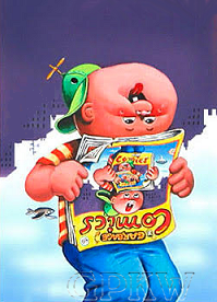
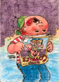 BITS & BOBS: — Bunk's topsy turvy gag was one of several concepts approved for the release by Topps that Tom executed for the OS5 set. Per Bunk's tight color rough, not a lot changed with the concept other than subtle changes: a bullet hole has been added to the character's propeller hat, two teeth removed from the mouth and tongue redirected, the white stripes on the T-shirt changed to yellow, and the nose and mouth lowered, placed closer to the set of eyes, and lastly, '69' added for the number — moving the fish skeleton over. Although the #69 has a plethora of meaning, including yin yang, infinity, a certain s-e-x position, et cetera, for this example it's a number that remains the same when turned on its head. This is the second visual mention of 'COMICS' for the OS5 release, after card #172, making it the second-subject matter for the concept. The artwork contains Bunk's trademark purple shaded cityscape. An image within an image isn't new, but this is certainly refreshing; in art circles this is known as the 'Droste effect' (Dutch), the effect of a picture recursively appearing within itself, usually in a place where a similar picture would realistically be expected to appear. Placing the bird in the image helps with the illusion, it works in both 'directions'; the bird is missing from the second image and replaced by an underwater scene with submarine and fish. Also, placing the tongue vertical and having the eyes looking 'upwards' extends the deception, appearing to be looking 'downwards' as well. And then adding an inverted nameplate by the NPD Department. |

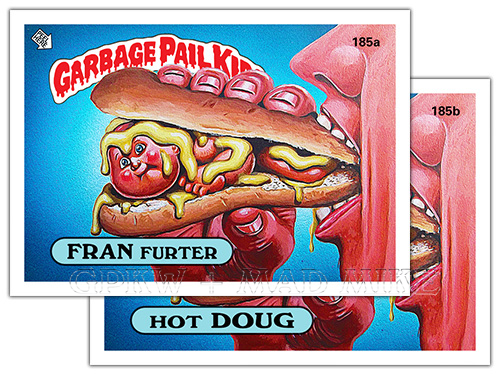
185a
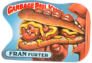
FRAN FURTER — Nomenclature = Frankfurter. def'n: Frankfurter — A smoked sausage or beef and pork made in long reddish links. 185b HOT DOUG — Nomenclature = Hotdog. def'n: Hotdog — A frankfurter, usually served in a long soft roll. 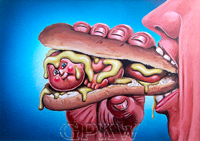
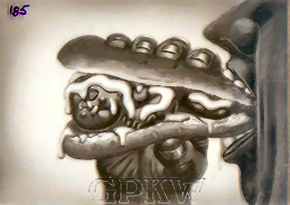 BITS & BOBS: — Bunk's mystery meat morsal gag was one of many concepts approved for the release by Topps that Tom executed for the OS5 set. Although the human takes up more space than the GPK character within the image, the non-vegetarian message is felt, loud and clear ... especially imagining and envisioning the little frog-like legs getting bitten into first. The horizontal format works very well with this image, especially with centering the subject matter and placing the GPK header and nameplate to the extreme far left hand side of the card at the same location as the character's head; this is one of the only extremely offset headers and nameplates within the GPK canon. Heavy on the mustard, hold the relish. — The black-and-white picture to the right is a GPK film transparency; during the card production process a photographic image is placed on black mask film and used to alter the transparency of the artwork. This is a transparent positive image and not a film negative which adds color to the printed image. Transparency proof cards were auctioned off of eBay through the Topps Vault in 2006 (above, right). |

186a
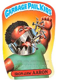
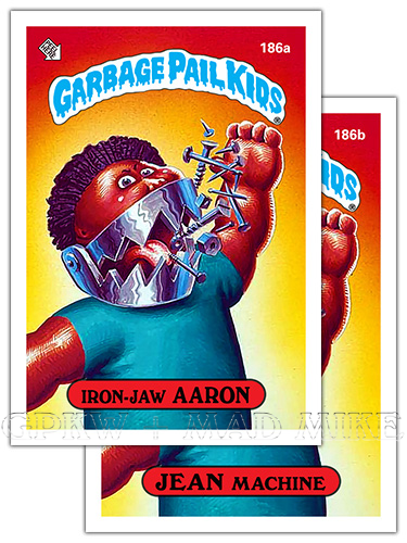
IRON-JAW AARON — Semi-rhyme; the name Aaron
with the word 'iron(-jaw)'. def'n: Iron — A metallic element used in structures. Great hardness or strength. Iron-jaw; tough jaw. def'n: Jaw — The bony structure of the mouth holding the teeth. Either of two hinged parts in a mechanical device: The jaws of a wrench. 186b JEAN MACHINE — Nomenclature = Mean machine; or a Rhyme: the forename Jean with the word 'machine'. def'n: Machine — A person who acts or performs a task mechanically without thinking or intelligence. 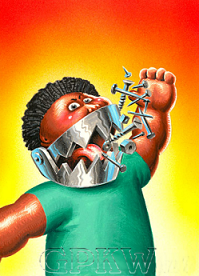
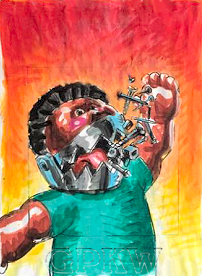 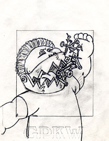 BITS & BOBS: — Pound's jaw-dropping jaws-of-steel gag titled 'IRON JAWS' was the thirty-third approved concept for the release by Topps that John executed for the OS5 set per his production notes; also marked as artwork 'F' and 'R' (revised), although not all concepts made it into the release. Per Pound's tight pencil and color rough, the concept and character remained exactly the same except for a bit of the out-of-picture hand, cut out of the card image, can be seen. One of the few GPK characters with a mean scowl; the frown, glower and glare of an angry or bad-tempered expression. A 'mean machine' is usually considered as a team or group thought to be unbeatable or extremely powerful, oftentimes a sports team with a high performance ability ... in this case, it's any fast or powerful motor vehicle. This signature GPK bust shows the stiff, awkward lack-of-mobility of the CPK-like doll arm. The level of humor is raised, in a comic/comical or cartoon character kind of way, by adding the 'nuts, bolts/nails and screws' element as the character's main source of 'food' energy to sustain his 'hungry man'-sized appetite. — Most of the original GPK cards had very unique die-cut or die-line for their sticker pattern or outline which was adopted from the Wacky Packages franchise (pictured at the bottom of this page). |

187a
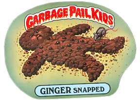
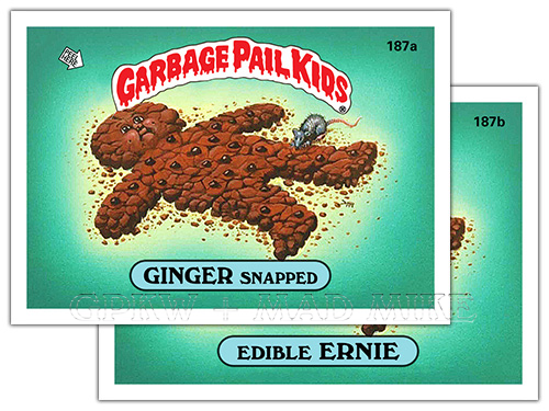
GINGER SNAPPED — Nomenclature = Gingersnap. def'n: Ginger snap — A flat, brittle cookie spiced with ginger (the pungent, aromatic root of a tropical Asian plant) and sweetened with molasses. def'n: Snap — A thin, crisp cookie. To break suddenly with a sharp sound. 187b EDIBLE ERNIE — Ernie; an E forename to go with the word 'edible'. def'n: Edible — Fit to be eaten.  BITS & BOBS: — Bunk's five-second rule gag (def'n. humor. A notional rule stating that food which has been dropped on the ground will still be uncontaminated with bacteria and therefore safe to eat if it is retrieved within five seconds.) was one of many concepts approved for the release by Topps that Tom executed for the OS5 set. The ginger snap cookie itself is in the shape of a gingerbread man—a biscuit or cookie made of gingerbread; usually in the shape of a stylized human being, but seasonal themes and shapes are also common. Gingerbread itself, a cake made with molasses and flavored with ginger, is decorated into fanciful candy houses during the holidays. Bunk's artwork shows the traditional three buttons often found on gingerbread men cookies along with what appears to be preserved ginger pieces, still edible by rodents. Animal tested and possibly harmed. — The black-and-white picture above is a GPK film transparency; during the card production process a photographic image is placed on black mask film and used to alter the transparency of the artwork. This is a transparent positive image and not a film negative which adds color to the printed image. Transparency proof cards were auctioned off of eBay through the Topps Vault in 2006 (pictured). |

188a
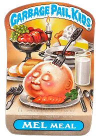
MEL MEAL — Mel; similar-sounding forename to
go with the word 'meal'. def'n: Meal — The food served and eaten in one sitting. def'n: A square meal — expression. A substantial and nourishing meal. 188b ROSS ROAST — Semi-rhyme; the forename Ross with the word 'roast'. def'n: Roast — To cook with dry, excessive heat. A cut of meat roasted or suitable for roasting. def'n: Pot roast — A piece of meat slowly cooked within a covered dish, usually along with vegetables. 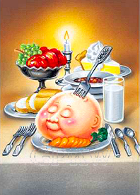
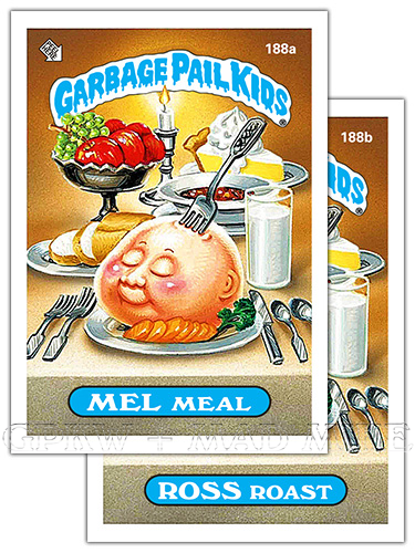
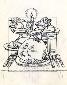 BITS & BOBS: — Pound's bon appétit/good appetite gag titled 'MEAL' was the forty-eigth approved concept for the release by Topps that John executed for the OS5 set per his production notes, although not all concepts made it into the release. Per Pound's tight pencil, there were no revisions or drastic changes to the concept or character. The candlelit dinner for one showcases the literal and visual idiomatic and informal phrase for 'stick a fork' in (something), which is used to indicate that something or someone is finished, oftentimes meaning defeated or ruined. For cooking and baking, and for this instance, it means to check to see if the item is cooked or baked evenly through. In this case, a serving fork is planted in the slab of meat. The properly set table with silverware and meal was roasted with carrots and served with a bowl of soup, french bread, a bowl of fruit, glass of milk and a lemon meringue pie. The character is 'sitting' there with a slightly bemused expression, as though in a peaceful state. A nice square cannibalistic meal. — Most of the original GPK cards had very unique die-cut or die-line for their sticker pattern or outline which was adopted from the Wacky Packages franchise (pictured at the bottom of this page). |

189a
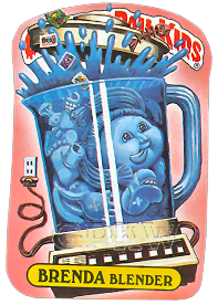
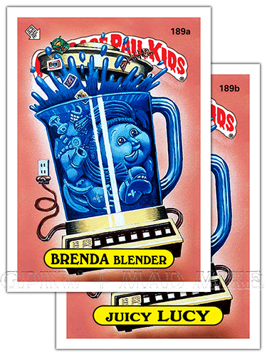
BRENDA BLENDER — Rhyme; the forename Brenda
with the word 'blender'. def'n: Blend — To make or form a uniform mixture. Something blended. def'n: Blender — noun. An electric machine used in food preparation for liquefying, chopping or pureeing. 189b JUICY LUCY — Rhyme; the forename Lucy with the word 'juicy'. def'n: Juicy — Full of juice. def'n: Juice — A fluid naturally contained in plant or animal tissue. 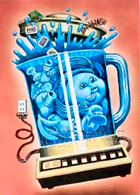
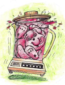 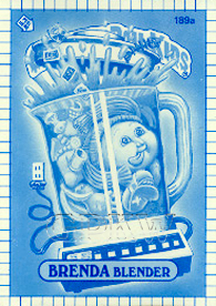 BITS & BOBS: — Bunk's power juicer was one of many concepts approved for the release by Topps that Tom executed for the OS5 set. As seen with Bunk's original Gross Bears Big Bad Buttons color rough artwork, the GPK equivalent was a leftover concept from the 1985 Care Bears parody button set. The Gross Bears final artwork for 'Blender Bear' was finally published within the 2016S1 GPK set as Lost card #1 within a value box. A fish bone, apple core, dentures, banana peel and tin can were added to the mixed bag of contents within the blender. The OS3 green wrapper, the #189 sticker, the OS3 characters for card #90 and #115 were also added to the mixture, all artwork Bunk had completed. A tongue sticking out remains intact for the later rendition, but the blood-red liquid was changed to a more politically correct water blue-like liquid. Feet and arms can be made out for both characters, but the GPK pigtails take over for a lot of the limb locomotion. Triple vertical electrical outlets may be pretty rare. — During the trading card production, a blue-lines process is applied, also known as 'whiteprint', used within the correction process of the set. The method is a contact printing process which accurately reproduces the original in size of artwork. A whiteprint is not permanent and will fade if exposed to light for weeks or months. Blue-line proof cards were auctioned off of eBay through the Topps Vault in 2006 (above, right). |

190a
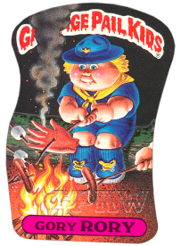
GORY RORY — Rhyme; the forename Rory with the
word 'gory'. def'n: Gory — Bloody; bloodstained. Characterized by much bloodshed or physical violence. def'n: Gore — Blood, especially from a wound. 190b GIL GRILL — Rhyme; the forename Gil with the word 'grill'. def'n: Grill — A cooking utensil containing metal bars. Food cooked on a grill. 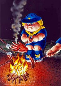
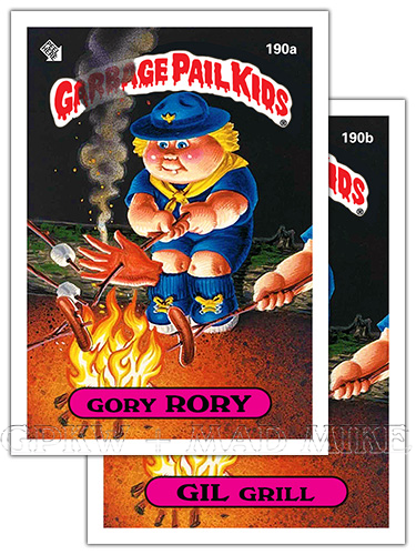
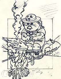 BITS & BOBS: — Pound's campfire tales gag titled 'SCOUT' was the twenty-ninth approved concept for the release by Topps that John executed for the OS5 set per his production notes, although not all concepts made it into the release. Per Pound's tight pencil, there were no revisions or drastic changes to the concept or character, but did mention another option: 'ALT - ... COOKING SMOKEY THE BEAR'S HEAD?'. Instead, the original concept with the Scout leader's hacked-off hand was used. Other, more traditional, items seen being cooked around the campfire are hotdogs and marshamallows on a stick. The Boy Scouts of Amarica ('BSA') is one of the largest youth organizations in the U.S. founded in 1910; the goal is to train youth in responsible citizenship through participation in a wide range of outdoor activities, et cetera, including outdoor skills such as camping and hiking. Cub Scouting age range is 7 to 11 years and Boy Scouting age range is from 11 to 17 years. Cub Scouts wear a uniform that distinguishes levels within the den, the pack and the community and often includes a cap or hat with insignia. It is doubtful that this Scout will earn his camping merit badge. — Most of the original GPK cards had very unique die-cut or die-line for their sticker pattern or outline which was adopted from the Wacky Packages franchise (pictured at the bottom of this page). |

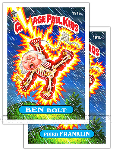
191a
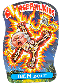
BEN BOLT — A parody on Benjamin Franklin; an
American scientist who discovered electricity. def'n: Bolt — A flash of lightning or a thunderbolt. def'n: Lightning — A natural electrical discharge of high voltage between a cloud and the ground. 191b FRIED FRANKLIN — A parody of Benjamin Franklin; 1706-1790 statesman, author and scientist. def'n: Fry — past tense. Fried. To cook over direct heat. def'n: Fry — informal. To be electrocuted by electricity. 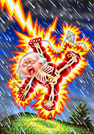
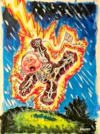 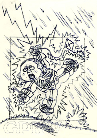
BITS & BOBS: — Pound's electrocution gag titled 'BEN FRANKLIN - LIGHTNING' was the twenty-fifth approved concept for the release by Topps that John executed for the OS5 set per his production notes, although not all concepts made it into the release. Per Pound's tight pencil, there were no revisions or drastic changes to the concept or character. The image tells the famous kite-in-a-thunderstorm story, the experiment demonstrated the connection between lightning and electricity where Franklin and his son stood in a field with materials aready: a simple kite constructed of a large silk handkerchief, a hemp string, silk string ribbon, a Leyden jar, a length of wire and a house key. The character with his bifocals and signature hair can be seen with his transparent, traditional outfit: his suit which includes a coat, waistcoat, ruffled shirt, breeches, kneesocks and buckled shoes, flying the aforementioned kite but holding the key rather than it being attached to the wire kite string. The see-through body and skeleton gag is well known in the cartoon and comic realms after a character has been electrocuted by either lightning or electricity. — Most of the original GPK cards had very unique die-cut or die-line for their sticker pattern or outline which was adopted from the Wacky Packages franchise (pictured at the bottom of this page). |

192a
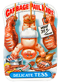
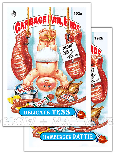
DELICATE TESS — Nomenclature = Delicatessen. def'n: Delicatessen — A shop that sells freshly prepared foods ready for serving. def'n: Delicate — Requiring great skill. Delicacy; a choice food. 192b HAMBURGER PATTIE — Nomenclature = Hamburger patty. def'n: Hamburger — A cooked patty of ground meat. def'n: Patty — A small flattened cake of chopped food. 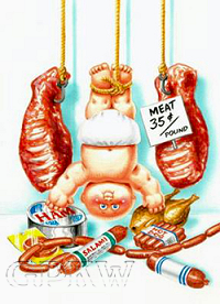
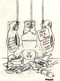 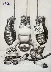 BITS & BOBS: — Pound's deli market gag titled 'MEAT MKT.' was the twenty-first approved concept for the release by Topps that John executed for the OS5 set per his production notes, although not all concepts made it into the release. Per Pound's tight pencil, there were no revisions or drastic changes to the concept or character, but a revision did exist. Also, Pound suggested the names LARRY Lunchmeat, SALVADOR Deli, Hot DOUG (card #185 nomenclature) and Hamburger PATTY. Much like card #182 with the artist's initials, this is the first set Pound was able to sneak his last name into one of his paintings considering Topps did not advertise credit to their freelance artists in the 80's. The 'MEAT 35¢ / POUND' contains John's surname, with the double-meaning being the price of meat per 'pound'. And, as seen on his tight pencil when sold, his signature is still the same. — The black-and-white picture above is a GPK film transparency; during the card production process a photographic image is placed on black mask film and used to alter the transparency of the artwork. This is a transparent positive image and not a film negative which adds color to the printed image. Transparency proof cards were auctioned off of eBay through the Topps Vault in 2006 (above, right). |

193a
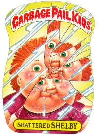
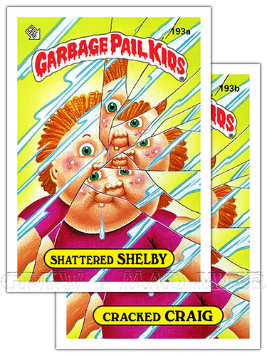
SHATTERED SHELBY — Shelby; SH forename
to go with the word 'shatter'; shattered shell. def'n: Shatter — To break or burst suddenly into pieces, as with a violent blow. def'n: Shell — The usually hard outer covering that encases certain organisms. 193b CRACKED CRAIG — Craig; C forename to go with the word 'crack+ed'. def'n: Crack — To break or cause to break. def'n: Mirror — A reflective surface, typically coated glass, that reflects a clear image. 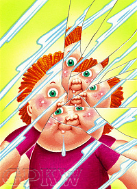
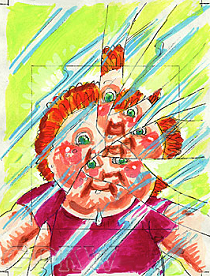 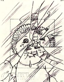 BITS & BOBS: — Pound's bad luck gag titled 'CRACKED MIRROR' was the thirty-ninth approved concept for the release by Topps that John executed for the OS5 set per his production notes, although not all concepts made it into the release. Per Pound's tight pencil and colour rough, there were no revisions or drastic changes to the concept or character. It is unknown how or why the mirror cracked, but the reflection of a drooling CPK parody doll with out-of-control acne may have done the trick. The mirror itself is cracked no less than fourteen times, with the character reflected in no less than seven of the broken fragments. The concept is based off of superstitions of old (a widely held, abeit unjustified, belief in supernatural acusations that lead to certain consequences of an action or an event), like a black cat crossing one's path, where breaking a mirror will bring the person bad luck for seven years. There have been several myths and beliefs over time regarding reflections in water, mirrors possesing magical powers and photographic images stealing a part of one's soul ... the seven years timeframe for a broken mirror most likely stemmed from ancient Roman times when it was believed that it took seven years for a life to be renewed or rejuvinated. If a person looking into a mirror were in bad health, or in this case riddled with pimples, their image would actually break the mirror as a warning sign. |

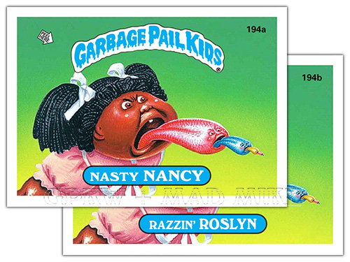
194a
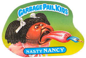
NASTY NANCY — Semi-rhyme; the forename Nancy
with the word 'nasty'. def'n: Nasty — Malicious; spiteful. Unpleasant. 194b RAZZIN' ROSLYN — Semi-rhyme; the forename Roslyn with the word 'razzin'/razz+ing'. def'n: Razz — To ridicule, heckle. To harass persistently, as with taunts. 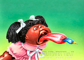
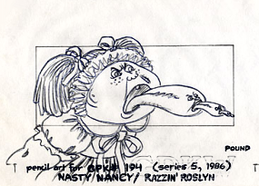 BITS & BOBS: — Pound's bratty gag titled 'STICKING TONGUE(S) OUT' was the seventh approved concept for the release by Topps that John executed for the OS5 set per his production notes, although not all concepts made it into the release. Per Pound's tight pencil, there were no revisions or drastic changes to the concept or character. Of course, sticking out your tongue can have multiple meanings, including the act of being extremely rude or mean, especially by a spoiled, self-centered and badly behaved bratty kid. The level of humor is raised, or in this case extended, by adding a face to the character's tongue and sticking it's tongue out in turn to the point it disappears from sight. — Most of the original GPK cards had very unique die-cut or die-line for their sticker pattern or outline which was adopted from the Wacky Packages franchise (pictured at the bottom of this page). |

195a
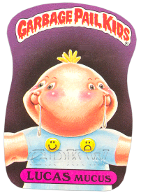
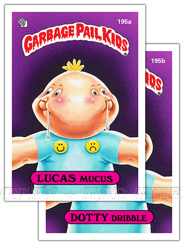
LUCAS MUCUS — Rhyme; the forename Lucas with
the word 'mucus'. def'n: Mucus — The viscous liquid secreted as a protective lubricant coating by the glands in the mucous membrane. def'n: Mucous — Producing or secreting mucus. 195b DOTTY DRIBBLE — Dotty; D forename to go with the word 'dribble'. def'n: Dotty — Crazy. def'n: Dribble — To fall or let fall in drops. To drool, trickle. 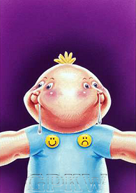
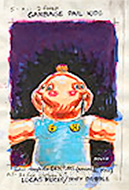 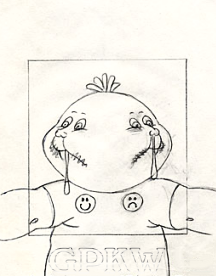 BITS & BOBS: — Pound's seeing-double gag titled '2-FACED' was the forty-fifth approved concept for the release by Topps that John executed for the OS5 set per his production notes also marked as 'A' and 'R' (revision), although not all concepts made it into the release. Per Pound's tight pencil, he also suggested an alternate version for the concept: 'ALT - 3RD FACE INBETWEEN 2?', and the cheek smiles lines were shorted on the character. The orange hair from the color rough was eventually changed to yellow to match the happy and sad buttons; a happy face for the spit drool and the sad face for the snot dribble. The original 'smiley' face was created in 1963 by Harvey Ball, a graphic and ad artist, who was employed at the time by State Mutual Life Assurance Company and was asked to created a happy-face to raise the spirits of the employees. — Most of the original GPK cards had very unique die-cut or die-line for their sticker pattern or outline which was adopted from the Wacky Packages franchise (pictured at the bottom of this page). |

196a
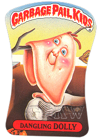
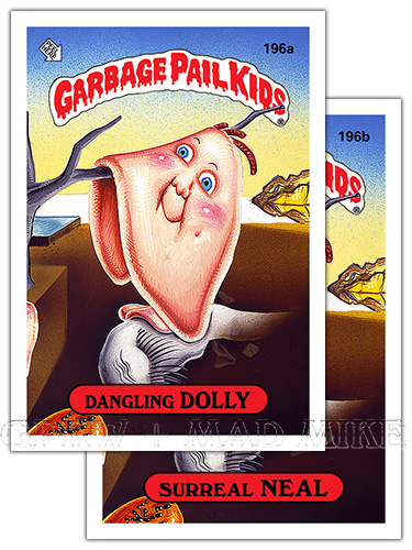
DANGLING DOLLY — Nomenclature = Dangling (Salvador)
Dalí. A parody of a famous painting by the Spanish artist Salvador Dalí; born in 1904. def'n: Dangle — To hang or cause to hang loosely and swing to and fro. 196b SURREAL NEAL — Rhyme; the name Neal with the word 'surreal'. def'n: Surrealism — A 20th literary and artistic movement that attempts to express the workings of the subconscious by fantastic imagery and incongruous juxtaposition of subject matter. adjective. Surreal. 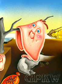
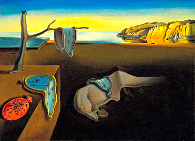 BITS & BOBS: — Pound's 'SURREALIST' gag was one of several concepts approved for the release by Topps that John executed for the OS5 set. The GPK image is a parody of artist Salvador Dalí's painting titled 'The Persistence of Memory, created in 1931 with a certain amount of precision, but only "to systematize confusion and thus to help descredit completely the world of reality.", although, the golden cliffs in the distance are on the coast of Catalonia. The clock faces (an analog clock or watch that displays the time through the use of a fixed-numbered dial and moving hands) is replaced by GPK faces, the two made one, with the mollusk like creature (Dalí's facial profile) placed over the extended tree limb. The pocket watch with ants is relocated due to the vertical presentation and it's unknown if the face cut off on card (and artwork) has a fly on it. The piece and theme focuses on the passage of time, the awareness of this time and inescapable death and unavoidable decay. — Most of the original GPK cards had very unique die-cut or die-line for their sticker pattern or outline which was adopted from the Wacky Packages franchise (pictured at the bottom of this page). |

197a
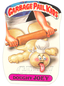
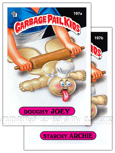
DOUGHLY JOEY — Rhyme; the forename Joey with
the word 'dough+y'; adjective. Doughy. A parody of the 'Poppin' Fresh' Pillsbury Doughboy advertising mascot. def'n: Dough — A thick, pliable mixture of flour and other ingredients that can be rolled or kneaded. 197b STARCHY ARCHIE — Rhyme; the forename Archie with the word 'starch+y; adjective. Starchy. def'n: Starch — A carbohydrate found in wheat and prepared as a white tastless powder (flour) to stiffen with starch. 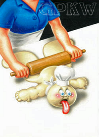
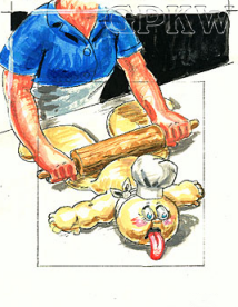 BITS & BOBS: — Pound's cookie-dough gag titled 'DOUGHBOY' was labeled as concept '5-H' and approved for the release by Topps that John executed for the OS5 set per his production notes, although not all concepts made it into the release. Per Pound's color rough, he also posed the questions 'COLOR? - WHITE OR FLESH?'. The natural 'white' cookie dough was most likely yellow enough for the character not to have to be painted flesh tone in color. The Pillsbury Doughboy (fka Poppin' Fresh) was created in 1965 and used as an advertising mascot for the Pillsbury Company, where a human finger would poke the Doughboy's stomach; the character is completely white with a white chef's hat, white scarf tied in front and two big blue eyes. The GPK character can also be seen in a greatly reduced chef's hat, a scarf tied in back and protruding blue eyes and tongue due to being pressed and smashed by a rolling pin. — Most of the original GPK cards had very unique die-cut or die-line for their sticker pattern or outline which was adopted from the Wacky Packages franchise (pictured at the bottom of this page). |

198a
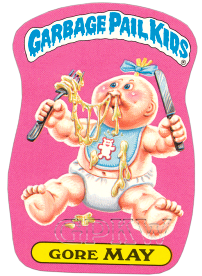
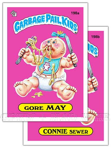
GORE MAY — Nomenclature = Gourmet. def'n: Gourmet — A person who knows and appreciates fine food and drink. def'n: Gore — Blood; especially from a wound. Something that looks disgusting. 198b CONNIE SEWER — Nomenclature = Connoisseur. def'n: Connoisseur — An informed and astute judge in matters of taste; expert. def'n: Sewer — An artificial, usually underground conduit for carrying off sewage or rainwater. 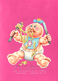
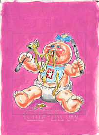 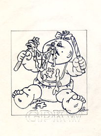 BITS & BOBS: — Pound's booger delicacy gag titled 'EATING SNOT, w/ FORK' was the twenty-fourth approved concept for the release by Topps that John executed for the OS5 set per his production notes, although not all concepts made it into the release. Per Pound's color rough and tight pencil, he also noted an alternative and slight revision with: 'ALT - NO BOW, FOR NAMING EITHER SEX?', but it wasn't necesary and the hair bow remained. The character is using a knife and fork, the prim and proper way to consume spaghetti-like strands of snot whilst sporting a bear baby bib. It's not often a Pound background is one solid color, instead of noticeable airbrushing. A simple concept in nature that would fit in nicely with the OS1 release. — Most of the original GPK cards had very unique die-cut or die-line for their sticker pattern or outline which was adopted from the Wacky Packages franchise (pictured at the bottom of this page). |

199a
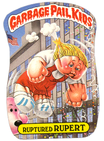
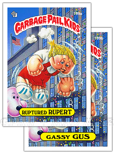
RUPTURED RUPERT — Rupert; a similar sounding
forename to go with the word 'rupture+d'. def'n: Rupture — The act or process of breaking open or bursting. def'n: Parade balloon — A large character balloon kept afloat wtih helium. 199b GASSY GUS — Semi-rhyme; the forename Gus with the word 'gas+sy'. def'n: Gassy — Containing, full of, or resembling gas. def'n: Gas —slang. Flatulence. Having or causing excessive gas in the digestive system. 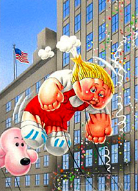
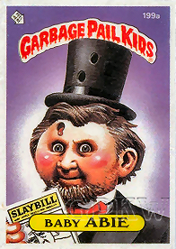 BITS & BOBS: — Pound's parade around balloon gag was one of several concepts approved for the release by Topps that John executed for the OS5 set. The image is reminiscent of the Macy's Thanksgiving Day Parade and shows a deflating balloon with escaped helium; the character was a replacement for a previoulsy unpublished 'Presidential' image by artist John Pound that was painted in 1986 and was intended for the OS5 set, but removed from production. A pair of slick proofs went up for sale on eBay through the Topps Vault during April of 2005. The piece was originally intended for the OS3 set whose character had one bullet hole through the hat and holding a 'PLAYBILL' which was changed to 'SLAYBILL' and revised for the OS5 card with the hat now having two bullet holes and another bullet hole added through the forehead. Printed cards 199a Ruptured RUPERT and 199b Gassy GUS replaced cards 199a Baby ABIE and 199b Missing LINC within the set in which both went through a layout change from a black number to a white number, a blue GPK header to a red GPK header and a blue nameplate to a yellow nameplate, the same layout as the original proof. The proof with red GPK header contains a red ® trademark symbol, characteristic of OS3 headers only. — Most of the original GPK cards had very unique die-cut or die-line for their sticker pattern or outline which was adopted from the Wacky Packages franchise (pictured at the bottom of this page). |

200a
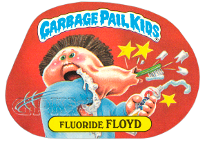
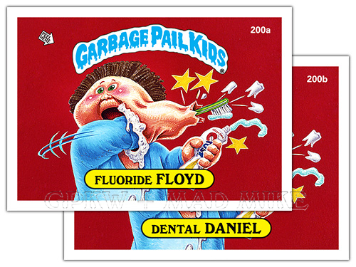
FLUORIDE FLOYD — Semi-rhyme; the forename Floyd
with the word 'fluoride'. def'n: Fluoride — A binary compound of fluorine with another element. Often added to a water supply for the purpose of preventing tooth decay. 200b DENTAL DANIEL — Semi-rhyme; the forename Daniel with the word 'dental'. def'n: Dental — Of or pertaining to the teeth. 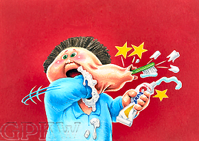
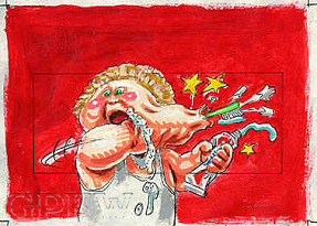 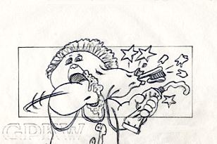 BITS & BOBS: — Pound's dendite gag titled 'BRUSHING TEETH - OOPS' was labeled '5-G' and marked as the twenty-eighth approved concept for the release by Topps that John executed for the OS5 set per his production notes, although not all concepts made it into the release. Per Pound's color rough, the artwork went through a color variation and wardrobe change; the character has blond hair instead of brown and is wearing a white muscle-shirt instead of a pajama top for the whoopsie-daisy dental accident. — The first set to contain a Wacky Packages product parody within the artwork image; the character is holding a tube of toothpaste called 'CRUST', the same name as the OS1 Wacky Package sticker. 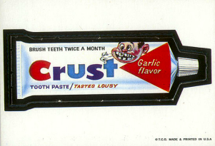
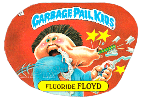 — Most of the original GPK cards had very unique die-cut or die-line for their sticker pattern or outline which was adopted from the Wacky Packages franchise. This particular sticker can aslo be found with a regular and inverted die-cut for both cards; this 'true' error occured during the set-up for the layout of the card for the printing process. |

201a
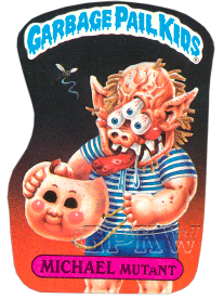
MICHAEL MUTANT — Michael; M forename
to go with the word 'mutant'. def'n: Mutant — An organism differing from the parental strain as a result of mutation. def'n: Mask — A covering for all or part of the face worn as a disguise. To hide or conceal with. 201b ZEKE FREAK — Rhyme; the forename Zeke with the word 'freak'. def'n: Freak — A person, thing or occurrence that is abnormal or very unusaul. def'n: Monster — A creature that is typically large, grotesque and frightening. 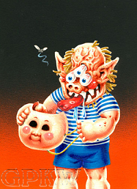
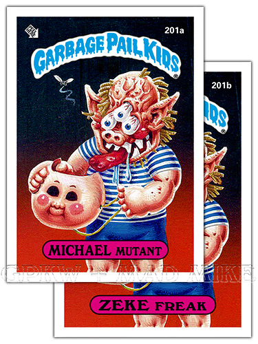
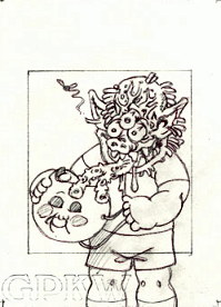 BITS & BOBS: — Pound's monster-behind-the-mask gag titled 'MASK / MONSTER' was the fortieth approved concept for the release by Topps that John executed for the OS5 set per his production notes, although not all concepts made it into the release. Per Pound's tight pencil artwork, the monster tongue called for a slight revision and was greatly reduced in size, looking a bit more normal in nature, and the tasting organ no longer extended into the mask and lost its spiny appearance. Stripes were added to the character's T-shirt and socks removed from the final artwork. With the holiday colored background, black and orange, the human Hallowe'en mask covering the creature's face is a nice switch from a monster mask always covering a normal face. The hovering fly suggests the monster must give off a certain amount of musk. The concept is reminiscent of the OS1 monster face concept, but without the GPK mask. — There contains three OS5 characters, including RICHIE Retch (Series 2, #17), within the 2013 and 2014 MiniKins releases of resin figures that are reminiscent of the 1986 Cheap Toys characters; sticker write-up text by Pat Barrett and Colin Walton. |

202a
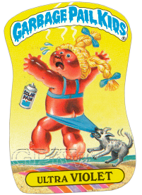
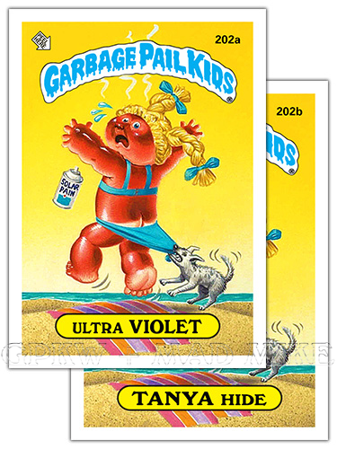
ULTRA VIOLET — Nomenclature = Ultraviolet. An image parody of the Coppertone sunscreen mascot. def'n: Ultraviolet — Of electromagnetic radiation from the sun with wavelengths just shorter than those of visible light, and just longer than those of x-rays. 202b TANYA HIDE — Nomenclature = Tan+ned hide; tan your hide. def'n: Tan — To convert hide into leather, especially by treatment with tannin. To make or become brown by exposure to the sun. def'n: Hide — The skin of an animal. 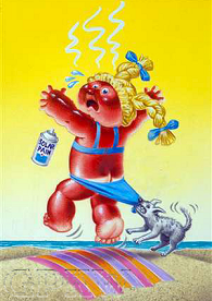
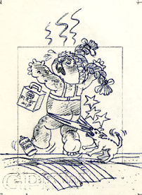 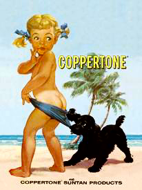 BITS & BOBS: — Pound's kissed-by-the-sun gag titled 'SUNBURN' was the nineth approved concept for the release by Topps that John executed for the OS5 set per his production notes, although not all concepts made it into the release. Per Pound's tight pencil artwork, although it does not state a revision has taken place, there are quite a few changes from the final artwork. The character's sunburn is reduced from a 2nd degree burn with apparent blistering seen on the visible arm and leg to a 1st degree burn with reddening of the epidermis only. The 'SOLAR PAIN' spray can found dropped by the victim's foot now replaces the 'FIRST AID' kit placed in the same location for the final painting. The noticeable 'pain' identified by the comic book-like stars are removed, freeing up some space around the character. Lastly, to add pain to injury, the burn victim is being depants by a dog, with less bum revealed for the final artwork. The image is a parody of the advertising mascot for the Coppertone girl, introduced in 1965, that was usually accompanied by the slogan "Don't be a paleface!"; both characters have blond pigtails, blue ribbons, blue swimsuit bottoms, both being revealed by a dog, but only one is topless ... one with a surprised look and one with a shocked look. |

203a
TOOTHIE RUTHIE — Rhyme; the forename Ruthie
with the word 'tooth+ie'.
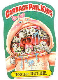
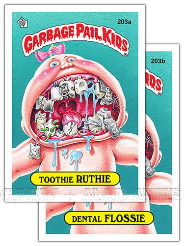
def'n: Tooth — One of a set of hard, bone-like structures rooted in sockets in the jaws, used to bite and chew. adjective. Toothy. 203b DENTAL FLOSSIE — Nomenclature = Dental floss. def'n: Floss — Short for dental floss. A thread used to clean between the teeth; to clean between one's teeth with dental floss. 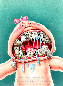 
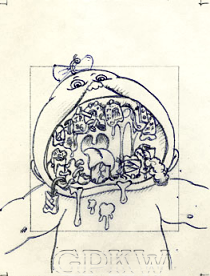 BITS & BOBS: — Pound's rotten mouth gag titled 'BAD TEETH' was the third approved concept for the release by Topps that John executed for the OS5 set per his production notes, although not all concepts made it into the release. Per Pound's tight pencil artwork, no revisions took place for this concept and no changes took place for the final artwork; except see point #4 below. The image is very reminiscent of the junkfood candy concept within the OS1 release where the character's mouth is bigger than their head; this is the outcome of not brushing one's teeth after so much sugar and lack of care. So much so, that a spider has had time to take up residence within the mouth cavity of the character from no cleaning. The character's dental network is made up of two rows of ten teeth each, top and bottom, left to right, per a normal baby teeth chart, except for an third molar on the bottom row; wisdom teeth don't normally come in until around 17-25 years of age. Pound's COA read, "GPK with wide open mouth + lots of cavities", and per email correspondence on February 10, 2025, "I looked and found a color rough for GPK #203, that shows a little detail of the tooth. with JP 86. I assume I sent in the final art with that detail too." — Upper deck: 1) a seemingly intact second molar, 2) a majorly cracked first molar, 3) a dead gray canine tooth hanging by a nerve/root with saliva, 4) a lateral incisor tooth with a receding gumline [NOTE: per pencil & color rough artwork, the tooth read 'J.P. 86' for 'John Pound 1986', but the final artwork was painted over], 5) a central incisor tooth decay, two nails and plaque, 6) a central incisor with tooth decay and plaque, 7) a missing lateral incisor tooth surrounding by saliva, 8) a canine tooth held on with a metal bracket and screws, 9) a first molar riddled by cavities and 10) a second molar with an attached spider web. Lower deck: 1) a third molar wisdom tooth with cavities, 2) a first yellow molar, 3) a worn down second molar tooth, 4) a hanging and bandaged canine tooth by its root, 5) a lateral incisor filled with holes and green worms, 6) a central incisor tooth broken off, 7) a central incisor tooth completely creacked with plaque, 8) a missing lateral incisor tooth, 9) a wrapped canine tooth with plaque, 10) a first molar tooth with cotton gauze sticking out with stitching and 11) a second molar cracked in half. — There contains three OS5 characters, including RICHIE Retch (Series 2, #17), within the 2013 and 2014 MiniKins releases of resin figures that are reminiscent of the 1986 Cheap Toys characters; sticker write-up text by Pat Barrett and Colin Walton. |

204a
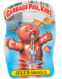
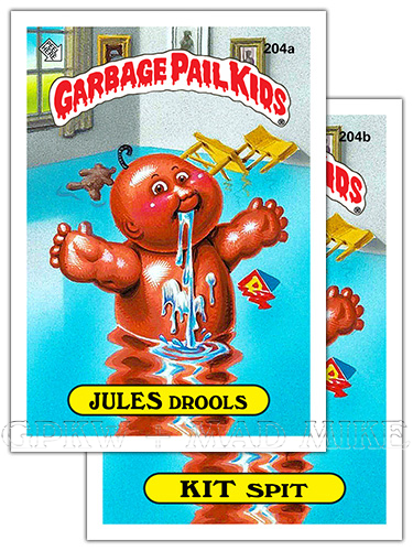
JULES DROOLS — Rhyme; the forename Jules with
the word 'drool+s'. def'n: Drool — To let saliva run from the mouth; drivel. def'n: Drool — slang. To talk nonsense. 204b KIT SPIT — Rhyme; the forename Kit with the word 'spit'. def'n: Spit — To eject saliva from the mouth. def'n: Spit up — A mild regurgiation of, usually, food, milk and saliva. 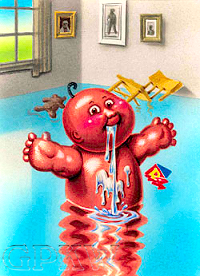
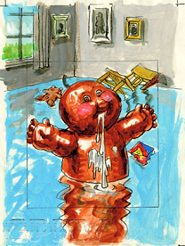 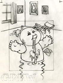 BITS & BOBS: — Pound's active saliva gland gag titled 'DROOLING' was the fourth approved concept for the release by Topps that John executed for the OS5 set per his production notes, although not all concepts made it into the release. Per Pound's tight pencil and color rough artwork, the artist had suggested the nomenclature of 'DROOLIN' JULIAN', but the name was not used for the release. At this stage with GPK, the background wasn't always highly developed unless it helped tell the story and sell the concept; in order for the character to be swimming in spit, the artwork was given a room with walls to show the level of drool that had escaped the infant. A wooden chair, upside down stuffed animal teddy bear and building block toy can be seen floating. The character is apparently suffering from some sort of excessive salivation condition caused by an overactive salivary gland. — Most of the original GPK cards had very unique die-cut or die-line for their sticker pattern or outline which was adopted from the Wacky Packages franchise (pictured at the bottom of this page). |

205a
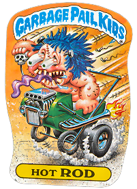
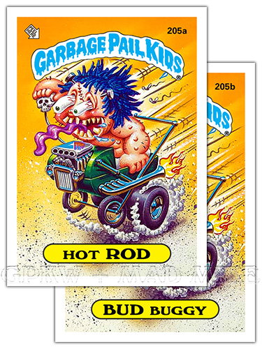
HOT ROD — Nomenclature = Hot rod. def'n: Hot rod — An automobile rebuilt or modified for increased speed and acceleration. def'n: Hot rodder — A hot rod driver, builder or enthusiast. 205b BUD BUGGY — Semi-rhyme; the forename Bud with the word 'buggy'. def'n: Buggy — A small, light, four-wheeled carriage. A baby buggy. def'n: Pram — British. A baby carriage. 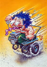
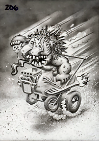 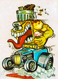 BITS & BOBS: — Pound's 'ROD BUGGY' gag was one of several concepts approved for the release by Topps that John executed for the OS5 set. The parody is based directly off of artist Ed Roth's 'Hot-Rod' character from the 50's and 60's right down to the grotesque, monster-looking mutant. Ed Roth was an artist and customer car builder during the hot-rod movement and created the iconic Rat Fink (R.F.) character. The Dunruss card company released an Odd Rods parody card series in 1969 along with other similar titles thru 1973 including Odder Odd Rods and Silly Cycles. The Topps company later released a card set titled Weird Wheels as a parody of the popular Hot Wheels toy cars in 1980; one card in particular showcases a Rat Fink-like character. Rat = a rodent or (informal) a despicable character and fink; a snitch. — The black-and-white picture above is a GPK film transparency; during the card production process a photographic image is placed on black mask film and used to alter the transparency of the artwork. This is a transparent positive image and not a film negative which adds color to the printed image. Transparency proof cards were auctioned off of eBay through the Topps Vault in 2006. The pictured transparency (middle image) is labeled incorrectly with the #206 instead of #205. |

206a
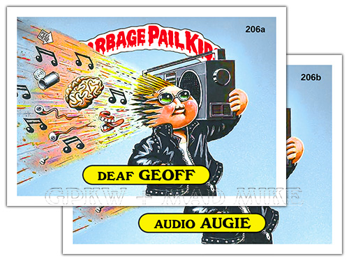
DEAF GEOFF — Rhyme; the forename Geoff with
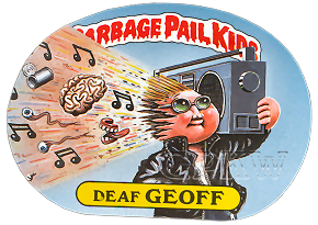
the word 'deaf'. Parody of the alternative hip hop musician and rapper 'Def Jef' of the late 1980s (and early 1990s). def'n: Deaf — Partially or completely unable to hear. 206b AUDIO AUGIE — Semi-rhyme; the forename Augie with the word 'audio'. def'n: Audio — Of or pertaining to sound or to the reproduction of sound. Audio reception. Audio sound. 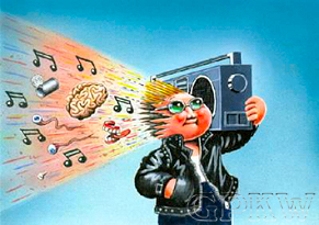
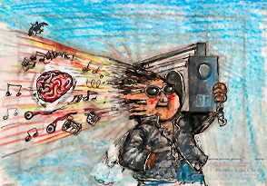 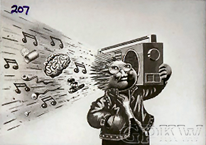 BITS & BOBS: — Bunk's 'BOOMBOX' gag was one of many concepts approved for the release by Topps that Tom executed for the OS5 set. Per Bunk's color rough artwork, the same ghetto blasted brain innards, and then some, all remain within the final artwork, except the 'bat in the belfry' (head) has been removed. The character's brown/brunutte hair has been changed to blond, but everything else remains relatively the same except for some jacket refinement. — The black-and-white picture is a GPK film transparency; during the card production process a photographic image is placed on black mask film and used to alter the transparency of the artwork. This is a transparent positive image and not a film negative which adds color to the printed image. Transparency proof cards were auctioned off of eBay through the Topps Vault in 2006. The pictured transparency (middle image) is labeled incorrectly with the #207 instead of #206, an OS6 number. |

WHAT IF?
Website
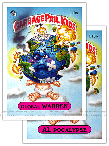
Mock-Up L10a GLOBAL WARREN — Nomenclature =
Global war; world war. def'n: World war — A war engaged in by all or most of the principal nations of the world. def'n: World — The earth with its inhabitants and all things upon it. The concerns of the earth and its affairs. def'n: Global — Of, relating to, or involving the entire world; worldwide. def'n: War — A state of usually open and declared armed hostile conflict between states or nations. Website Mock-Up L10b AL POCALYPSE — Nomenclature = Apocalypse. def'n: Apocalypse — The expectation of an imminent cosmic cataclysm in which God destroys the ruling powers of evil. Today the term is often called Armageddon, the end of the world, which may be a shortening of the phrase 'apokalupsis eschaton' which literally means "revelation at the end of the æon, or age". def'n: Armageddon — The site or time of a final and conclusive battle between the forces of good and evil.  
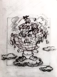 BITS & BOBS: — Pound's WWIII gag titled 'GLOBE-HEAD' and marked as '5-?' and was another approved concept for the release by Topps that John executed for the OS5 set, per his production notes; although not all concepts made it into the release, like this particular one. The final artwork was marked as 'OUT' by Topps and was pulled from the set. Per Pound's tight pencil and color rough artwork, there doesn't appear to be any revisions through the production process, except for the character's tongue sticking out being removed, and the artist had suggested the name 'EARL EARTH'. The atomic clouds are reminiscent of OS1 character ADAM Bomb and Blasted BILLY. The globe appears like a beat up and broken down boxer. — The previously unpublished 'world war' image was painted in 1986 and was possibly pulled due to the Cold War that stretched from 1979 through 1985 and its lasting after affects. The final artwork was finally published in 2010 for the Flashback Series 1 set as Lost GPK cards 67a Global WARREN and 67b AL Pocalypse and in 2013 for the OS1 Chrome set as Lost GPK cards L6a Global WARREN and L6b AL Pocalypse. |

WHAT IF?
Website
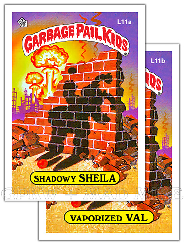
Mock-Up L11a SHADOWY SHEILA — Shelia; S
forename to go with the word 'shadow+y'. def'n: Shadowy — That is or is like a shadow; specifically without reality or substance; illusory. def'n: Shadow — Refers to either a dark part of something or to an area of complete darkness. Website Mock-Up L11b VAPORIZED VAL — Val; V forename to go with the word 'vaporize+d'. def'n: Vaporized — To destroy by or as if by converting into vapor. def'n: Vapor — Any cloudy or imperceptible exhalation, as smoke or noxious fumes. 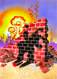
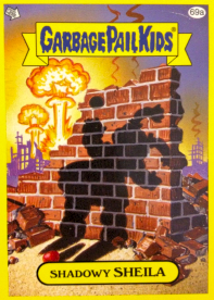 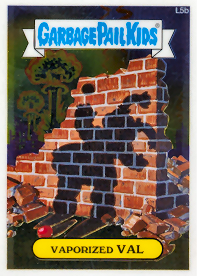 BITS & BOBS: — Pound's WWIII gag titled 'ATOMIC VAPORIZED GPK' was marked as '5-10' and was the tenth approved concept for the release by Topps that John executed for the OS5 set per his production notes, although not all concepts made it into the release, like this particular one. The final artwork was marked as 'OUT' by Topps and was pulled from the set. The New Product Development naming panel had the nomenclature 'Shadowy SHEILA' and 'Vaporized VAL' as the first two listed name options and asterisked as if chosen; this same nomenclature ended up on the card images finally released for this character in 2011 and 2013. Although the red playing ball was not completely vaporized like the GPK character, and is seen motionless on the ground, the shadowy object is also imprinted on the brick wall, as seen in the visualized story below, called a 'thermal shadow' (differential absorption and reflection). 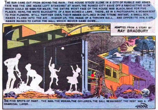 — Per Pound, circa 07/2022, "That image was inspired by an old EC Comic sci-fi panel drawn by Wally Wood, that showed one or more figures as a shadow left on a wall after a nuclear blast destroyed the town." The science fiction short story, "There Will Come Soft Rains", by author Ray Bradbury, was published in May 1950. EC Comics (aka Entertaining Comics) adapted the story for their Weird Fantasy issue No.17 Jan-Feb in 1953, and was drawn by artist Wallace Wood (1927—1981), an American comic book writer, artist & independent publisher. — The previously unpublished 'nuclear war' image was painted in 1986 and was possibly pulled due to the Cold War that stretched from 1979 through 1985 and its lasting after affects. The final artwork was finally published in 2011 for the Flashback Series 3set as Lost GPK cards 69a Shadowy SHEILA and 69b Vaporized VAL and in 2013 for the OS1 Chrome set as Lost GPK cards L5a Shadowy SHEILA and L5b Vaporized VAL. |

WHAT IF?
Website
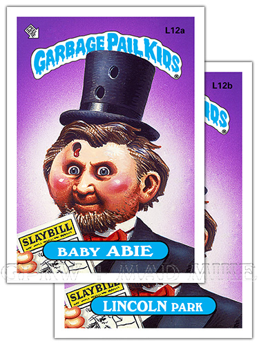
Mock-Up L12a BABY ABIE — Rhyme; the forename
Abie with the word 'baby'. A parody of Abraham Lincoln (February 12, 1809 – April 15, 1865) who served as the 16th President of the United States from March 1861 until his assassination in April of 1865. def'n: Baby — Something that is one's special achievement or interest. slang. Often used in address. Website Mock-Up L12b LINCOLN PARK, aka 199b MISSING LINK (Missing LINC) — Nomenclature = Missing link. John Wilkes Booth, a well-known actor and a Confederate spy from Maryland assassinated Lincoln. def'n: Lincoln Park — Chicago's alrgest park & community area (neighborhood) on the North Side of Chicago, IL. def'n: Missing — Not present. To be absent from a place and of unknown whereabouts. def'n: Missing link — A thing that is needed in order to gain complete knowledge. 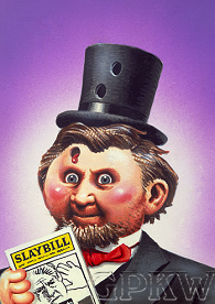
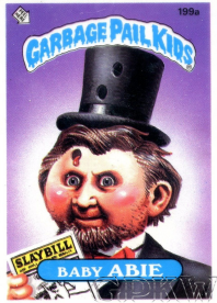 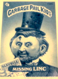 BITS & BOBS: — Pound's presidential parody titled 'LINCOLN' was the twenty-ninth approved concept that John executed for the OS3 set per his production notes. The piece may have been pulled for a variety of different reasons from the regular set, originally intended for the OS3 set and later revised and pulled from the OS5 set. Just from the color rough, one can ascertain the many changes before the final artwork was complete; the wrinkled forehead and smile lines were removed to make the head look more CPK-like and a hand was added holding a 'PLAYBILL' (a theater program). From the original OS5 colour proof, the header and nameplate for the OS3 set were most likely red and yellow, respectively — 'PLAYBILL' was changed to 'SLAYBILL' and two additional bulletholes were added, one with blood; not surprising that as the concept grew more gruesome it was yanked from production again. The original transparency proof card is also pictured above. — The image with one bullet hole has not been released on card, but the second revision can be found within the 2010 Flashback set as cards 66a Baby ABIE and 66b LINCOLN Park, within the 2013 Chrome Series 1 set as 'lost' cards L2a Baby ABIE and L2b Missing LINC and within the 2016S1 set as 'classic patriot' cards 7a Baby ABIE and 7b LINCOLN Park and as 'patriotic patches' #7. |
Definitions taken in part from The American Heritage Dictionary.


— The original GPK sets all had unique die-cuts for their sticker outline,
adopted from the Wacky Packages franchise.
