 |
February
26th-March 25th
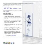
I didn;t really like this layout. It's did not look particularily good in Netscape, and especially in 640x480 resolutions because of the smaller paragraph spaces, and of a scroll bar at the bottom. However, the image of Mercury was gorgeous, so I went with it anyway. |
 |
March 26th-April
28th
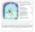
This was my first attempt with cut-up images, and I was actually rather pleased with it. The image is from a Sailormoon RealMedia video from Senshi TV that I had taken a screen capture from. |
 |
April 29th-June
29th
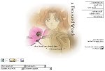
I absolutely loved this layout; it was simple and saved a lot of space. Since this new trend of "pull down menus" had arrived, I decided to try it out, but sort of twisted it to my own liking. You see in the bottom left-hand corner? Those aren't acctually navigational menus(the navigation's up in the top right corner), but information menus. I'm still using them in my layout for July, shown below. I took a bit of a break during this time ...you know, for school, life, and stuff. But since I liked this layout so much, I probably would have kept it up anyways. |
 |
June
30th- July 29th
This layout was intended to horizontally scroll for smaller resolutions. The banner in the bottom left hand side is a birthday gift from my sister site. |