Step One
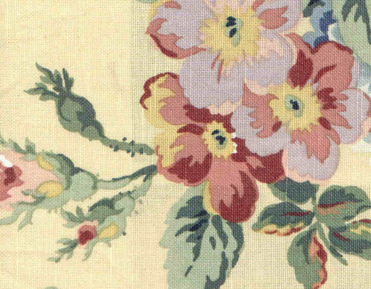
"The Anchor Fabric"
An anchor fabric is the fabric that will be used most often throughout the room, or the predominate fabric. This fabric will be used for the window dressings, and maybe to upholster a small chair and/or ottoman. It is recommended that your anchor fabric consist of no less than three colors.
1) Color
The anchor fabric features a minimum of three colors. It will compliment my both my walls and sofa, and work well with my area rug.
2) Pattern
This fabric has no set pattern, so it would be considered a curvey pattern.
3) Size
The floral print would make this seem like a large pattern, but, it will depend on the other fabrics which I choose.
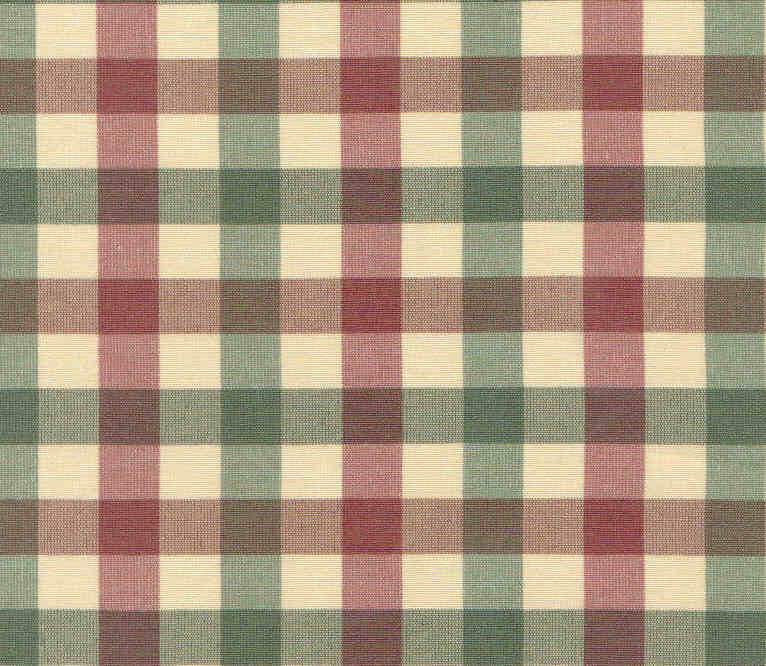
The secondary fabric is the fabric that will be used for larger accessories or medium-sized pieces of furniture such as side chairs, wingback chairs, etc, or maybe smaller pieces like seats of dining room chairs. The secondary fabric can also be used on such items as a bedskirt and shams in coordination with the anchor fabric. This fabric, when paired with the anchor fabric, should compliment the room and should not become the focal point fabric.
1) Color
The three colors in the plaid which I have chosen incorporate all three colors from my color scheme. It also compliments the colors found in the anchor fabric.
2) Pattern
The plaid features a straight pattern. Paired next to the curvey plaid, it will not overwhelm the eye with too much pattern.
3) Size
In relation to the anchor fabric(the chintz) the plaid would be considered medium in size.

The accessorizing fabric is used sparingly around the room in spurts of color. It is meant to be the "finale" of sorts for the "show" that is being produced by the anchor and secondary fabrics. Since you will use this fabric on a limited basis, it makes it possible to splurge on more elegant and luxurious fabrics as brocades, velvets, chenilles and jacquards. It is possible to have more than one accessorizing fabric
A good example of placement of accessorizing fabric(s)is lampshades: cover lampshades with a soft chenille and add tassel fringe for an elegant decorator statement. Small throw pillows: a pillow made with accessorizing fabric(s) will take center stage when placed in front of larger, plain pillows. A table runner: make a simple, no-sew runner and add two handmade tassels on each end.
The Design Elements of the Accessorizing Fabric
The fabric I have chosen to represent the accessorizing fabric is a celery green chenille. It has a wonderful texture that will add richness to the room.
1)Color
The color is one of the three colors in the chosen scheme. It matches the color of the sofa, except it is featured in an alternate texture. The color will allow it to blend with the sofa, yet the texture will allow it to have its own personality.
2)Pattern
The pattern, because of the nap of the fabric, would be considered curvy.
3)Size
In comparison to the larger chintz pattern and the medium plaid design, the scale of this chenille fabric would be considered small.
1) Color
There is a recognizable three color scheme. Using this color scheme, I can choose other accessories such as candles, flowers, etc. I can also choose to carry these same three colors throughout the home, or - I can choose another complimentary color from the anchor fabric to use in an adjoining room. (To further understand creating a color scheme, read the section entitled "Building a Color Scheme That Flows.")
2) Pattern
As I mentioned before, fabric patterns are considered either curvey or straight. If you look at the three fabrics above, placed in the order they are used, you will see that the pattern is curvy, straight, curvy. Why? Because this creates visual interest and makes the eye continue around a room. For example, if my dining room featured a striped (straight) wallpaper, what pattern do you think would be best for window treatments? A curve. Why? They each compliment each other better than they compliment themselves. In other words, the wallpaper would loose its visual interest if I paired it with another striped fabric. There are exceptions, as in the case of a room which is decorated in a single fabric scheme. But, generally, if you follow this rule of thumb you won't go wrong.
3) Size
When I described the elements of pattern, I said that all fabrics fall under the category of small, medium or large. If you notice, each of these scales are represented. The large is the chintz, the medium is the plaid and the small is the chenille. Some designers might say that you need one of each for a well-rounded and coordinated room. I tend to disagree. I think it is possible to have a selection of fabrics that fall under a medium, medium, small pattern - just to name an example. For instance, lets say I had chosen a large safari type print that featured different African animals in earth tones colors as well as some blacks and golds. Then, I wanted to use a black and white stripe for my secondary fabric. But, what if I also wanted to use a black and gold leopard print for my acessorizing fabric. Then, my fabric pattern would be large, medium, medium. I think that as long as the scale of all fabrics work in close relationship to each other, you can use any combination. What I would not recommend is to use two or three large size prints and suddenly try to throw in a mini scale print. This will seem too off balance and the mini print will look out of place.
I hope this has helped to take out some of the confusion of coordinating fabrics. I realize that this can be one of the hardest steps when it comes to decorating a room because unlike a gallon of paint, which you may have purchased for $30 or less, you are talking about a major expense when it comes to purchasing enough fabrics to decorate an entire room - or even a single project such as a window treatment. So, I would also like to suggest the following. If you are trying to match fabrics to either walls, wallpaper, furniture or other fabrics - do not rely on those itsy-bitsy pieces of fabric which stores supply as "swatches." Go ahead and purchase at least an 1/8 of a yard. This way, you can take the fabric home, lay it out on the sofa or tape it against your wallpaper. By doing this, you will get a true feeling for the fabric. A small swatch can be very deceiving because you do not always get the total picture - and often, several colors that are featured in the fabric are not even represented in the small swatch. By the way -this is my same philosophy as far as those tiny paint chips are concerned. They, too, can be deceiving. Although you may spend a little more in the long run, go ahead and purchase a quart of the color you have chosen, take it home and apply it to the walls, etc, in small areas. Only by doing this can you know for sure if that color is the right color.