
"Building a Re-Usable Color Scheme"
Follow the links below to go to:
|
"Home Sweet Rented Home" : Main Menu "Home Sweet Rented Home": Windows and Walls "Home Sweet Rented Home": Cabinets and Tiles "Home Sweet Rented Home": Fickle Furniture...Does that belong there? The Everyday Decorator: Home Page |

But, I have actually learned to both love and accept these patternless sofas and chairs, and realize just how much easier my life is (and how much heavier my purse is) because I do not have to replace the beautiful yellow chintz sofa that was darling in the last house but looks like a nightmare in this house.
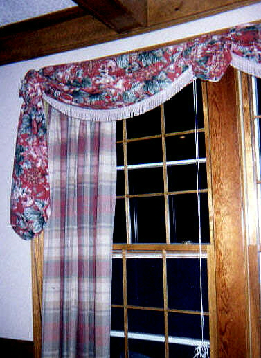
So where do I get my color from? It's really quite easy. I developed a color plan several years ago using a three color scheme. One of the colors was as neutral as could be...taupe. The other two colors were red and hunter green. Now, over the years, the hunter has changed to another more neutral and updated color - sage. With these three colors, I have managed to decorate every room in the main part of my home because I have chosen and bought accessories that could be mix-matched to any room, no matter what house I was in. I also invested in some great fabric, and taught myself and designed several no-sew curtain treatments. I cut or sew the fabric as little as possible. The same piece of fabric has served as window valances draped over decorative rods; table toppers; pillow slipcovers (secured on back with duct tape) - and so on.
So how did I use the same fabric in different homes in different rooms? Basically, I chose a chintz design that incorporated all three colors from my Three Color Scheme. It was easy to switch from hunter to sage because there are several hues of green in the fabric, just as there are several hues of reds and pinks. Along with the chintz pattern, I also have several yards of a large plaid, a textured brocade, two patterns of stripes, and some solids - all which have been collected and saved along the way - all of which have been reused and recycled.
I developed a technique for building a color scheme (see main menu for "Building a Color Scheme") which serves as my decorating Bible. I know I can mix and match furniture, accessories and fabrics for any room.
We have been programmed to think that white walls are a decorating faux paus and with them, our homes are nothing more than empty shells in which no life can exist. While I will be the first to choose painted walls over white ones, I will also be the first to say that I have managed to create cozy and welcoming rooms amid these colorless spaces. I know this for a fact: I have seen lots of pretty, painted walls using every color imaginable, and the rest of the room was as dull as a two-day old cola. Color on walls should only be a backdrop for one's collections, accessories and furniture. Color on the walls should not compete with the room, but it should compliment it. Over the years I have discovered from working with clients, using the "Use What You Have" method, that most rooms featuring white or beige walls simply need an "uplift" revolving around furniture placement and re-accessorizing. I have gone into client's homes and created inviting vignettes, rehung artwork, added greenery and lighting, and the homeowner's have had a whole new outlook on their once nondescript home. All of this done without painting one single stroke.
- Try grouping like objects together to create more of a visual impact. A grouping of prints, even if they do not have matching frames, etc - will create more visual interest than if they are scattered around the room.
- White and beige are great reflectors of light. Rely less on general overhead lighting, and add softer wattage bulbs in lamps. Use uplights, or can lights, to cast warm shadows on the wall. Soft light bulbs create a warmer glow than bright light. Use a special task lamp with a stronger watt bulb for reading purposes.
- Create interesting vignettes that draw the eye to that section of the room. The eye is drawn to color, but it is also very fickle. It doesn't matter where the color is, and it doesn't necessarily have to be on the walls. A conversation area can be created using two chairs, and a colorful patterned ottoman. A pretty chenille throw draped on one chair arm sends an invitation to sit down and get comfortable. A tall palm placed off to the side with a soft uplight will add ambiance to the space, and the green will add "life." A lamp with a shade covered in fabric to match the ottoman completes the look, along with a small vase of fresh flowers - and a few personal items such as a small, family photo or a favorite book.
- Use area rugs to add additional color, and draw the eye away from the wall. Area rugs can be placed over any type of flooring, even carpeting. Use rubber non-slip matting to hold the rugs in place on slippery surfaces. There are matts for carpet-on-carpet, and carpet-on-tile/linoleum - so make sure you get the right type.
- Read the section about "Windows and Walls" to learn more ideas for adding color to white walls.