Author: Not sure...
 |
Content: ***
Originality: * Design/layout:* Technicality: *** Overall statement: A general Sailor Moon page that hasn't quite spanned the gap between banality to originality. (The maximum amount of stars is five.) |
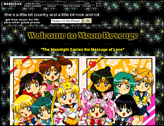
| The entrance page is a nice idea,
but I would recommend taking out the background or changing the text colour.
Yes, it's true that at least the colours don't clash, but they're not very
nice together. I would also change the font. Another thing you should do
is take all the images like the title, EntLogo.jpg, and make them transparent
gifs. If you don't know how to do that, you can find out at this nice little
page, Manga Style, who
has a tutorial
on how to do it using PaintShop Pro.
They look soooo much nicer when transparent, because they blend into the
background. You might also want to read through the entrance page for grammatical
errors...(the first sentence doesn't make much sense).
The main page could be a lot smaller (less scrolling is usually nice). First of all, the picture is huge and doesn't it belong on the character shrines page? Also, you might want to make subsections so that there isn't so much on the main page (it's a tad overwhelming). Most of the links are sort of placed randomly; you might make a subpage with all the club stuff, one for the multimedia, one for the information, etc, and link all the individual pages from there. Also, please don't just choose random colors! Yellow, cyan and neon green don't really go with anything else on the page. Ok, now we're on to the inner senshi palace. A lot of this stuff belongs on the senshi shrines page; I'd take everything out except the part about the Silver Millennium. Another pet peeve is mixing the North American and Japanese version; the Silver Millennium and the Imperium Silver Crystal are not from the same version. I like the description on the rooms. I would change the background and the font, it's way too big and not a lot of us take kindly to Comic Sans MS. Aaand, I would recommend designatiung a BGCOLOR in the <BODY> tag, that way the background will be black when the background image is loading, so we can read the text. In the outer senshi castle, you could use the <ALIGN=LEFT> attribute. You just insert it inside the image ( <IMG SRC="image" ALIGN=LEFT> ). It would help a lot on all of the pages, actually. The information on the characters was mostly good, and it's good that they weren't regurgitated stats. However, some of them had too many pictures (Neptune's comes to mind), and pleeeeeeaaase get rid of the Comic Sans MS font, it's too big and very annoying. Ok, since most of the information
pages are the same, I'll write a few basic changes that I think you should
make:
I hope that helped! |