Review by: Usagi-star
 |
Content: **
Originality: **** Design/layout: *** Technicality: *** Overall statement: A fairly original, generally non-annoying site that's getting there in terms of substance. (The maximum amount of stars is five.) |
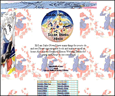
| The main page looks to be pretty
well-coordinated, and it looks like there's a whole lot to do here. The
title pic looks a tad funny because it's not transparent; you can make
it transparent using Paint Shop Pro. The graphics are ok, but look deformed
on the sidebars. Still, it's cute and I like the background image. ^_^
I also like how it's not too cluttered. The text is a bit small, though.
It's also sorta weird how you have a picutre of Usagi holding a gun...
*L*
Ok, we'll now go through the features one by one... The game room is cute. I like the idea, even though it was REALLY easy after seeing that silhouette of her. ^_^ Ok, the galleries are pretty and have some nice pictures, but it takes forever for them to load. I would recommend making a text list or thumbnails, because most of us are too impatient to wait for it. ^_^ Also, the picture on Mercury's gallery...the first one, in manga style with the flowers...that's not Ami, it's from another Takeuchi manga series... ^_^ (I know, I got mixed up about that too). But actually, there are some nice pictures in here that I haven't seen before (and that, my friends, is really rare ^_^). Setuna's Time Port was a fairly accurate story, except that it mixed up the Japanese version and the DiC version a lot. Princess Serena and Prince Endymion are from different stories; Uranus and Neptune aren't even in the English version. Other than that, though, I can't find anything else wrong with it. Hey, a poetry section! Wow. That's kinda neat. And the poems aren't bad, either. Ok, I'll actually give a substantial compliment for once: they're GOOD. ^_^ (I mean that ^_^.) I like the dark poetry and the weird poetry. ^_^ The bios are nice, if somewhat cliche, and the layouts on them could use some work. I think they might look a lot better if you used one of those corner-box layouts, if you know how to make them. (They're not that hard, you can ask me about 'em if you need help ^_^.) Also, Pluto's bio is almost impossible to read. It also seems to be mixing the English version with the Japanese again, but I'd rather you do that than write about something you don't know about. Awww, the fanart is cute! It's not bad, just a slightly different style. ^_^ I would recommend making separate, small pictures for the thumbnails because when you resize them, the computer still has to load the entire picture, just in a smaller space. Also, the banner you have for your page is so clever! I love the little milk-moustache Usagi ^_^. The You Know You Love SailorMoon yadda yadda was pretty funny...I don't really like the background image on that page, but that's just me. The text on the "about us" page is hard to read because of the background image as well...however it's good that you formatted the text. The Sailor Nova page could use some proofreading...the text is kinda smushed and weird. ^_^ I dunno if it was my computer or
what (I have a hunch it was) but the Elios fanclub page took forever to
load...the title pic looks sorta weird and the background is too. I like
the image map and the guestbook buttons, which could be adjacent rather
than taking up two lines. I also don't understand why there's a "member
of the Elios fanclub" badge on the page. I do like Elios, though... he
was pretty cool. ^_^
Anyway, this page is definetely getting
there. I'd say condense some of the stuff into a couple full pages - webrings,
clubs, pets, etc - and add some real substance. More opinions on the characters,
writings on the show and manga, et cetera. You're off to a good start ^_^.
|