Author: Fuji, Cameron, and Ikki
Review by: Usagi-star
 |
Content: *****
Originality: **** Design/layout: ***1/2 Technicality: *** Overall statement: A creative and in-depth shrine to Mako, with much more than your usual stats! (The maximum amount of stars is five.) |
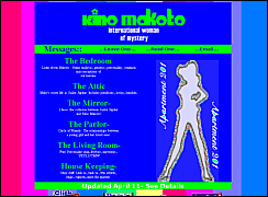
| I love the main page! Love it, love
it, love it! Even though the colors are LOUD, the text isn't hard to read
(excpet when it's absolutely tiny - might take of that ^^) and there is
a general coordination between them. The picture is so neat, and the page
just makes me laugh. ^^ I'd say that's a commendable trait in a Sailormoon
page.
On the profiles page, we have a very nice picture of Mako. The graphics aren't overdone and the section seems to be quite complete. The thing I couldn't understand was why you had the links described below the table; why didn't you put the descriptions after the links on the table? It makes it look odd and a scroller. The profile page is basic...I like the comments, gives it a personal touch. I also like the general layout of this page; the background really does a lot for it. A change in font would be nice, and possibly displaying the stats a little more clearly, in tables, maybe, but other than that it's fine. The "Misconception Madness" has another smart but not entirely gorgeous layout. I might try aligning the text differently - to the left, or to the right. I like the general flow of the writing, and the font. The Character page is very nice. Gives several insights on Mako that I have never read before, and since the author loves Mako so much he/she can defend her on most misconceptions. I do think you could do better than the side-border layout, though. The "Names" page is also interesting. I don't think "Lita" quite matches Mako's real personality, though...more like Ami. ^^; The text is sort of large here. The "Underneath the Smiles" page is another enjoyable write-up that tells about the sadder, more obscure side to Mako. The layout is fairly nice; I might take it a step further and try putting the Mako-circle images across the top or bottom as well, and maybe make the background colors in the table and the other region different. One thing that goes unexplained in detail is this loss of Mako's senpai - who was he, and how did she lose him? (I know, he isn't really described, but a little more detail would be nice ^^.) The Attic is SailorJupiter's realm, I see. The index page here could use a background ^^. It's sort of strange how, on the Henshin page, all of Mako's attack images are displayed in a jumble on one side; it seems like they would look nice arranged vertically aside the text. The "Karate Kid" page is interesting and clear in its intentions. I like the design here, and I think you could improve it further by adding a background to one of the table cells, and/or expanding the title image to take up the whole top cell. I would also elaborate more on Mako's weaknesses and strengths in battle...speed, attack power, endurance, that type of thing. The Astrology page is thorough, and I especially like the Jupiter Paradox page. I have always wondered why Mako's powers have to do with electricity and wood, and how someone can control a sound, and the biggest one of all, how she takes care of herself without parents. I do like the Jovian Orbit page. It's too bad the inner senshi aren't respected as much as the Outers; I love them a lot. I also might double-check what the person said on your boardroom as to why Jupiter is an inner senshi - sounds suspiciously like a rumour to me, but hey, it could be true. Phew..this review is turning out quite long! I'll have to be more scant in my comments. The "Mirror" index page is nice,
but the colors are quite mismatched.
The Fun page is the best layout I've seen here, aside from the main page. I also like the "House Keeping" layout, but it looks like you've got a dysfunctional webpage ranker at the bottom. (Hee, thanks for linking me, have a cookie ^.^) The best feature of this page is
definetely content. Very complete and interesting. What I would improve
here is the layouts; sometimes the colors are off, and sometimes the table
is misaligned. What I see being done is new layout technique, but it could
stand to be more polished in some places. (Meaning worked over again and
again until all the details are perfect, adding up to a very smooth, pretty
look.) A couple of things to experiment with further is text alignment
and
a uniform design. (Not really necessary, but I love uniform designs ^^.)
Anyway, I can see you've put tons of work into this shrine - good job!
|