Author: Maino
Review by: Usagi-star
 |
Content: ***1/2
Originality: *** Design/layout: *** Technicality: **1/2 Overall statement: A Venus shrine with semi-intersting writeups and a penchant for simplicity. (The maximum amount of stars is five.) |
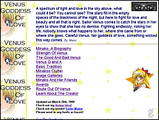
| Ahh..a Venus shrine. I can't say
I'm partial to them, but I think this one will be nice enough. The background
on the main page is very nice, an interesting way to display your title.
The pic of Minako's eyes looks a tad weird in this space, but I do like
little introduction, it gives it a bit of ambience. ^^ I also like the
picture to the side of the links. The links themselves might look nicer
orange, to match the rest of the page, and the same goes for the text.
There's a slightly annoying background midi, but nothing obnoxious.
The biography page is pretty straightforward, again I like the background. The title juts out unnaturally against the background; it might look better as a transparent gif. The pictures are nice but don't blend into the background; the second one also looks a bit distorted. The biography itself is nice, however; a broad view of Minako's history as Sailor V and Sailor Venus. The Strength of Venus page looks better since the pictures blend into the background, and the second one has a nice border around it. The font, however, is way too big. The Good and Bad Venus has the same layout with a moderately large pic that would look better as a transparent gif. I enjoyed reading it, and I also think it's cool that she lived in England. ^^ The Q and A page is something I don't see too often; there could be a bit more to it, but that's ok. Also, I may be wrong about this but didn't Minako wear a bow in her hair because a boy told her it was pretty once? It could've been a rumor, oh well. ^^ The Japanese Tradition page is interesting; I don't quite understand why it's there but interesting nonetheless. Some of it wasn't explained very well, but some of it was new information. The "Minako's Clutter" page was actually a place where Maino gives out an award; I don't know why it's called that from reading the page. The title has a white background, which clashes with the black background of the page...it's really easy to avoid this. The award is transparent, which makes me wonder why the rest of the page doesn't utilize transparent gifs. Oooohhh no, the gallery uses resized images for thumbnails (meaning resized with the HTML width and height attributes, and not with an image editor). What you need to do is make separate small images for each large image so that it doesn't take forever to load; just because you resize something using HTML doesn't make it smaller in file size. ^^;; This is also a very small gallery - I know there have to be more pictures of Venus than that. The Minako and Friends Gallery has the same problem. *_*;; I would also take the MIDI out; it's distracting when you're looking at an image and then returning to the gallery. The links page is very small, it could use a lot more, especially to other Venus shrines, but I do like the banner. ^^ Right now, I think this site's strong point is content. You could write a more elaborate biography, make separate sections on Sailor V and Minako, and put a lot of more stuff into the galleries and links page. You might also integrate tables more often into the layouts, and experiment with transparent gifs. Right now I would say work on what you have. ^^ |