Author: ChibiKris
Review by: Usagi-star
 |
Content: ****
Originality: ***.5 Design/layout: ***.5 Technicality: **** Overall statement: An eloquent, pretty yet somewhat small Usagi shrine that could easily be very large. (The maximum amount of stars is five.) |
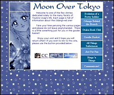
| An entrance page....interesting.
I'm not quite sure what the use of this is, since it only has small stuff
like a tracker and a disclaimer, but it is pretty. Myself, I would add
a border of some sort around the main sqaure so that it doesn't melt into
the background like that. There are some nice graphics on this page, however.
I like the colors, and I really like the title of this site, BTW. :D
Ah! The index page is adorable. Beautiful use of colour (hehe, don't I sound like that painter guy on public television ^^), and everything has a neat, compact look to it. The background is cute, as well. I like this a lot, however I couldn't help noticing that the tracker and the disclaimer could both fit on this page. I also don't quite understand why there's a white line through the middle of the Usagi picture...ah well. It's very cute. ^_^ Anyway, now we go to "Evolution of a Pretty Soldier." We do seem to have a trend of nice titles here. The layout here is simplistic, but the graphics are nice. The thing I would change with the manga picture is the way it goes over the purple line and stops. I would also change the pink color used in the text. ^.^ Taking the link to the "powers" page, we find exactly that: Usagi's powers (gee, who would'a thunk). The colors are sort of random, I might change that. Other than that it's ok. Hey, wow, there's a list of Usagi's "Defining Moments." This page is very thorough and original, also very interesting. I really like it, and doen't overexplain things. Very nice. The "Odango Behind the Brooch" is, as you probably guessed, a page about Usagi. The layout seems a little wide, but it's nothing my 1024x768 screen can't handle (heheh). ^_^ The writing on this page is very eloquent and enjoyable. I do like the "differences and similarities" part (hehe..."She hates English, I teach English"). I would love to see some elaboration here; you could easily make three pages of content out of the information here. Especially the part about Usagi and Mamoru; I like your insights here. Now on to the "Otaku Book Club." This is just a page for products offered by Amazon.com...the font is nice, but the picture is a tad weird. ^_^;; Hmm, what could possibly be in "The Goodie Basket"? Oh, free stuff, I get it. ^_^ The page sort of lacks flair, but the Image Gallery page is nicer. Interesting background. Looks like we have a lot of galleries here. There are only 5 pictures in the Usagi gallery and 6 in the Serenity gallery, but they're all very nice. I might change the Serenity gallery to be two rows of three thumbnails. ^_^ The "senshi" images are pretty, and the Romance gallery is very nice. "Just For Fun" has a very cute layout, I like the red and blue scheme here. I might put the links into a colorful table, just to spice it up a little. The pages here are about the author, and the format tends to be a side-corner or border background setup, with cute pics of Usagi on the sides. This is very cute for some things, but other times it sorta gets old. ^_^;; I think you could be doing more stuff like the layout in "Usagi's Most Defining Moments" or on thr "Chattacon" page or even on the main page, and the graphics on those pages are also very good. The "Communicate" page is cute, I like the colors and the font, but maybe you could devise a table or some cute format to put the image links in, because right now they're just sorta there. ^_^; This page is already quite nice, with no annoying mistakes or javascript (beyond the pop-ups which I had turned off long ago ^^), and I can see the author is quite competent. I think you should expand the informational pages a lot more and make more of a distinction between the Usagi Behind the Brooch page and the Evolution of a Pretty Soldier page; I can tell they're about Usagi's different identities, but it's sort of vague. I also think you could explain Usagi's family, her other identities as Selenity and Princess Serenity, and specific differences between the anime and manga Usagi, since there are a lot. Also, about the design, I'd suggest straying from the side-corner layout so often ^_^;;. After seeing the pretty main page I know you can think of something that is both fresh and pretty. Try putting the text in different places, different types of backgrounds (right side, bottom, etc), things like that. And make sure you always have your color palette handy. ^_^ |