Author: Lunar Brat
Review by: Usagi-star
 |
Content: ***.5
Originality: **.5 Design/layout: ***.5 Technicality: **** Overall statement: A general SM page with plenty of effort and average content/graphics. (The maximum amount of stars is five.) |
| Main Page
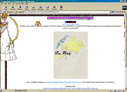
I found it sort of strange that the bgcolor for this page was black when the background image is mainly white. The background image is nice, although somewhat large; you might find it convenient to use an image splicer like Fireworks to splice it and put it into a table. I like the little Usagi cursor (although it seems to have something of a quirk when you do a right-click), and the image map is a nice idea, with the titles flashing as you run the mouse over them, however I'd suggest changing the image used for it into something much more colorful. Please don't put the midi on autostart -_-;; , I'm sure most people don't appreciate that. However, there aren't any big problems with the main page (and I do like it that there's not too much clutter), so we'll move on. Sub-pages
TSSG- The Sailor Senshi Club is next. Pretty nondescript name, but the page is cute and again, no technical errors that I can see. The graphics are sort of splotchy, and again we're missing a title ^^;, but the mouseovers work and they're quite cute. ^_^ Lunrabrat's Adoption Center is next. Looks cute, but...where are the links? Oh! They're the same color as the background. ^_^;; Oops! You're lucky I have a habit of highlighting everything with my mouse, or I wouldn't have seen them at all! ^_^ For some reason, Netscape won't let me see the senshi pictures in this section. -_-;; Might want to take a look at that. Now for fun! What could the "Sailor Moon Super Scroll" possibly be? Hmm...I guess I've never seen this before! It's cute, although I don't understand why the little animated twirly senshi are there, but it's cute. ^_^ We also have a long list of paper dolls - might want to explain how to use them. ^_^ For some reason, I can't get to the Iron Mouse, Sailor Moon and ChibiChibi doll. O.o; Some of these look like they were scanned, and not drawn digitally - if that's the case, you might want to say where they were scanned from. I can't use the puzzle page because I don't have AOL 4.0 ^_^; Also, the text is not visible on this page. Oh dear, same with the colorforms page. Plus, the images are broken. ^_^;; Then we have a silly sort of Sailor Moon Test that works, but... Anyway, the polls page works quite nicely, and so does the emulator page, and luckily all of the links work. Uh-oh...the Free Graphics page doesn't show in Netscape. -_-;; *pulls out MSIE* This page is pretty cute, actually! Although the text could be green to match the background, I like the setup and the clever use of table borders. It's too bad the pages inside don't follow the same format. The graphics in here are cute, actually, although they tend to get a bit splotchy at times. ^_^; But it's the thought that counts, right? ^_^ Just one suggestion...some of them, especially on the "server logos" page, are really big, you might want to resize them. The multimedia page has a bunch of stuff in it...It's all functional, but devoid of any images, layout technique, etc. Nothing wrong with that, actually. There are two separate pages for the mp2s and mp3s, but neither of them has a lot on it...why not just combine the two? Animated gifs? Sounds good, but....ack! They're all smushed on one page, therefore making it take forever to load! Solution: split them into separate pages, separated by character. This is too much for one page and I can hardly tell where some of them start/end. *_*;; Positives
|