Author: Morning Moon
Review by: Chibiusa
 |
Content: **.5
Originality: *** Design/layout: ***** Technicality: ***.5 Overall Grade: ***.5 Overall statement: Beautiful designs, an ultimately lovely page. Definitely eye candy! Recommendations for the Author: Although the layouts are lovely, if you focused a little more on content and structure, your site would quickly rise to the top. (The maximum amount of stars is five.) |
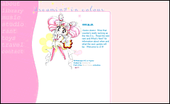
| First impression: Wow. With a capital
W. The Chibimoon-oriented (*grin*) design on the main page is so unbelievably
original and well done, I want to run right up to Morning Moon and give
her a big hug. The colors go so well together, and I adore the yellow sparkles
and flowers. The Chibimoon picture is absolutely adorable, too! Correct
use of java scripts- I applaud you. Please note that this is the same design
as most of the subpages, so unless they have a different design, I won't
mention the layout. Very nice job. The only thing I would recommend you
change is the link graphics on the left hand side. The text color is a
little dark, and it's hard to read. Make it a little lighter, and it would
be awesome. Also, the contact graphic is slightly
smaller than the others, is that on purpose? I noticed that Dreaming in Colour is one in 12 sites in the Moon Circle, run by Usako. The layout on Morning Moon's Moon Circle page is very simple, but nice. I like the title graphic a lot. I might suggest making the links a brighter color, just to bring some umph to the page. I highly reccomend you visit all of these pages: they're all on the rim of being some of the "greats" of the "Sailormoon Community". First section: About. The first part of this section is entitled "poppies", and seems to be a personal page for Morning Moon. Most of this site is insights, and I really don't like to review people's thoughts. But I -will- say that the layout for "poppies" is absolutely gorgeous. No glamour or bright colors, but this layout definitely inspires me. Nice use of the font "chick", the graphics are extremely well done. I especially like the title "Nightbloom". Awards: a simply set up list of awards Dreaming in Colour has one. A few problems here- the first link is broken. Also, with the last award, both links are just to the image, instead of one to the site and the other to the image. Simply fixed, ne? Thankyous: self-explanitory. Only problem: the words are a little overlapped by the title image. What's new?: simple history and updates. No problems, very nice. Why?: Dreaming in Colour's extended history, self-explanitory. How?: a simple list of tools Morning Moon uses to create the page. Very well written. She uses such correct language! "Programme" and "Colour"... I'm green with envy. ^^;; Next big section: Library. This is the information on the senshi section. I must say that I am very, very disappointed with these character sketches. They really only provide basic stats in paragraph form, when I know Morning Moon could do so much more with her writing skills. Also listed are attacks and the meaning of their name, which is semi-creative. Thought and planning is what makes a page unique, and I would really like to see more of that. Next up: Music. Morning Moon has a very large collection of midis, which is organized nicely. It even includes some rarely found samples, such as the Cantonese theme. Well done! Only one of the real audio files is available right now, but the author is willing to email one you may want at any time. The collection is small, but once the rest of the files are up, I'm sure it will be nice. She also directs you to where you can downlaod real player, very smart! Studio: small galleries for each senshi. Nicely organized, but nothing spectacular. There isn't really any pictures I haven't seen before. And for some odd reason, when I click on the Jupiter link, it leads me to Venus. Not that Venus is a bad thing... Also easily fixed. Rant: ooh, I love these things. Blowing off steam is so much fun, am I right? All three of Morning Moon's rants are insightful and fun to read, the newest addressing the fact that so many SM pages are closing down lately. It's a matter that more than one person has attempted to write about, and the author carries this out nicely. Toys: fun stuff! Yay! The thought of the week definitely provides something to think about. Interesting questions, most definitely! I'd like to see some of the responses Morning Moon gets. In the goodies section, she provides some lovely desktop backgrounds that I might just use myself! Very, very nice. I especially the Chibiusa one! ^_- Travel: links, ways to get away from the site. I would organize the links page a little better. First, I'd list all the text links. Then maybe list the buttons 2 by 2, all at once. Then the banners, last. It would the feel of the page a little nicer. No S.T.A.R.? Well, a girl can dream. ^^ Morning Moon also provides some really pretty buttons and banners to link her with. Gosh, I love this girl's graphics. Contact: list of different email addresses and ways to get to Morning Moon. All in all, this is a really impressively designed site. Unfortunately, it's extremely lacking in the content department. If I haden't seen the character profiles and image galleries, I wouldn't have really known it was a Sailormoon site. Buff up the info a little, and girl, you'll have one heck of a site. |