Author: Ummm...couldn't find a name...(we sort of assumed it was a guy, BTW) ^^;
Review by: Chibiusa
 |
Content: ***
Originality: **** Design/layout: ***.5 Technicality: ***.5 Overall statement: A very professional looking, opinionated combo page. |
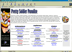
| Main Page
The first thing that strikes me when I see this page is: organization. The author seems to be extremely neat about the way he separates each section, and I like that a lot. The graphics are very professional looking, as is the rest of the site. I like the pillow-embossed text graphics! Oh, and the smaller graphic of ChibiChibi and Eternal Sailormoon is extremely cute, by the way! It brings a nice theme to the page. Sub-Pages
The first section is entitled Personal Opinions. The author provides some fun and extremely original text on what he thinks about the show, and anime in general. They're nicely written and organized. Great job! I'm sure all surfers will have fun reading this section. Next section: Character Info. Wow,
I really like the picture on the little star graphic. Never seen it before,
I don't think! Only two sections of this sub-page are open, but the ones
that are are great. The author provides in-depth information about the
Moon Family and the Outer Senshi, and includes those cute little shape
graphics along the
The news section lets viewers express their opinions on the latest to come out of Sailormoon. Nice idea! The only thing I would reccomend changing is the setup: have the actual news itself on one page, and add a link to a separate page for comments. It would be a lot easier! The Guess Who? section is something that I've seen before, but the author pulls it off without making it seem unoriginal. It's almost like a contest! The form is correctly set up, good job. There's even an archives section of who's won before. I like this a lot... lemme guess! Is it... Professor Tomoe? ^^ Downloads, Penpals, and Pictures are all on hold... just get those up, and you'll be golden! PSP includes a large awards section that I have absolutely no complaints about. I don't like to judge awards sections, unless they're a mess (organizational wise). This one looks fine! Links and banners looks good, as does the questionnaire. That about wraps up the sub-pages! Positives
Things to Fix
Suggestions for the Author
|