Author: Ziggy
Review by: Chibiusa
 |
New Main Page Layout
 |
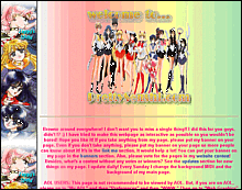
| New main page layout is very nice!
Simple, color-coordinated, depending on which image shows up in the rotating
image in the upper left hand corner. One thing I would get rid of on this
main page is the midi. It gets kind of annoying to some people *ahem* ^^
and they're kind of pointless.
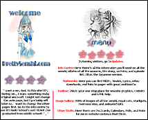
New sub-page layouts are awesome! I really love them. Each one features a different senshi- kind of reminds me of a different site I've seen. I'm really impressed with the vast improvement in all of the layouts- the colors match! It's almost like someone else is designing them. Once again, only changes I would make is to take the midis off. The Quiz still has that wavery look- make it like the others! They're so very nice. Waaaiiiittt a second- after the Cool Stuffs section, all the others look exactly the same. Not done yet, possibly? I hope they'll eventually look the same as the others. The About Ziggy page has changed its look, which I'm glad about. The layout isn't stolen anymore, and Ziggy has really done the best she could to improve since my review. I'm really proud of her! I'm really impressed with the improvements made. Definitely keep it up, Ziggy! |