Author: Andria
Re-Review by: Usagi-star
| Old Main Page Layout
N/A |
New Main Page Layout
|
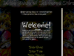
| Mmm....frames. Actually done correctly,
I like. (Not that they were incorrect the first time ^^.) The title is
nice, and the pictures on the side, though I can't tell what they are (^^;;)
give it a nice, dark atmosphere. ^^ Sort of mystical. Anyway, I do like
the stars concept (^_-). On to Star One.
Since you've added the frame on the right everything looks much more balanced. Ah, and I see the links back to the main page don't give me more frames...goood. ^^ Most of the content here is fine, except that I might use the <P ALIGN=JUSTIFY> tag more often rather than centering everything, especially on the introduction page. I like how you're using more than just Times New Roman; keep it up. ^^ Now for Star Two...It might be just me, but the galleries look better. ^^ I'm glad you have discovered separate images as thumbnails, rather than just resizing the picture with HTML. ^^ It's a bit weird that you use Japanese names when you haven't seen the original, but I just notice that a lot. It's also a bit odd that you have Usagi, Rei, and Ami galleries and then a Michiru gallery. ^^ The Rating and Rates thing is interesting, but I might explain it more. Also, it's a long scroller - try tables. ^^ Not much notable on Star Three (I mean that in a good way ^^). The Character descriptions is a nice little section; however I would suggest not writing about the characters you haven't seen. I did that once; it didn't turn out well. Some broken images here as well. The links page is a little empty. ^^ The "Other Links" page was a broken link...and the other pages were nearly empty. Oh, well. The ideas on this site have improved,
like the Star One, etc idea, and the black layout. The frames look tidier,
and I can see an atmosphere forming. The one thing it lacks right now is
coordination; the fonts and colors are random, as well as the sizes. Some
backgrounds are white, and sometimes I'll go to a page and there'll be
nothing there. While it has improved significantly, I see a lot of easy
improvements still waiting to happen.
|