|
|
||||||||||||||||||||||||||||||||||||||
     |
||||||||||||||||||||||||||||||||||||||
|
|
||||||||||||||||||||||||||||||||||||||
|
|
Quick Intro
This section is all about graphic design. I first got interested in computer graphics about five
years ago, when I was came across a 3D rendering program called POV Ray (POV Ray website).
It was and still is an exceptional piece of software, and whats more it is freeware. I also
stumbled upon FractInt (FractInt website), which is used to render various fractal
equations. About this time, I also started learning some graphics programming. As time went on, I
my interest shifted from technology to design . Sometime last year, I started
doing some website design, and it was during this time that I really got interested in graphic
design. As far as graphic design is concerned, I have been seriously studying it only for about
a month. So, here is some of the stuff that I have been able to come up with since then. As can
be expected it is not very professional. Hopefully, with time and practice, things will improve. This Site This site design cannot be said to be mine. I have tried to implement examples of designs that I have seen elsewhere, sometimes with slight modifications. So in that sense the design is not original at all, with bits and pieces drawn from various sources. The cover page has a photograph of myself taken many years ago. The font for Welcome text is Bellevue. The navigation bar is set with Lemuria, a great font for small sizes. The boxes next to the name are done in Wingdings. The text next to my photo is set in Parisian. I like this font and its useful for doing small bits of information. The typeface for the main body text is Ventura. The text is also spaced out a little bit to allow some white space into the text. I feel that the text on most websites is overly cramped, which is neither pleasing on the eye, nor easy to read. With that in mind, I have also created some whitespace margins on the left and right of the main body text. In my opinion, its a lot easier to read small columns of text than text which occupies the whole screen. Design Examples
Here I will list various sites which I think have cool design, or cool graphics / artwork or
something which makes the site interesting. Remember, I am not talking usability here, but
graphics and design. Check out the attik site for some great graphics which have been used in various forms of advertisment.  typo5
typo5
typo5 is a typographic site. Apart from a collection of interesting free and commercial fonts, there is also a great display of grunge artwork. 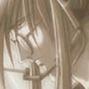 Solace
Solace has an excellent collection of artwork and some great tutorials on anime figure drawing. If you want to learn anime, go here first. Art Work
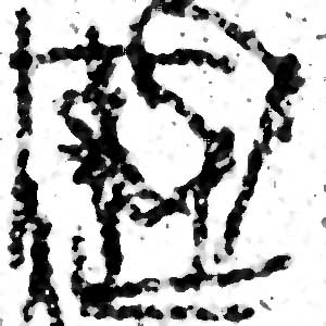
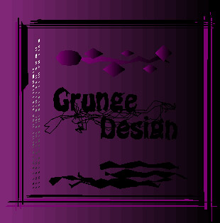
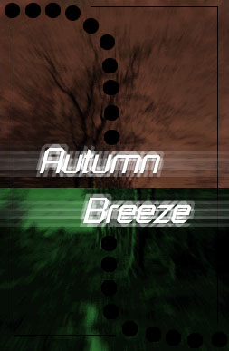
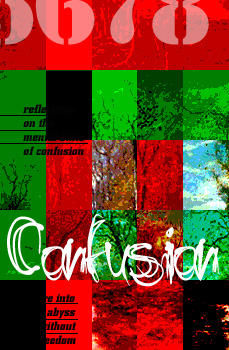
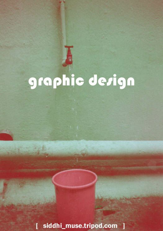
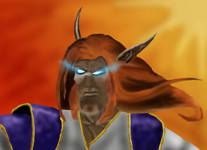
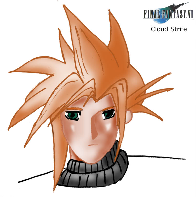
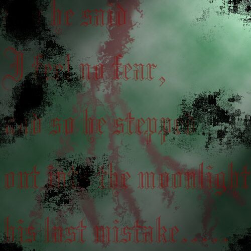
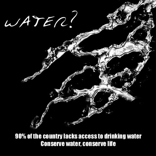
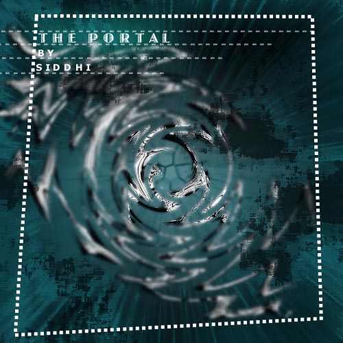
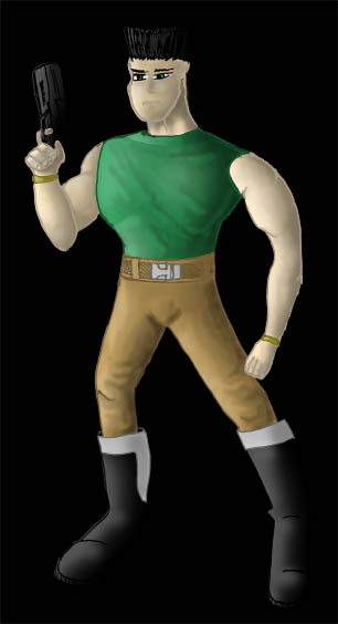
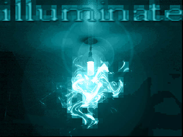
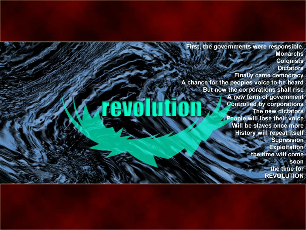
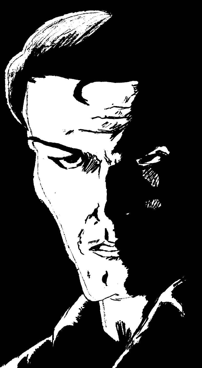
Here is some of my work so far. Some of the images are of the 'untidy' theme that seems to
quite popular (especially with typographers). I am quite awful in drawing, having neglected
art for many years. Therefore I prefer to use photography to give the visuals in the images.
Unfortunately, I dont have too many useful photographs with me, so one of these days I will
have to go out and take some. I am not a professional quality photographer either, so I will
have to work on that too.
Links
These are links to some of my favourite websites on design (and typography) or just sites with
nice design. Even if you cant check out all the sites, I suggest that you visit at least one
site from each category.
|
|
||||||||||||||||||||||||||||||||||||