 |
 |
| Not Textured | Textured |
You spend hours creating your
SCURK masterpiece. You ruin your eyesight carefully drawing in the edges,
shapes, shadows, details. You redefine the term "obsessive- compulsive"
as you try to choose between 4 identical shades of brown from the color
palette. And yet, when you finish, something still isn't quite right....your
buildings look flat, childish, blocky. Your building lacks realism.
What went wrong? What's missing? The answer is usually one simple thing
- texture.
|
|
| Not Textured | Textured |

Some of this is caused by the inadequacies of digital
rendering techniques, but most of it is because in real life no surface
is just ONE color...there are many variations which our eyes go and unconsciously
blend together so we perceive only one color. Translating this into SCURK
technique, I try never to have two pixels of the same exact color next
to each other. Of course, never is an exaggeration, but I do try
and break things up as much as I can.
Let's draw a supposedly "blank" wall. Lets say, for instance,
that it is a brown color. At the very least, you should take the next shade
down (lighter) of brown and randomly draw some pixels on the wall (covering
about 25% of the wall) and the next shade up (darker) and randomly draw
some more (covering 25%). That way you'll have 50% base color, 25% a bit
lighter, 25% a bit darker:
 |
Zoomed-in brown wall. Ok, so the texture pixels aren't drawn on completely at random - I usually go back over my random stippling and break up any clumps of too much of any one color. |
 |
| Simple really! |

You'll notice that some of the textures are very complex,
they use complementary colors (see my color
web page) to get their effect. Most of the time you don't want too much
contrast in a texture (therefore only go up or down one shade), but if
the wall that you are drawing actually does have some texture in it (stucco
or varicolored brick), then you can add more contrast, either through varying
shades or using complementary colors:
 |
Lotsa texture detail...have fun! |  |
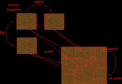
Of course, you can and should use textures even to do walls that are not "blank." Lets say you have a facade with a pattern of windows on it. Adding texture to the wall "behind" the windows will add life to the entire building as well as depth to the windows themselves, all it takes is a little more cutting and pasting:

I created my initial "texture template" by copying and combining little pieces of wall from the original image of the building - you have to be careful with this method because some of the colors in the original could translate to "animated" colors in the SCURK palette, you'll have to edit these colors out later. Of course, I could have just drawn it freehand, using a selection of colors from the original wall or just picking and choosing from the color palette, being careful not to pick any "animated" colors." Whichever method you choose, the next step is to build a textured "wall" using the copy and paste methods described above. Next you take your mono-colored wall with windows and select just the windows and then copy them. It's easiest to do this with Paint Shop Pro or any other good graphics editor (use the magic wand select tool to select the background then invert the selection), but you can do it in DosSCURK by using the "blank" color to erase the background color and then select. Of course, if you are using WinSCURK, then you are hosed....get DosSCURK or PSP. Now its a simple matter of pasting your selection onto the textured wall, cutting out the resulting wall at the correct angle for your perspective, and then incorporating the new, textured facade in your building:
Naturally, if you are using a textured wall on one side of your building, you will want a textured wall on the other side of your building (except for the exceptions, of course). How do I make a complex, textured wall that is a few shades darker for the shaded side of my building? Two choices: Using SCURK itself, there is the hard way, replacing each pixel by hand with a darker shade , do it on a small "texture template" only and then use the usual methods to build the rest of the wall; or, Using PSP or any other editor, the easy way, just go to the "adjust brightness/contrast" menu item and adjust the shade, (-5) is usually about right (as always, watch out for "animated" colors!).
To further complicate matters, I often try to texture
a wall so that it is lighter at the top and darker
at the bottom (for obvious reasons). Again, this is a rather easy to do,
just do the normal "stippling" technique in bands that get darker as you
work your way down:
 |
If you are using a 3-shade texture like in the example, all you have to do is fill the entire wall in the first shade, freckle the top with +1 shade, and then make a random line of +1 shade about 1/3 of the way down (of course, the line should kinda slope off in the direction of the perspective horizon, not be straight across, like in the example). Use the fill tool to fill in +1 shade below the line, and then freckle some of the original shade below the line. Last, go to +2 shade, freckle some on below the line (even a bit above, if you want) and then do the same thing - make another random line further down, fill below and then freckle some +1 shade onto the +2 area. Of course, if you are using a complex texture (with complimentary colors, etc.) it gets more complicated....use PSP!

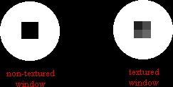
Overall, texturing is a pretty simple technique, if you do it step-by-step. The most important part is frequently checking your work (by zooming out to normal magnification view) to make sure that everything still looks good. The mistake that I most often make is to use too much or too little contrast in my texture. Too little contrast and you don't see the texture at all. Too much contrast can also be a disaster - unless you intend it to look that way! Be especially careful if the wall that you are texturing has windows or other details on it. Make sure to use very little contrast in your texture so as not to mess up these details - the details have to contrast A LOT from the texture. As long as we are on the subject of windows, you should always make sure that your windows have more then one shade in them, if not they look like one-dimensional black holes, or worse yet, like panels:
For instance, when I make a regular 2x2 window, I make the top left hand pixel very dark, the top right hand +1 lighter, the bottom left +1 lighter from that, and the bottom right +1 lighter from that (+3 from the first pixel!). The reason is that the inside of the window ledge will cast the deepest shadow on the top left corner of the window. I often vary this formula, but any way you do it, you want to give the impression of shadow and light being cast on and reflected by the window, if not they look lifeless. Doors work the same way, of course. Take a refresher look at my shadow page.
One last observation about texture: as a rule don't use
a regular-patterned texture! keep it random. Of course there are exceptions...when
the building actually does have a regular patterned texture, as brickwork
often does....over an area broken up by a lot of contrasting details (windows
for instance) so that you can't see the entire pattern....or just to make
a building stand out a little bit in a subtle way (sounds strange but it
works, if you have a lot of random-textured buildings, one that is regular
textured will stand out but not "like a sore thumb"). I DO use regular
textures for horizontal surfaces - rooftops and pavement. Why? because
this way it stands out from the randomly-patterned vertical surfaces and
because pavement, especially, usually does have a patterned texture.
 |
Notice how the little patch of pattern-textured roof up top and the pattern-textured green roofs at the bottom contrast with the complex textures in the rest of the tile. |
 |
 |
 |
| saci@voicenet.com |