 |
|
I'm a kid at heart - when I got my first color video card
(a Hercules??) and opened up the paint program, I felt like a kid with
a box of crayons or a watercolor set. SVGA was even better, of course,
and being able to take my usually aimless doodling and create a city is
the best of all! So let's look at SCURK's color palette like a big box
of crayons - this is after all a "software toy."
|
|
 |
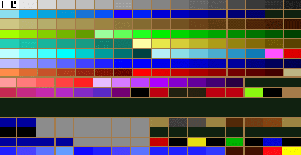
This is the DosSCURK palette. Looks like 192 colors, but I think there is some repetition... |
| WinSCURK palette sorted by hue | DosSCURK palette sorted by hue |
 |
 |
| (The white squares show how many colors are "missing") | (note that not all of these color squares are unique) |
First of all, think about the colors of the buildings
in your city or town. Unless you live in Disney World or the Aegean Islands,
greys, browns, and earth tones predominate. Also there is some red (mostly
bricks), blue (mostly windows), and green (vegetation). Fortunately, those
are the colors that predominate the palette - a whole range of greys, browns,
greens, reds, and blues (too bad the ranges aren't better organized in
the actual palette). For the most part you'll want to use the darker
tones within these color ranges. Real cities just aren't all that bright.
 |
Ranges of color |
| White | Walls, Highlights | |
| Black | Windows, "Glass Box"-type buildings | |
| Grays | Walls, Highlight for Windows, Rooftops | |
| Browns, Tans | Walls, Bricks, Rooftops | |
| Reds | Brick walls, Roofs | |
| Blues, Blue-Greens | Windows, "Glass Box"-type buildings | |
| Greens | Vegetation, Rooftops | |
| Yellows | Highlights |
For now, let's concentrate on the relationships between the color ranges. Although they are badly organized, you can still see that the various ranges complement each other. By being aware of the similarities between the color ranges, you can pick a color from a complementary range when you need an effect - blending two areas of color together, adding subtle shading, adding texture, making a gradient, whatever you need. In the diagram below, I try to show how the color ranges are related - the long red arrows link complementary color ranges. Pay close attention to the relationship between the main ranges of grey, brown, and blue which are related especially closely - the short red arrows link individual complementary colors:

As you can see, you can start working with a color from one range and then easily jump to a related color in another range. This works especially well the greys and the browns and blues, you can pick almost any color in the brown or blue range and find a grey that matches it, and vice-versa. This technique of using a closely related color is a powerful tool in overcoming the limitations of the color palette. You don't have a very wide range of any one color, but by using the related color you can extend the range, and thereby give greater apparent detail to your buildings.
Now I'm going to throw in two disclaimers. ;-) The first is pretty obvious - the above "color chart" is by no means exact, I did it "by eye." Once again, it's really just a guide to give you some ideas when you are SCURKing. Second is that the effects of mixing colors are rather subtle and not to be applied as large areas. Rather, they work best when you mix a few pixels of each complementing color:

Here's another subtle technique. Besides the main color
ranges there is a entire range of "lights" and "darks" - the colors at
the beginning and end of each range. The colors at the "dark end" of the
different color ranges are pretty much all alike - almost black. You can
use them almost interchangeably. Let's look at the color palette again.
Notice that there is a group of colors that are almost indistinguishable
from "pure black," and a group of colors that are very dark, but still
have a bit of individual color to them. You can use
the "almost black" colors wherever you would use pure black but don't want
as much contrast or need a bit of "blending"- for instance a very dark
shadow on a light wall. Likewise you'd use one of the "very dark" colors
wherever you need to blend from a definite color to black.
| "Pure Black" |  |
orange:
very dark, still has some color
red: almost black |
| orange:
very light, still has some color
red: almost white |
 |
"Pure White" |
Again, the actual usage of this technique is very subtle. In the example below, I am contrasting green to orange in the building on the right-hand corner, so I use a very dark green in place of black in the windows. On the left side, for the white walls I use both white and an off-white in order to give the wall some texture:

 |
 |
 |
Note for DosSCURK users: There is a "false" color on the DOS color palette. Immediately following the main range of greys in the middle of the table there is a range of colors that go from brown to a greenish-brown (olive). The very first color (darkest in this range), which comes right after the last (darkest) grey, is a slightly greenish brown.

When you draw a pixel with that color it will look O.K. in all the SCURK views but is a bright bilious green in the main SimCity 2000 program. Don't use it! It's about the same color as the old-fashioned "green-screen" terminals used to use for text - awful. Somebody made a little programming error... Anyway, that is the only "bug" in the color palette that I know of, and it may be just on my computers (I'm using various ATI video boards, but Lee Sojot tells me he's seen the same bug). Please write me if you know of any other SCURK bugs.
| saci@voicenet.com |