Contrast
Contrast - the difference between light and dark shades
- is a key element in making a object that you draw look three-dimensional
instead of flat. Without contrast, your buildings are going to look like
cartoon outlines. With contrast, your buildings will have definition, detail,
and depth. Here are two examples of what a difference
good use of contrast can make (for once, they're not my own SCURKs...):
 |
I deliberately "defaced" an early Joel Garcia
tile to show you what happens when you don't use contrast correctly. Even
though the facade of this building is very interesting and complex, it
comes out as a washed-out mush because of lack of contrast. At the bottom,
the entrance-way looks cartoonish because there is no blending between
colors to make the door look detailed. Joel's actual tiles are much,
much better than this, take a look at his New
York tileset. If you want to see this tile before I messed with it,
click
here. |
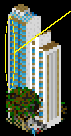
| This is the SHIROKIYA DEPARTMENT STORE, Tokyo,
SCURKed by Lee Sojot.
Notice the complex roof line, the cylinder, dome, and cone that make up
the corner tower, and his effective detailing. Lee's excellent use of contrast
makes these features stand out. Contrast makes Clarity. |
 |
What is the main "technical" difference between these
two images? On my previous page on shade,
we introduced the "Rule of Three," you need at least a 3-shade difference
in order to have contrast. Lee's department store follows the rule, my
messed-up tile doesn't. Notice that not only does Lee use use the "Rule
of Three" to decide which colors to use on the shaded side of the building
and around the bend of the corner tower (where he gradually bends shades
to fool the eye into seeing rounded shapes), but he also goes to lighter
shades for the flags which jut out over the entranceway at the bottom of
the corner tower and for the line over the ground-floor windows. Below
is my analysis of the corner tower of Lee's building. Of course, I don't
know exactly what was going through Lee's head as he was SCURKing this....my
analysis just looks at how the different shades of grey work together to
clearly define the complex detail of this tower:
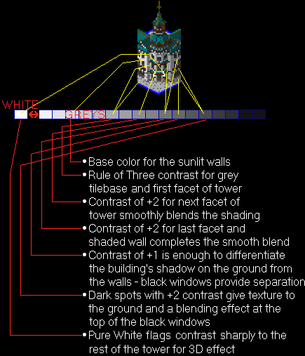
As you can see, the "Rule of Three," is not meant to
strictly dictate what the difference should be between adjoining surfaces,
but rather it's a guide for what shades you can use. Lee uses a +3 contrast
or even more when he wants to sharply delineate two surfaces but he uses
less when he wants to create a smooth blend, like in the different facets
of the tower. Notice also that Lee uses a shade very close to black for
the shadowed part of the dome and the steeple. Black helps to outline and
define shapes. Another especially important detail is the way that Lee
uses white for the flags over the entranceway. The flags are drawn with
only 10 pixels but look like they jut out from the rest of the building.
These same guidelines apply well to anything else that
you are SCURKing. Keep careful track of the relative
shades you are using. Use +3 or more contrast when you want to show
a sharp difference between surfaces, and +1 or +2 for a blend such as in
a curved surface. Do not be afraid to use pure black (or one of its
equivalent shades). However, be sure to use it sensibly - as
a very dark shadow or the last color in a blend of shades - otherwise your
drawing will look cartoonish. As always, these are just guidelines, but
by keeping track of the differences between shades you'll be effectively
employing contrast to give definition.

|
Careful use of contrast helps define the multiple facets
of the building, as well as the rooftop and window details. As you can
see, using black can be effective. |
The manner in which contrast aids detail and depth is
more complex. Small details (such as Lee's flags) can be made to stand
out by using a high contrast, especially when you use brighter shades for
the detail against a dark background. This happens because brighter shades
actually appear bigger - look at the two dots in the circle below:
 which dot looks bigger?
Both dots are only one pixel big, but the one on the left
looks bigger. In general, any small detail that you draw in a lighter shade
than the surrounding surfaces will appear bigger than it really is (how
much lighter? use the Rule of Three...). So Lee's white flags appear bigger
than they really are, therefore they look like they are closer to the viewer
(remember the rules of perspective),
fooling the eye into seeing 3-D. I use the same technique for the balconies
in the building below:
 |
White balconies
jut out from shaded side of the building |
Strictly speaking, the balconies should be progressively
darker from left to right because they are on the shaded side of the building.
However, by making them very light, I get the same 3-D effect as in Lee's
department store. Darker details also give an
impression of depth, especially since any indentations in a building are
naturally shadowed. As I wrote before, contrast
gives depth.
 The light on dark contrast has other uses also. You might
exaggerate the brightness of an object purely avoid that it gets lost in
the shadows:
The light on dark contrast has other uses also. You might
exaggerate the brightness of an object purely avoid that it gets lost in
the shadows:
|
|
Original Size |
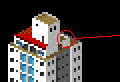 |
Notice how light
the back edge of this ledge is in comparison to it's surroundings |

|
Again, strictly speaking, the back edge of the ledge
behind the rooftop tower should be very dark because it is in shadow. However,
if I drew it with the correct dark shade, it would "disappear" into the
dark rooftop:
 Instead, I made it very light in relation to it's surroundings
so that this small little ledge is now a distinctive feature. I did not
use "Pure White," as it would be too overpowering, but rather one of the
lighter greys which is just right. As usual, I used the "Rule of Three"
and some experimenting to chose the right shade - the ledge is -3 from
the wall of the roof tower. This is yet another example of contrast
giving definition.
Instead, I made it very light in relation to it's surroundings
so that this small little ledge is now a distinctive feature. I did not
use "Pure White," as it would be too overpowering, but rather one of the
lighter greys which is just right. As usual, I used the "Rule of Three"
and some experimenting to chose the right shade - the ledge is -3 from
the wall of the roof tower. This is yet another example of contrast
giving definition.
By drawing a much lighter shade around a darker
object - highlighting - you can make the dark object look a bit smaller,
even though you haven't changed the color of the object itself. Look at
the row of windows on the stairwell tower on the small office building
below:

These windows are long, thin slits in the wall. However,
due to the size of the building, I have only two pixels to work with -
at best I'd get a rectangular window. I need to get each black window pixel
look like it is only about half a pixel high. How do I do this? Under each
window (the lower ones are somewhat obscured by the palm tree), I colored
the wall white instead of the pre-dominant light-greys. The result is to
make this piece of wall, the "windowsill," look bigger than it really is
(brighter is bigger) and kind of "squeeze" the window above it to look
narrower and longer. Note that in the figures below that this effect is
really only noticeable in the original size view, where the pixels all
kind of blend together:
|
2x zoom |
Original Size
|
|
| With white lines under windows |

|

|
White lines emphasize "windowsills," make the windows
look thinner |
| Without white lines under windows |

|

|
"Normal size" windows |
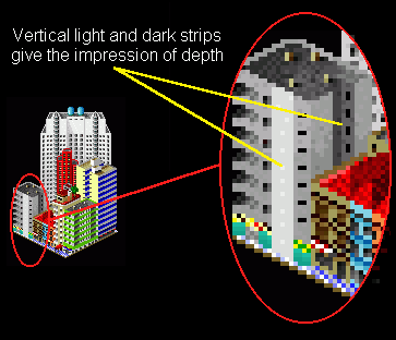
Dark areas (such as shadows) drawn next to light areas
have a similar effect - the light areas look bigger. In the tile below,
I have only a one-pixel wide vertical strip on the darker building on the
left to represent the part of the front wall that is not windows. I need
to visually widen this strip so that it looks about 1.5 pixels wide, but
I can't make the strip any lighter because then there would not be enough
contrast in relationship to the left-hand building (I'd lose definition).
To solve this problem, instead of exaggerating the brightness of the vertical
strip, I exaggerate the darkness of the shadow next to it, thereby making
the vertical strip of wall appear wider:
|
Original size
|
Zoomed-in
|
|

|
 |
Dark blue strip exaggerates size
of grey wall to the left. notice that the lighter building to the right
uses the same dark-against light technique for the left wall. Of course,
in both cases, the dark strips are also simply shadows of their respective
walls. |
Note that these effects that I've outlined work because
of contrast, not brightness. In other words, a white pixel looks big not
because it is so bright but because it contrasts so much in relation to
the pixels around it. A very dark pixel will not look correspondingly small.
It will also appear to be bigger because it is distinct, the viewer can
see it more clearly than if there were less contrast. Once again, look
at the two dots in the circle below:
 Which
dot looks bigger?
Which
dot looks bigger?
Again, both dots are only one pixel but the dot on the
left looks bigger, even though it's "pure black"! So you can get some of
the same detail effects with very dark shades that you can with very light
shades - the key element is high contrast.
Below is a fragment of a building that I've drawn three
times, once with low contrast windows, once with high contrast windows,
and once with "blended" windows. Note the apparent sizes of the rows of
windows on both sides of the building:
|
Low contrast
|
High contrast
|
"Blended"
|

|

|

|
The low contrast windows look small or even non-existent
(even though some of them are six pixels big!); the high contrast windows
are distinct, but sometimes they appear too large, especially in the upper
right row of windows and the two windows on the rooftop tower. The solution
is to to "blend" the windows, using high contrast (black) to define the
window size and then lower contrast to avoid a big blotch of a window.
Here is a close-up view so you can see exactly what I did:

|
I drew the black pixels in where the shadow would naturally
fall. Remember, black must be used sensibly to be effective. The lightest
grey that I used in the windows is the same shade that I used in my "low-contrast"
example above. By blending from high to low contrast, I've got the benefits
of both techniques without the disadvantages. This technique is particularly
effective when SCURKing windows. |
These techniques of exaggerating contrast allow you to
overcome the chief limitation of SCURK - pixelation.
You don't have to be stuck with blocky, pixelated details. Many times while
SCURKing, especially if you are working from a photo, you will want to
draw something that is "just a little bit" bigger or smaller than a pixel.
By carefully controlling the contrast, you can get "half pixels," and can
make the details appear any size that you want. A low contrast-pixel looks
smaller than it really is, and a high-contrast pixel (especially a brightly-colored
one) looks larger than it really is. Combining the two, as I did in the
example above, you can modulate the apparent size of your details.
I use this technique a lot. ;-)
 Choosing which exact shade to use in the "blend" is,
as usual, a matter of trial and error. As a guideline, I count how many
shades are between the detail that I want to blend and the base color of
the surface behind it (i.e. between a window and the wall) and then I divide
by two. This "halfway shade" is my guideline to start experimenting and
will appear to be about "half a pixel" wide - I use a lighter shade if
I want a smaller apparent pixel and darker if I want a larger apparent
pixel. On the building below, I wanted to make the small windows on the
extreme ends of the sunlit facade a little bit longer (up and down direction).
The windows are actually drawn with only 1 pixel,but I used a blend with
the wall to make each window appear to be 1.5 pixels long. Note that these
windows are actually a dark blue, but as I illustrated on the page on color,
this shade of blue has a corresponding shade of grey on the color palette.
The base shade and the detail shade are 16 apart, so my "halfway shade"
is +8, but I felt that +8 was too dark so I used +4. I did something similar
on the roof detail, so that the roof would look like it has a slant to
it:
Choosing which exact shade to use in the "blend" is,
as usual, a matter of trial and error. As a guideline, I count how many
shades are between the detail that I want to blend and the base color of
the surface behind it (i.e. between a window and the wall) and then I divide
by two. This "halfway shade" is my guideline to start experimenting and
will appear to be about "half a pixel" wide - I use a lighter shade if
I want a smaller apparent pixel and darker if I want a larger apparent
pixel. On the building below, I wanted to make the small windows on the
extreme ends of the sunlit facade a little bit longer (up and down direction).
The windows are actually drawn with only 1 pixel,but I used a blend with
the wall to make each window appear to be 1.5 pixels long. Note that these
windows are actually a dark blue, but as I illustrated on the page on color,
this shade of blue has a corresponding shade of grey on the color palette.
The base shade and the detail shade are 16 apart, so my "halfway shade"
is +8, but I felt that +8 was too dark so I used +4. I did something similar
on the roof detail, so that the roof would look like it has a slant to
it:
 Do all windows and details have to be blended? Of course
not! I only use these effects when I want to fool the viewer's eye into
seeing a little bit more than is actually there in the pixels.
Do all windows and details have to be blended? Of course
not! I only use these effects when I want to fool the viewer's eye into
seeing a little bit more than is actually there in the pixels.
Phew! I'm finally done this contrast page... since there
is a lot of material here, I'm going to give you a quick summary (at the
risk of repeating myself (again)):
-
Contrast is the difference in shade between the different
colors that you use in SCURKing a tile
-
Contrast gives clarity
-
Contrast is crucial for:
-
Definition
-
Use the Rule of Three to judge how much contrast you need
between surfaces of a building
-
Use +3 or more contrast between the sunlit and shaded sides
of a building
-
Use +1 or +2 to represent a curving wall
-
See my page on shadows
-
Do not be afraid to use black to define spaces
-
Use black where it makes sense - as a very dark shadow or
the last color in a blend of shades
-
Detail
-
High contrast makes details clearer
-
High contrast makes details appear bigger, especially if
you use a brighter shade (such as pure white)
-
A bright area next to a dark detail will "squeeze" the detail,
making it appear smaller
-
A dark area next to a light detail will "expand" the detail,
making it appear bigger
-
"Blended" contrast allows you to "fool the eye" into seeing
a fraction of a pixel
-
Use the "halfway shade" as your guideline for which shade
to use for blending
-
Use a shade that is lighter than the "halfway shade" for
a smaller apparent fraction of a pixel
-
Use a shade that is darker than the "halfway shade" for a
larger apparent fraction of a pixel
-
Depth
-
Light shades appear to jut forward towards the viewer
-
Dark shades appear to recede away from the viewer, making
indentations in the building
Overall, the proper use of contrast is
one of your most effective tools in making realistic images with SCURK.

