Anti-Aliasing
One of the most annoying limitations of SCURK is that
all diagonal lines and curves come out jagged when you draw them because
of pixel
limitations. I call this effect "jaggediness,"
but there is a real computer-graphics name for it - aliasing. The computer
screen cannot make an exact representation of a diagonal line or curve
so it uses the closest available pixels as "aliases." Fortunately, there
is a cure for the "jaggies," a technique called anti-aliasing:
|
Tower with aliased windows
|
Tower with anti-aliased windows
|

|

|
The technique is fairly simple - just like using
"contrast
blending" to change the apparent size of details, you can use a medium
contrast shade to fill in the jags:
 As in "contrast blending," the actual shade that I choose
for anti-aliasing is chosen by eye. Generally, a +4 or +5 contrast from
the background color (in the above example, the background color is white)
works pretty well. You have to be careful because a darker shade
usually has some definition of its own (would contrast too much with the
background color), and would thereby also be "jaggy":
 Anti-aliasing with too much contrast!
Another method of anti-aliasing is extending the "contrast
blending" over several pixels, not just the pixel that is right in the
corner of the "jag." This method takes more work, but it has the advantage
of giving you a smoother blend:
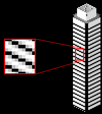 Extended anti-aliasing
Again, you have to be careful not to overdo the amount
of contrast. The extra "blended" pixels tend to darken the apparent shade
of the background color. Also, when you are drawing rows of windows like
in the example, the "blended" pixels from one row touch diagonally with
those of the next row. That may cause come unwanted effects, the only way
to know for sure is trial-and-error.
You'll notice that in the above examples I was leaving
the windows (black pixels) alone and blending pixels into the background
color (white pixels). For other anti-alias applications, you may want to
blend both ways, blending a pixel or two of the darker color and a pixel
or two of the lighter color:

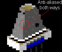
Joins between sloping walls, like in the truncated
pyramid above, are especially hard to draw and need good anti-aliasing.
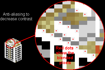
Sometimes, you also may want to blend only the pixels that are inside the
line that needs to be anti-aliased. For instance, you may have a large,
light-colored wall and you need to eliminated the "jaggediness" where the
wall meets the rooftop. Drawing blended pixels on the rooftop would look
wrong, because the roof is at a totally different angle from the wall and
because the roof has its own texture
that you do not want to interfere with. A solution to this problem to draw
blended pixels only on the wall. This way you are cutting down on the contrast
of the jags, making them less obvious:

In the example above, notice that I did not anti-alias
the dark grey lines at the top of the rooftop structures. I left them "jaggedy"
on purpose so that they stand out. Overall, anti-aliasing is yet another
way of controlling contrast. As always, you have to use trial-and error
to decide when to use it and when not to. Eventually you just get a "feel"
for it, but for now some simple guidelines are:
-
Long, straight windows need to be anti-aliased
-
When you have sudden breaks in a line (such as on the walls
of a pyramid) you may want to anti-alias it
-
When a vertical surface meets a horizontal surface (such
as a wall with the rooftop), and there is a lot of contrast between them
(there usually is...), you may want to anti-alias the join
-
Horizontal stripes across a wall need to be anti-aliased
-
Sometimes you may want to deliberately leave some lines aliased
so that they stand out better
Also, be sure to zoom out often to look at your work overall
when you are anti-aliasing. This drawing technique must be carefully fitted
into your structure as a whole.


 Anti-aliasing with too much contrast!
 Extended anti-aliasing