Walls
Walls are basically simple - big blank slates on which
you can draw windows, doors, and limitless details. The tricky part is
where your walls join - getting the angles right. To start with, let's
examine a basic wall, based on a "normal" 2x1 line, where it joins another
2x1 wall. This is what you usually will be drawing
at the near corner of your buildings, so it's a pretty important feature,
leading the eye to the rest of the building. Thanks to pixelation,
there are twelve different ways you can make this join, depending on whether
you use one or both pixels of the last segment of 2x1 line, and also on
which side of the join you draw "higher":
| Sunlit side higher |
Both sides equal |
Shaded side higher |
|
 |
 |
 |
2 pixel sunlit side,
2 pixel shaded side |
 |
 |
 |
1 pixel sunlit side,
1 pixel shaded side |
 |
 |
 |
2 pixel sunlit side,
1 pixel shaded side |
 |
 |
 |
1 pixel sunlit side, 2 pixel shaded side |
Which of these joins you use is generally
not a conscious decision, but rather the result of what fits in with the
window pattern that you are using and the detailing around the roof and
ground lines. Whether or not the join looks good depends on what colors
you are using and how much contrast there is between the two sides. For
instance, the join where you use two pixels on both sides of the join and
both sides are at the same height looks acceptable with high contrast,
as in the example above, but looks like a flattened corner if you have
low contrast, because the eye sees the corner as a 4-pixel wide strip instead
of as an angle:

Likewise, if you use one of the joins where a 1 pixel
side meets a 2 pixel side at an uneven height, then you
could wind up with an angle that looks too sharp, especially if you are
left with one lone pixel inside the angle at the near corner of the roof:

In both these cases, the effect is not necessarily "wrong"
- it all depends on what you are trying to create. The important thing
is to be aware that the exact placement of the two sides in a corner can
be crucial. If you are not satisfied with the results you get, you can
try simply shifting one of the two sides up or down a pixel or subtracting/adding
one pixel-width of wall to either side and come up with a whole new corner.
"Tweaking" the join will also allow you to add or subtract a little space
from the rooftop as necessary:
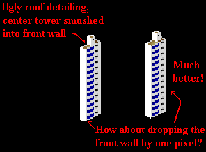
Another important point to remember is that if the top
of your wall uses a certain kind of join, then the bottom of the same wall
should use the same kind of join, especially if the wall is a short one:
 Same
join!
If you do decide to make the top and bottom join different,
then make sure that there is some kind of detailing, or even a tree, to
break up the line between the top and bottom of the building so the viewer
does not notice the discrepancy:
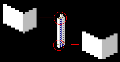 In the example above, the small brown ledge above the ground
floor distracts the eye from the fact that the top and bottom of the wall
have different joins. Having the joins match becomes far more important
and far more difficult for smaller structures (10 pixels or less in height).
I'll explore the ins and outs of small structures in my page on details.

If all buildings were just big rectangular boxes, SCURK
(and architecture in general) would be very boring (look at what they built
in New York City in the 60's and 70's). Fortunately, real buildings are
full of angles and corners. Modeling those angles is half the fun of SCURK.
If you can "build" a 3-dimensional visualization of your building in your
mind, then transferring it to the computer screen is rather easy. If not,
you just have to be extra careful as you follow the zigs and zags of the
building's surface while drawing it in SCURK. Most angles in real life
actually are at 90 degrees, so the joining techniques that I outlined above
work very well. However, you're not always going to see the join at a neat
45 degree perspective and there are often as many "inside corners" as there
are "outside corners."
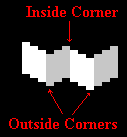 Fortunately, the general "rule of thumb" for drawing
these ins and outs is simple: draw a 2x1 line going downwards (from left
to right) when the wall is coming towards you, and going upwards when the
wall is going away from you:

Pretty obvious, right? Well, it is. The only part that
can be difficult is what happens when one wall obscures ("hides") another.
Let's continue drawing the wall in the previous example to make a "T-shaped"
building:
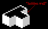 How did I determine where to put the "hidden
wall"? As usual, a little bit "by eye" and a little by method. The crucial
part for this building is determining where to put the left-most pixel
of the hidden wall in relation to the line of the rooftop:
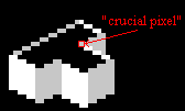
For a "baseline" on where to place this pixel, look at
the corresponding wall join (the inside corner) on the other side of the
leg of the "T". Looking from left to right (from the "away" wall to the
"towards" wall"), the join goes over one and down one. So, logically, the
same join on the hidden wall side should go one up and one back:
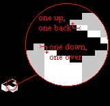 After placing the crucial pixel, it's just a matter of counting.
The "away" wall on the left goes 6 pixels over in a 2x1 diagonal and is
7 pixels high, so for the "hidden wall, you continue drawing the 2x1 diagonal
for 6 pixels (or as far as you want if you're drawing an asymmetrical building)
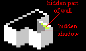
and drop the wall down 7 pixels. Of course, you won''t be able to draw
the full 7 pixels down, the front wall hides the full depth of the "hidden
wall," so just stop when it reaches the roof line. Note that since the
roof line is a 2x1 line and the shadow that it casts on the hidden wall
is a 1x1 line, this shadow is also hidden (remember, shadows are cast a
a 45 degree angle - a 1x1 line - see my shadow
page). There's no need to try and draw this shadow, the visible part
of the hidden wall is entirely sunlit:
Shifting the "crucial pixel" over even by one changes
the building quite a bit (remember every pixel
is crucial!). And often you will want to shift this pixel deliberately,
in order to make your building look better. In this particular case, I
think that the leg of the "T" looks wrong... it looks as if it is lower
than the base of the "T", as if that entire wing was built shorter. The
solution is simple - shift the "crucial pixel":
 |
 |
 |
| Any of
these shifts work well |
Notice that in the left-hand example I simply drew the "crucial
pixel" one up from the last pixel of the roof line; in the center example
I drew it exactly on the same pixel (which meant that the first two roof
line pixels of the "hidden wall" are also hidden - be careful to subtract
two pixels from the length of the 2x1 diagonal); and in the right-hand
example I drew the crucial pixel one up and one over. In this last example,
by starting the "hidden wall" so far over, I wound up having the end of
the wall fall exactly on the same vertical as the end of the front wall,
so I had to "cheat" in order to make these walls distinct. I did two things
to differentiate the walls - first I made the hidden wall +1 darker (enough
to suggest some differentiation but not so much that it would look like
a shadow), then I drew in some +3 contrast pixels starting right where
the two greyish walls apparently meet, suggesting a shadow. As I wrote
up above, this shadow is actually hidden (it should be a 1x1 line), but
I needed it in order to separate the greys, so I "cheated." So sue me.
Funnily enough, this last example is actually the most "accurate"
of the versions of the T-shaped building, as you'll see below.
By now you may be asking yourself, do I really need to
obsessively count every single pixel in every line when I'm SCURKing? Well,
you don't, not really. Heck, I don't (although it may seem like I do after
everything I've written up to now). You do need to be very aware and very
careful about what you do in the corners, at the joins. After you get some
experience in SCURKing, you just draw what "looks" or "feels" right, but
at the beginning you'll find it's a big help to count your pixels...."OK,
so I went one pixel up and one over on this side of the building, so I
should go one down and one back over here..." Once you get that corner,
the "crucial pixel," right, then the rest of the wall pretty much falls
into place.
Nevertheless, I myself often get lost and don't know where
to start or end a particular wall. Here's where I use a modification of
the wireframe technique that really helps in placing walls (wireframe is
when you drawn only the outline of a wall). Let's look again at my T-shaped
building:
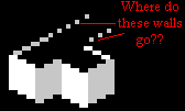 Rather than try and count pixels, just continue drawing the
roofline of the wall on the left-hand side of the building over across
the "top" of the leg of the "T":

I often draw the wireframe "guideline" in a completely
different color (pink is a good choice) in order to keep it distinct, so
that I know that it is a guideline and not an actual part of the building.
Now that I have the guideline drawn I can complete the wall in one of two
ways. I can count over 6 pixels same length as the other side of the "T")
and draw the vertical part of the wall:

Alternatively (especially on very big walls which are
a pain in the butt to count), I can copy the other corresponding section
of wall and transfer it over, carefully matching up the corner of the wall
with the "crucial pixel":

Obviously, I made a total mess of the leg of the "T" -
no problem, though. Simply remember (beforehand!) to make a working copy
of this leg onto a blank part of your tile (or onto another, blank, tile
if there is not enough room) and then copy it back on top of the building:
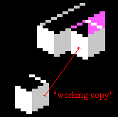
Either way, now erase the guidelines, fix the colors (with
the <fill> tool), complete the final roofline, add any "cheats" necessary,
and you're done! This wireframe method gives you the
most "accurate" placement of the hidden wall. It is especially useful for
large structures, where I often draw most of the walls entirely as wireframes
and then copy and fill to my heart's content:
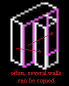 Just be very careful not to confuse yourself when you are
drawing wireframes. I try to stick to a color scheme where each plane of
the drawing is a unique color - for instance, the "front wall" of the base
of the "T" is pink, even though it is split in half by the leg of the "T."
After I am done drawing, erasing, and <fill>-ing, then I correct the
wireframe color. I'll explore this more on my page on technique.
But here's another hint:
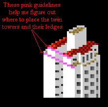 As you can see, guidelines can be very useful, just remember
to make them a distinguishing color (think pink!) and erase them carefully
when you are done.
Something that you may have noticed by now in SCURK is
that the big things are relatively easy while the little things are difficult.
Case in point - one-pixel-wide walls. These walls occur rather often and
are truly difficult to draw because of the corners. Let's look again at
the building in the example up above. The center of the facade juts out
one pixel, leaving a long 1-pixel-wide white wall:
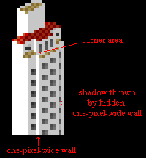 The wall itself is pretty simple, just a straight line.
The corner area is very tricky and takes a lot of trial-and-error. Keep
experimenting until you get it right, keeping in mind the different types
of joins from the top of this page. Almost invariably, you'll wind
up with a "lone pixel" if the join has the one-pixel wall one higher or
one lower than the main wall:
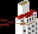
Contrast
effects will help you to downplay any "awkward" aspects of the corner (or
highlight anything you want to emphasize, of course). Notice that in the
building above, I drew the lighter rooftop pixels up against the wall corner
pixels so that these pixels all blend together a bit. Also, notice that
the shadow cast by the wall on the other side of the facade conveniently
allows me to differentiate between the center section of the facade and
the far wall. If it weren't for this very important shadow, you wouldn't
even know that there is a "hidden" one-pixel wall and that the facade is
stepped back again from the center section. (Yes, strictly speaking, the
visible one-pixel walls should have shadows on them also; but I need the
white in order to make them stand out - sometimes I'll make this type of
wall +1 or +2 darker though to represent the shadow.) As always, one pixel
makes a big difference - notice that the shadow only starts one down and
one over (a 45 degree angle!) from the top of the center section:
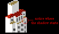
Notice also that the one-pixel wall is "sunlit," even
though it is on the shaded side of the building. Strictly speaking, the
visible one-pixel walls should have shadows on them, but I made them white
like the sunlit walls in order to make them stand out. However, depending
on the building, you may not want to draw the "sunlit" one-pixel wall quite
as light as the "true" sunlit walls (give it a +1 or +2 contrast). For
the opposite case, a one pixel wall drawn on the sunlit side, things are
a little simpler. This wall should be drawn as shaded, in the same shade
as teh otehr shaded walls.
Light and shadow are even more crucial when you are drawing
an "inside" one-pixel wall, for instance in an indentation on a facade.
Look at the brown building in the left-hand corner of the
tile below:
 Both the facade and the right-hand side of this building
have long overhung vertical indentations that are defined by the one-pixel
walls within them and the shadows which these walls throw:
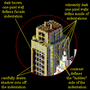 Two columns of shadow on the inside of the front facade are
usually overkill, but I wanted to have a clearly defined shadow against
the complex window pattern - normally I would only use one column. Also,
remember that an overhang usually throws it's own shadow, but here again
I was constrained by the windows.
Overall, the most important thing to remember about this
kind of wall is that it is always visible on the left-hand side of an indentation
on the left side of a building (the sunlit side), and it is always visible
on the right-hand side on the right side (shaded side) of a building. The
inside wall should throw a one-pixel-wide shadow to the right. Where the
wall is hidden, it will still throw a shadow, so don't forget it! Sometimes,
in fact, you won't even want to draw a pixel wall at the indentation because
the indentation is very shallow. In this case, draw just the shadow to
suggest the indentation, like inside the porches in this building:

Again, this may all seem like nit-picking. As you SCURK,
however, you will soon find that these one-pixel walls and narrow shadows
are incredibly important. In one of my own "personal
best" tiles, the MesseTurm, they are the critical element in defining
the tower:
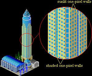
As you can see, the one-pixel walls emphasize the vertical
lines of the tower, a technique which is identical to one used by real-world
architects (heheh, well this is a model of a real-world building in Frankfurt,
so what did you expect?)
One last subject for this page which may or may not belong
here - rooflines. These are the diagonal lines that outline a rooftop (especially
flat rooftops). You could consider them to be horizontal one-pixel
walls:
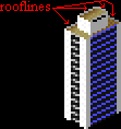
These very short walls are, in effect, the reverse side
of the walls that make up the sides of a building. Just as vertical one-pixel
walls define the sides of a building, they are critical in defining the
overall top-view shape of the building, even thought they are no more than
a diagonal line. Once again, shadows are very important, the roofline will
cast one or two pixels worth of shadow onto the rooftop itself (if the
roof is flat). I often make the shadow rather long, using contrast
blending to make this shadow tie in with the rest of the rooftop:

As you might be expecting by now, the the real tricky
part with rooflines are the joins. If you consider just the "standard"
2x1 diagonal roofline, there are 10 possible joins, depending on whether
the sidewall and the roofline ends in one or two pixels and how they overlap:
| * =
the best joins to use |
sidewall ends with 2 pixels; roofline ends with two pixels |
sidewall ends with 2 pixel; roofline ends with 1 pixel |
sidewall ends with 1 pixel; roofline ends with 2 pixels |
sidewall ends with 1 pixel; roofline ends with 1 pixel |
| sidewall and roofline overlap on 1 column |
*  |
 |
 |
*  |
| sidewall and roofline overlap on 2 columns |
*  |
 |
-not possible- |
-not possible- |
| sidewall and roofline do not overlap (pixels meet at corners) |
 |
 |
*  |
 |
By no means do you have to memorize this table (I wasn't
expecting you to memorize the table of wall joins either). This is only
to give you a general idea of what can happen at the junction of the roofline
with the wall. I myself use the first 2-pixel to 2-pixel join almost always
(the first one with the star on the table). You'll notice that the joins
that have a star in the table are (for the most part) symmetrical on a
horizontal axis:
 Now I'm not saying that all your roofline-sidewall joins
must be symmetrical - just that if your roofline "looks funny," then you
might want to try adjusting it a bit so that the join is symmetric. It's
also usually a good idea to make all the joins on the rooftop the same
(mirror images of each other, anyway):

Also notice that the rooftop has one sunlit roofline and
one shaded roofline, and each of these rooflines is, respectively, on the
opposite side of the roof from the sunlit and shaded sidewalls. If your
rooftop has multiple levels and/or small subsidiary rooftops, then keeping
a logical relationship between the rooflines and their joins becomes even
more important. Sometimes you'll have to "cheat" in order to maintain clarity:
 |
The roof of this building is made even more complex
because the sunlit roofline runs right into the join of the upper roof.
The upper roof uses same joins on each side, but not the lower roof - I
had to "cheat." Also notice that the upper roof structure casts a shadow
on the rear roofline. |
The shape of the "top" corner of a roof is almost unpredictable,
it depends on how wide your roof is and on what kind of joins you used
on the lower corners:

I don't even bother trying to predict what will happen
at the top joins, I just draw the other corners the way that I want and
then see what happens with the top join. In general I try to avoid the
joins that occurred in the two rooftops on the right in the above examples
- where the join has four pixels in a row or only one lone pixel. Adjusting
the joins on the side corners will usually fix any problem at the top join.
Widening or narrowing the entire roof by one pixel also works, but that
can have rather drastic effects on the rest of your building! If you are
really stuck, the appropriate contrast
techniques will usually help cover up the problem - if nothing else
you can always make the lone pixel the shaded pixel (instead of sunlit
like in the example) or increase the contrast of the two sides of a 4 pixel
join (so that it looks more 3 dimensional). However, sometimes the 4 pixel
or 1 pixel top join ends up fitting in pretty well up on the roof and I
just leave it alone - it's all a matter of what looks good to you.
 Looks good to me!
Wow! I can't believe how big this page got to be! I'm
going to have to index it ...someday....;-) In the meantime, remember
that the most important thing about all walls, no matter if they are long
and skinny or short and wide, is how they join - the corners. In all cases,
you can always fix a problem by simply shifting around a few pixels or
using contrast.
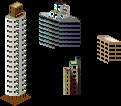
One topic I haven't covered on this page is what happens when the
walls are not at the "standard" 45 degree perspective angle or when they
don't join at a 90 degree corner or when the walls are curved. Basically
the same thing happens - you just carefully draw your diagonal (or curve)
until you reach the corner (review my page on perspective,
if you have to). Then you tweak the corner join until you get it to look
right and keep on going!
 Strange angles!
Speaking of strange angles
and curves, it's time (FINALLY!) for my next page - about shapes.


 Same
join!


 Looks good to me!
 Strange angles!

