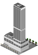
Windows
Windows are, at the same time, very easy and quite difficult
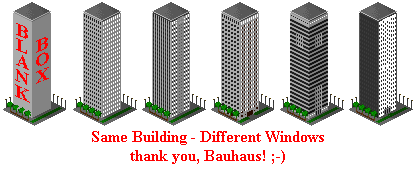
to draw in SCURK. What is certain is that windows are the crucial detail
in defining the "look" of your building. The pattern of windows on the
various walls is what makes your building more than just a big blank box
and what differentiates it from other buildings:
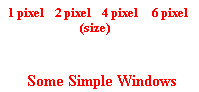
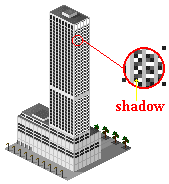
The basic window is just a dark hole in the wall, maybe
with a few shadow
and contrast
effects - that's the easy part:
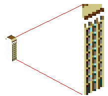
 Fitting these windows together into a pleasing and effective
pattern is the hard part. SCURK's pixelation
and perspective
problems mean that the neat patterns of windows in the above examples get
broken up as soon as you try to draw them onto a typical "diagonal" sim-wall:
Fitting these windows together into a pleasing and effective
pattern is the hard part. SCURK's pixelation
and perspective
problems mean that the neat patterns of windows in the above examples get
broken up as soon as you try to draw them onto a typical "diagonal" sim-wall:
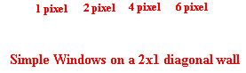
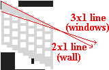
As you can see, the pattern of windows gets staggered.
This is as you would expect, but the real problem is that the wider windows
are themselves distorted when you put them on a diagonal. Worse yet, for
even widths, only every other row of windows distorts, so you in effect
have two different types of windows. This effect is disastrous in a 2-pixel-wide
window as it causes the entire wall to look wavy:
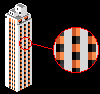
 |
This is one of Slugg's
tiles. As usual, I modified it for effect. Further along on this page you'll
see the real tile - much better! |
The effect does not look as bad with wider windows, but
it's still a pain:
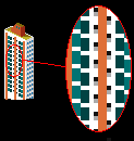
 |
Look at the building on the right....some windows "bend" up, some windows
"bend" down...what a mess! |
Fortunately, there are many different solutions to these
problems. Working out these solutions can be one of the most creative aspects
of SCURK - since windows are repeated in a pattern all along your building,
the minute detail of how you solve the problem of the individual window
quickly adds up to be a unique "style" for your creation:
 |
Here's Slugg's
original tile. How did he solve the window problem? |
The solutions that you can use are so varied and so individual,
that I will not attempt to catalogue them here. As you gain experience
SCURKing you will develop your own techniques. The best way to learn and
gain that experience is by closely observing the work of other SCURK artists
and then trying them yourself. Let's take a look then at some tiles
and observe what techniques are used. Hopefully, you will then be able
to use some of these solutions in your own tiles, and combine or modify
the techniques to create your own solutions.
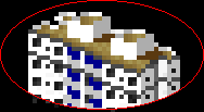
Let's start by again looking at Slugg's tile. He uses
a very simple technique to hide the difference between the columns of windows
- camouflage. Remember, the problem is that as you draw the rows of 2x2
pixel windows along a 2x1 diagonal line, every other window has a vertical
break in it:
 ....pretty ugly...
Slugg effectively uses contrast to accentuate the vertical
elements of his windows and disguise the horizontal elements - where the
breaks occur:
 |
Slug uses a dark grey for the horizontal lines, decreasing
contrast, and a light grey for the vertical lines, increasing contrast.
It still looks "pretty ugly" in close-up, but once it's integrated into
an entire wall, the technique is very effective. |
 |
This technique has an added effect - many buildings have
a vertical "ribs" along their walls (New York's Daily
News Building is a prime example) and you can effectively model them
by accentuating the vertical element of your windows. Better yet, you can
add a shadow to the "ribs," which is exactly what Slugg did on the shaded
side of his building:
 Good use of contrast is really crucial to using this technique
effectively. The Rule of Three is a big help, but remember, you'll quickly
run into a complicated pattern of contrasts. For Slugg's building, he needed
a +3 contrast between the sunlit and the shaded walls, a +3 contrast between
the ribs and the shadowed part of the horizontal lines (the spandrels)
between the windows, a +2 or +3 contrast between this shadowed part of
the spandrels and the part not in shadow (so the shadow will be distinct),
and then a low contrast transition to the actual window (remember, you
need to diminish the vertical breaks). If the window itself has some detail
to it - instead of just being a "black hole" - then things get even more
complicated:
Good use of contrast is really crucial to using this technique
effectively. The Rule of Three is a big help, but remember, you'll quickly
run into a complicated pattern of contrasts. For Slugg's building, he needed
a +3 contrast between the sunlit and the shaded walls, a +3 contrast between
the ribs and the shadowed part of the horizontal lines (the spandrels)
between the windows, a +2 or +3 contrast between this shadowed part of
the spandrels and the part not in shadow (so the shadow will be distinct),
and then a low contrast transition to the actual window (remember, you
need to diminish the vertical breaks). If the window itself has some detail
to it - instead of just being a "black hole" - then things get even more
complicated:
 |
These windows are grey with black/brown shadows. Notice that the shadows
extend over the horizontal spandrels between the windows in order to accentuate
the vertical "ribs." Underneath the roof overhang, all of these window
elements are further shadowed and need a new contrast scheme. Notice also
that I used some "complementary
color" brown, blue, and grey to give some more variety to the
facade. The entire facade is still a little "wavy," but in this case I
chose to draw some more contrast into the windows (thereby allowing the
vertical breaks) in order to have better clarity for my details. |
In the example above, you'll also notice that the "doors"
at ground level are really just lengthened versions of the windows (slightly
darker as well). This is pretty common in commercial buildings, the ground
floor has big picture windows and glass doors. Anyway, it makes SCURKing
a little easier ;-). Sometimes, you can even
make the vertical break be part of the window design, like I did with the
small residential building in the next example (notice that the windows
are 3 pixels wide, not two...but they still have a vertical break):
 The windows have shutters on them, check out the detail

Another way to avoid the vertical breaks in windows is
just to ignore them altogether by staggering your windows off of the 2x1
line:
| Instead of this... |
 |
...try this... |
 |
...or this... |
 |
...or even this... |
 |
|
"normal" |
|
1 pixel-wide spandrels |
|
2 pixel-wide spandrels |
|
"3x1 diagonal" windows |
At first glance, "staggering" your windows seems like
an ideal solution - certainly easier than the camouflaging techniques.
The "1-pixel wide spandrel" stagger (hereafter "1-pixel stagger"),
and the "two-pixel wide spandrel stagger" ("2-pixel stagger") both use
the exact same technique. Wherever the "normal" window pattern would have
had a vertical break, you simply ignore it and draw the window straight
across:
 Easy, eh?
A simpler way to look at it while you are drawing a staggered
set of windows is that each new window on a row is two pixels down for
the first window and then one pixel down for the next, then two, then one,
etc...(if you are drawing from right to left on a diagonal that slopes
down in the same direction, other wise two up then one up, then two, etc.):
 Yep, easy!
The only difference between the 1-pixel stagger and the
2-pixel stagger is the width of the space (spandrel) between the windows
- one or two pixels. Note that the actual height of the window in both
of these cases does not matter, the window can be 2 pixels high as in the
examples, or 1 pixel, or three, or whatever - the stagger pattern remains
the same. The "3x1 diagonal" stagger (hereafter "3x1 stagger") is even
easier to draw - each new window on a row is drawn one pixel down, no sweat!
 Even easier!
However, there are some compromises that have to be considered.
The windows in all three of these techniques deviate from a standard 2x1
line (45 degree perspective angle), so they look strange wherever they
meet a 2x1 line, such as at the top and bottom of the wall. The problem
is small but annoying in the 1-pixel and 2-pixel stagger. However,
if you are drawing any contrasting horizontal stripes or ledges between
the rows of windows then this problem is magnified, especially in the 1-pixel
stagger where you have only 1 pixel between window rows to work with:
| The 2-pixel stagger looks OK with stripes... |
 |
...but the 1-pixel looks awful! |
 |
Worse yet, in the 3x1 stagger the windows and the
wall are actually on different diagonals (perspective angles) making the
"gap" problem almost insurmountable:
 You'll have to come up with some way of hiding the gap between
the windows and the top of the wall (remember, this problem will also occur
at the bottom of the wall, or anywhere else that the windows meet a horizontal
line, but let's focus on the top of the wall, the same techniques apply
to the other situations). Once again, there are many different solutions,
you'll probably come up with your own as you gain experience with SCURK:
You'll have to come up with some way of hiding the gap between
the windows and the top of the wall (remember, this problem will also occur
at the bottom of the wall, or anywhere else that the windows meet a horizontal
line, but let's focus on the top of the wall, the same techniques apply
to the other situations). Once again, there are many different solutions,
you'll probably come up with your own as you gain experience with SCURK:
 |
 Make the gap at the top of the wall very wide (3 pixels or more)
 |
 |
| Stagger windows over only a very small width
of wall (two or three columns) |
 |
Draw some contrasting detail in the gap to distract the eye |
 |
| Draw the gap under an overhanging ledge or roof...shadow
hides uneven space |
 |
Make 2x1 line conform to the windows...this works best over small spaces |
 |
| Note in the detail that the top of wall goes 2 over, 1 up, 1 over,
1 up, 2 over, etc. |
This last technique, where you modifying the 2x1 diagonal
where it crosses over the windows, takes us to the next logical step -
modifying the perspective. Lets look at the
3x1 stagger again. Instead of worrying about making it conform to a 2x1
wall, simply make a 3x1 wall. In fact, over small distances, the viewer
doesn't even notice that it is not a "normal" perspective wall:
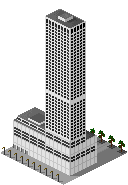
 Looks normal, but check out the detail
The building above "cheats" by using a 3x1 diagonal
on the sunlit wall and a 2x1 on the side wall, but as long as the "wrong"
diagonal that you use is not too extreme you can get away with it. At the
normal close-up of SimCity, the viewer doesn't notice the difference between
the diagonals. In fact, you can even mix and match diagonals on the same
wall and get away with it:
 |
This
building uses a 3x1 line over the windows on the ends, but uses a 2x1 line
over the balconies in the middle, all on the same sunlit-side wall |
 |
I personally enjoy drawing buildings that deviate from
SimCity's "normal" 45 degree perspective, so I use these perspective-modification
techniques a lot. When I start drawing a new building, first I sketch out
the windows, using whatever pattern looks realistic and/or pleasing. Then
I let the pattern of the windows dictate the perspective:
Yet another, very simple, way of avoiding the vertical
break problem is to change the horizontal spacing between the windows,
either increasing it (to an even number) or eliminating it. If you increase
the spacing between windows, you're trading in precious space on the tile...be
careful not to let your building get too wide. It may not seem as if only
one extra pixel of width will make a difference, but remember that you
have many columns of windows multiplying that one extra pixel. Before you
know it, you can run out of space:
Looks good here, but be careful not
to let the wall get too W-I-D-E |
 |
If you decrease the spacing between windows, be carefull
not to let your windows lump together into one long window. Draw enough
contrasting detail into the windows to have them be look distinct from
one another. Alternatively, make ever other window a different color:
 |
distinctive window detail
|
 |
| different colored windows |
As I wrote earlier, this page is by no means a comprehensive
catalogue of all the ways in which you can draw windows in SCURK. I didn't
even touch on circular, curved, or arched windows! (I'll save that for
my page on shapes).
The limitations of SCURK both impose some compromises and open possibilites.
The best way to truly learn what these are is by SCURKing.
Yep, this is a cop-out in what is supposed to be a SCURK
guide, but why don't you take a break from your browser and fire up SCURK
for a bit? Meanwhile, I'll work on the next page. ;-)